Modern Grotesque Body

Lumera Editorial + Bielchon
Creates crisp high-hierarchy contrast beneath Lumera Editorial headlines across menus, websites and labels.
Inspect Bielchon specimenDisclosure: MakerFileHub may earn a commission from qualifying purchases via paid links on this page. How our links work.
Tall condensed ribbon-swashed glamour display serif
Lumera Editorial is a tall, glamorous display serif braiding sweeping calligraphic loops through condensed high-fashion capitals!
Paid link
Get this fontProject & layout blueprintsAt-a-glance maker compatibility
Crisp hairline serifs shine on stationery, foil stamping, and packaging; add slight offset for small decals.
Visual anatomy & craft review
Lumera Editorial is a tall condensed display serif in which ribbon-like swashes run the full height of the ascenders and sweep across the caps, giving each word the look of a fashion masthead. The condensation stacks a long title vertically, and the ribbons sit above and below the line, so a tight leading collides them. It needs roughly 36 mm for the ribbon width to read, and it is best in one dense ink on matte white, or foil at 60 pt and above where the ribbon edge stays sharp.
Tall-glamour · Interlocking-ribbons · Art-Nouveau-chic
Two-font hierarchy recipes
Tested contrast partners — pairing Lumera Editorial with grounded secondary typography.
Lumera Editorial + Bielchon
Creates crisp high-hierarchy contrast beneath Lumera Editorial headlines across menus, websites and labels.
Inspect Bielchon specimen
Lumera Editorial + Lovely
Adds a warm human signature touch for 1-to-3-word callouts without competing against structured serif capitals.
Inspect Lovely specimenPractical applications
Concrete hierarchy, scale and production guidance tailored to Lumera Editorial’s stroke geometry.
A ribbon-swashed condensed serif is the lettering a fashion cover already uses to signal glamour rather than news. The tall swashes give the masthead full-height presence at 96 pt, and the condensed skeleton fits a long issue title inside the 210 mm measure without tracking out.
Hierarchy & layout recipe
Cover 210 x 297 mm, masthead 96 pt with 14 mm ribbon clearance, cover lines 11/15 pt, 18 mm margins. Feature opener 60 pt, standfirst 11/15 pt. Contents header 30 pt.
Pre-production check
At 60 pt on the feature opener the ribbon crosses the standfirst and the two lines collide into a knot. Allow 14 mm of clearance or drop the ribbonless alternate, and proof one opener at 1:1.
A ribbon-swashed serif reads as a fashion house rather than a pharmacy brand, which is what a small cosmetics line wants on its carton. The condensed elegance holds at 30 mm on a bottle label, and one ink on matte stock keeps the ribbon edge crisp where a coated sheet would glare.
Hierarchy & layout recipe
Carton 60 x 160 x 30 mm, word 26 mm with 8 mm ribbon clearance, 8 mm margins. Bottle label 70 x 50 mm, word 18 mm, 4 mm margins. Card 85 x 55 mm, word 16 mm, 5 mm margins.
Pre-production check
On a curved bottle label at 18 mm the ribbon edge lifts and the word looks cracked along the contour. Keep bottle labels at 22 mm or print the mark as a flat panel, and check one applied label on the bottle.
A ribbon-swashed condensed serif gives a black-tie wedding the tall elegance of a printed programme rather than a calligraphic stereotype. The swashes carry the couple's names at 34 pt, and the condensed columns fit a long guest list on a 400 mm table plan without shrinking.
Hierarchy & layout recipe
Invitation 130 x 180 mm, names 34 pt with 12 mm ribbon clearance, details 9/13 pt, 15 mm margins. Menu 120 x 210 mm, header 16 pt, courses 9/12 pt. Table plan 400 x 600 mm, names 11 mm, 20 mm margins.
Pre-production check
An 11 mm table-plan name lets the ribbon of one line touch the line below and the two merge at a distance. Increase table-plan leading to 16 mm, and proof one plan before printing.
Technical & licence verification
Confirm included OTF/TTF/WOFF formats, full glyph tables and licence coverage on the live store page before batch production.
Closest visual alternatives
Matched across letterform anatomy, stroke behaviour and craft applications.

Flamboyant coiled-swash couture editorial serif
Alerigue is a high-contrast luxury editorial serif distinguished by dramatic coiled spiral terminals and sweeping calligraphic ascender loops.
Ideas for this font

Art-Nouveau ligature & celestial-sparkle editorial serif
Resquel is an expressive high-contrast editorial serif featuring sweeping ribbon under-tails, interlocked ligatures, and star-sparkle counters.
Ideas for this font

Crisp contemporary editorial serif duo (Regular + Italic, OTF/TTF/WOFF)
Svara is a sharp modern editorial serif family pairing an upright Regular with a lively true Italic across OTF, TTF & WOFF formats!
Ideas for this font
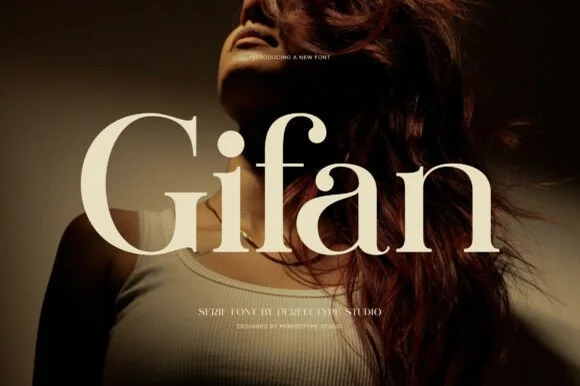
Bold high-contrast modern serif with teardrop ball terminals
Gifan is a bold, voluptuous modern luxury serif distinguished by lush teardrop ball terminals on 'f' and 'a' and notched architectural spurs!
Ideas for this font
Same independent foundry
Allow optional Google Analytics to measure visits and catalogue actions. Your search words and notes are not included. Privacy & storage