High-Contrast Display Serif

Ashley Marie + Auretha
Pairs sculptural editorial warmth with Ashley Marie's clean modern geometry.
Inspect Auretha specimenDisclosure: MakerFileHub may earn a commission from qualifying purchases via paid links on this page. How our links work.
Contrasting sans and two script treatments
Ashley Marie shows tall broad sans letters set very pale behind a darker connected Ashley line and a much finer extended marie line, where the upper script swells in the middle of the word, scattered dots sit at the ends of long outer strokes and a yellow corner badge advertises a font trio.
Paid link
Get this fontProject & layout blueprintsAt-a-glance maker compatibility
Weld or Unite overlapping script joins into one continuous vector path before sending to the blade.
Visual anatomy & craft review
The pale sans stays wide and airy, the first script keeps a swelling thick-thin rhythm, the second stays hairline and extended, and the dots punctuate the tails. That three-layer build is the character, because the sample uses the sans as a background rather than as a reading row. The badge promises a trio plus clipart, so confirm what actually installs before planning a three-part lockup. Keep the hairline script at 22 pt or above and test the pale layer against your ground colour first.
Contrasting · Extended · Paired
Two-font hierarchy recipes
Tested contrast partners — pairing Ashley Marie with grounded secondary typography.
Ashley Marie + Auretha
Pairs sculptural editorial warmth with Ashley Marie's clean modern geometry.
Inspect Auretha specimen
Ashley Marie + Lovely
Introduces organic movement on pull-quotes, signatures and gift tags.
Inspect Lovely specimenPractical applications
Concrete hierarchy, scale and production guidance tailored to Ashley Marie’s stroke geometry.
The three layers let a small label carry a brand name, a product word and a pale backing word without adding a single piece of artwork.
Hierarchy & layout recipe
Print a 60 by 90 mm label: set the brand in the first script at 20 pt, set the product word in the hairline script at 14 pt beneath, place the pale sans at 34 pt behind both, and keep 7 mm to the die edge.
Pre-production check
The hairline script vanishes on kraft; check a printed proof and stay on a coated label stock.
The layered scripts give a card depth and the pale backing word fills the space above a short greeting without a photograph.
Hierarchy & layout recipe
Print a 120 by 170 mm card: set the greeting in the first script at 30 pt, set the name in the hairline script at 18 pt beneath, place the pale backing row at 54 pt behind, and keep 16 mm of margin all round.
Pre-production check
The pale layer competes when the ground is tinted; check the card and keep the backing at 25 percent tint.
The three-part build suits a favour tag where the couple's names sit in the middle script and the pale word reads as texture.
Hierarchy & layout recipe
Print a 45 by 70 mm tag: set the names in the first script at 16 pt, set the date in the hairline script at 10 pt beneath, place the pale row at 30 pt behind, and keep 6 mm to the punch hole.
Pre-production check
The clipart is advertised, not shown in use; check the download list before promising a motif.
Technical & licence verification
Confirm included OTF/TTF/WOFF formats, full glyph tables and licence coverage on the live store page before batch production.
Closest visual alternatives
Matched across letterform anatomy, stroke behaviour and craft applications.
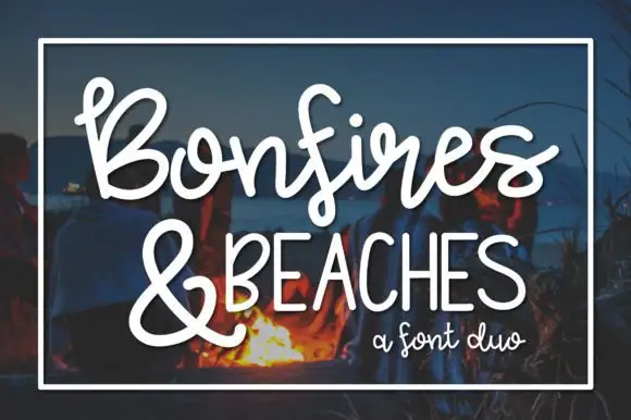
Looping brush script paired with tall narrow caps
Bonfires & Beaches is a duo: a looping brush script with a swinging tail on the first capital, paired with a tall narrow uppercase that carries the second line in even, slightly condensed letters.
Ideas for this font

Looped handwritten script paired with a bold rounded sans in small caps
Enchanted Bride is a duo of a looped handwritten script with soft rounded stems and a bold rounded sans, arranged so the script carries the names and the sans carries the labels.
Ideas for this font
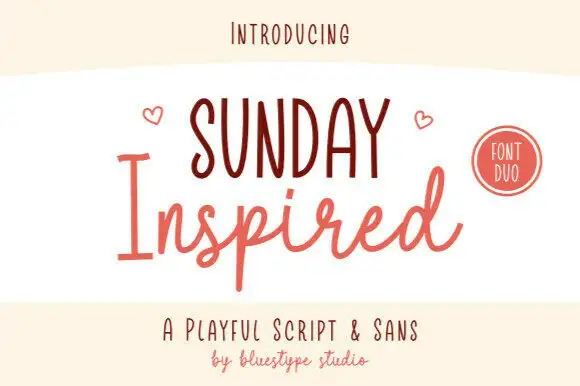
Playful script and tall sans duo
Sunday Inspired is a playful duo in coral on cream: a tall narrow sans in caps for the first line and a light handwritten script for the second, with small hearts flanking the lockup and a round badge at the right, so the plate reads as a friendly brand set rather than a single typeface.
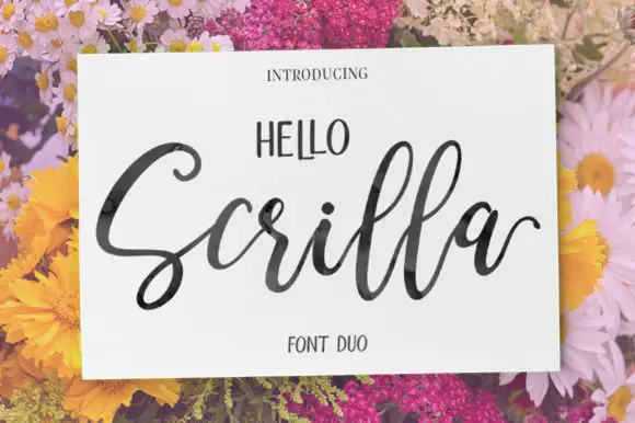
Fine looping script with wide open swashes, paired with narrow uppercase caps
Hello Scrilla pairs a fine looping script whose capitals open into wide airy swashes with a narrow uppercase sans that carries a short word above it in tall, tightly set capitals.
Ideas for this font
Same independent foundry
Allow optional Google Analytics to measure visits and catalogue actions. Your search words and notes are not included. Privacy & storage