High-Contrast Display Serif

Pink Vibes Duo + Raffined
Pairs sculptural editorial warmth with Pink Vibes Duo's clean modern geometry.
Inspect Raffined specimenDisclosure: MakerFileHub may earn a commission from qualifying purchases via paid links on this page. How our links work.
Duo
Pink Vibes Duo pairs two fat rounded capital rows, drawn in white with a soft pink glow, with a small dark connected script that runs across them, and in the lower sample the script joins the words with heart shapes instead of a plain connector stroke.
Paid link
Get this fontProject & layout blueprintsAt-a-glance maker compatibility
Sturdy stroke walls and open counters weed cleanly on adhesive vinyl, HTV apparel film, and cut cardstock.
Visual anatomy & craft review
The caps stay broad and inflated, the script stays thin and dark, the contrast between the two weights carries the pair and the hearts sit where a ligature would normally go. The upper sample sets the script over the caps without hearts, the lower inserts one heart between the words and a second heart cluster on the final s, so the decorative join is an option rather than the default. Branches in the corners are cover artwork. Check which connector glyphs your file carries before planning the heart link, keep 30 pt for the script strokes and set the caps in one colour so the pink glow does not come from the type.
Rounded capitals with heart-linked script
Two-font hierarchy recipes
Tested contrast partners — pairing Pink Vibes Duo with grounded secondary typography.
Pink Vibes Duo + Raffined
Pairs sculptural editorial warmth with Pink Vibes Duo's clean modern geometry.
Inspect Raffined specimen
Pink Vibes Duo + Hailey
Introduces organic movement on pull-quotes, signatures and gift tags.
Inspect Hailey specimenPractical applications
Concrete hierarchy, scale and production guidance tailored to Pink Vibes Duo’s stroke geometry.
The fat caps give a label its block and the script supplies the soft second voice, which suits a small beauty brand where the pairing is the identity rather than decoration.
Hierarchy & layout recipe
Print a 60 by 90 mm bottle label: set the name in the caps at 26 pt across the middle, run the script tagline at 14 pt beneath with 9 mm of clear ground between the rows, and keep 6 mm to the die edge for the glow.
Pre-production check
The heart join may be a separate glyph; check the file and the sheet with a test word before quoting the label.
The rounded caps read as a party headline and the thin script adds a name, so a short greeting gains two registers without a second typeface decision.
Hierarchy & layout recipe
Print a 120 by 180 mm card: set the greeting in the caps at 34 pt on one row, run the name in the script at 18 pt beneath with 10 mm of clear space, and keep 16 mm of margin at each side for the glow.
Pre-production check
The script is the fragile part; check a printed proof at 18 pt and keep the strokes off pale pink grounds.
The heart connector makes the duo read as a valentine without extra art, which is useful where a tag has one line for the brand and one for the occasion.
Hierarchy & layout recipe
Print a 45 by 90 mm tag: set the caps at 20 pt as a single word, place the script line at 12 pt with the heart join centred beneath, and keep 7 mm to the punch hole so the join stays clear.
Pre-production check
Below 12 pt the heart join becomes a dot; check the printed tag and hold the script at 12 pt or above.
Technical & licence verification
Confirm included OTF/TTF/WOFF formats, full glyph tables and licence coverage on the live store page before batch production.
Closest visual alternatives
Matched across letterform anatomy, stroke behaviour and craft applications.
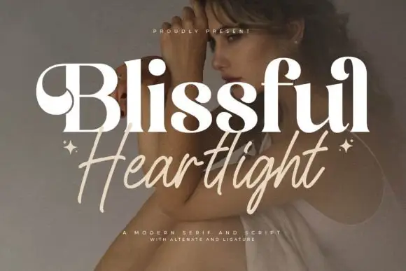
Heavy curled serif name above a loose slanted handwritten line
Blissful Heartlight shows a pale heavy Blissful line with round bowls and curled upper entries over a portrait, where the serifs swell into bulges at the joins and a thinner right-leaning Heartlight script sits beneath with long loose strokes and extended ascenders and descenders plus two small stars at the outer edges.
Ideas for this font
Duo
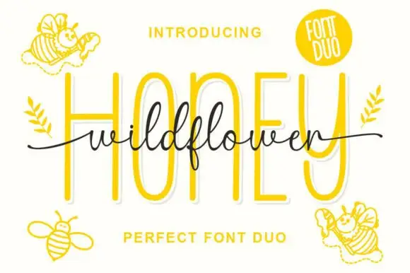
Wild Flower Honey Duo shows very tall rounded sans-like letters behind a fine connected script line, where the script f descends below its low body, long tails extend to both sides and small bees decorate the cover around the two rows.
Ideas for this font
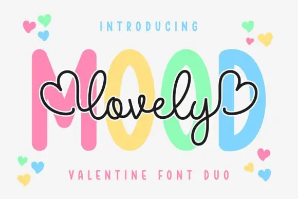
Fine heart-ended script layered over thick upright capitals
Lovely Mood Duo is a two-cut pair in which a fine monoline script with heart-shaped ends crosses a heavy upright capital word, so a card can carry a written line and a printed one in the same soft tone.
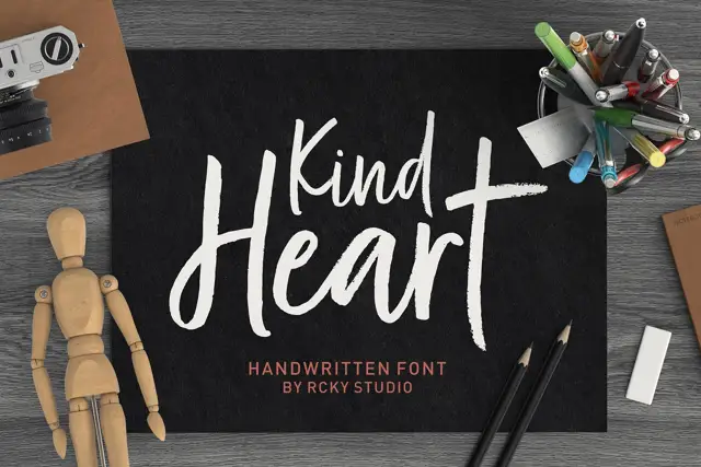
Rough brush title with a handwritten pair
Kind Heart Font Duo pairs a rough-edged brush title with a smaller, calmer handwritten companion, both of them cut with the same angled flat tool.
Ideas for this font
Same independent foundry
Allow optional Google Analytics to measure visits and catalogue actions. Your search words and notes are not included. Privacy & storage