Editorial Serif Anchor

Beyond Perfection + Aureline
Anchors Beyond Perfection's fluid strokes with crisp Roman proportions on wedding suites, headers and packaging.
Inspect Aureline specimenDisclosure: MakerFileHub may earn a commission from qualifying purchases via paid links on this page. How our links work.
Delicate enclosed calligraphy with wide looping capitals and returning strokes
Beyond Perfection is a delicate calligraphic script in which the capitals open into wide enclosing loops, the hairlines stay fine, the joins run unbroken and the final letter returns a stroke beneath the line, so a name reads as copperplate on an invitation.
Paid link
Get this fontProject & layout blueprintsAt-a-glance maker compatibility
Weld or Unite overlapping script joins into one continuous vector path before sending to the blade.
Visual anatomy & craft review
The B wraps a broad left loop around its stem, the lowercase keeps a narrow body with fine ascending loops, the connectors hold one weight from letter to letter and the closing n sends a return stroke that travels under the whole word. The enclosing loop is the character: it wraps the first letter, which is why the sample sets one name and a second short line. The family ships over four hundred alternates, swashes and ligatures, so a maker can swap a terminal per project rather than accept the default. Because the hairlines are fine, the face wants 20 pt in print and welds before cutting from 1.1 inches of x-height. The pale field and the fine rules are presentation.
Calligraphic · Delicate · Looped
Two-font hierarchy recipes
Tested contrast partners — pairing Beyond Perfection with grounded secondary typography.
Beyond Perfection + Aureline
Anchors Beyond Perfection's fluid strokes with crisp Roman proportions on wedding suites, headers and packaging.
Inspect Aureline specimen
Beyond Perfection + Kohilo
Keeps small-scale dates, URLs, nutrition facts and care instructions crisp and legible below script titles.
Inspect Kohilo specimenPractical applications
Concrete hierarchy, scale and production guidance tailored to Beyond Perfection’s stroke geometry.
The enclosing capitals give a couple's names ceremony, and the fine joins keep a long double name readable at 24 pt on heavy card.
Hierarchy & layout recipe
Print a 130 by 180 mm card: set the names at 24 pt across the middle, keep 20 mm below the returning stroke, and set the venue at 9 pt in a neutral serif in the lower third.
Pre-production check
A returning stroke printed into the venue line collides with it; check the proof and keep 18 mm of clear ground beneath the lowest loop.
The calligraphic capitals give a small label luxury without a second motif, and the fine body stays clear at 20 pt on a 40 mm panel.
Hierarchy & layout recipe
Print a 40 by 65 mm label: set the house name at 20 pt, keep 6 mm from each die edge so the enclosing loop stays whole, and set the volume in a 6 pt caps along the foot of the panel.
Pre-production check
Fine joins at 14 pt on a small label break up in print; check the proof and keep the name at 18 pt or above.
The delicate loop suits a romantic line, and the even connector weight keeps a short phrase readable at 30 pt on an A6 card.
Hierarchy & layout recipe
Print an A6 card: set the phrase at 30 pt across the middle, keep 14 mm at both ends for the entry and return strokes, and leave the lower half blank for a written message.
Pre-production check
Writing over a printed return stroke smudges the ink; check the card and keep the written band clear of every loop.
Technical & licence verification
Confirm included OTF/TTF/WOFF formats, full glyph tables and licence coverage on the live store page before batch production.
Closest visual alternatives
Matched across letterform anatomy, stroke behaviour and craft applications.

Very slanted calligraphy with broad lower sweeps and fine hairlines
Silken Luxe is a formal calligraphy script with a steep slant, broad lower sweeps and hairlines that thin almost to nothing, drawn so two words build an ornamental diagonal across the plate.
Ideas for this font
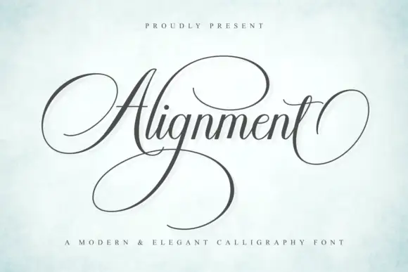
Formal calligraphic script with a large calligraphic capital
Alignment is a formal calligraphy script whose capital occupies three times the x-height and whose oval flourish sweeps out from the first letter and back under the last, so the word is framed top and bottom by one continuous gesture.
Ideas for this font
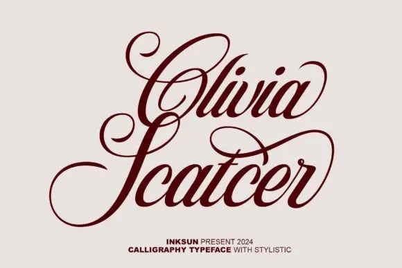
High-contrast looped calligraphy
Olivia Scatcer is a high-contrast calligraphy in oxblood on pale stone: wide open loops on the capitals, a pronounced thick-and-thin and a light forward slant, with a small credit line at the foot.
Ideas for this font
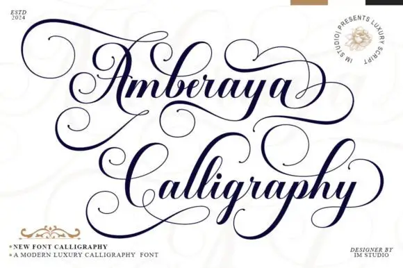
Dense ornamental high-contrast calligraphy
Amberaya Calligraphy builds large spiral A and C forms with thin sweeping connections, and long upper and lower swashes weave around both lines, including a wide curl that leaves the final y.
Same independent foundry
Allow optional Google Analytics to measure visits and catalogue actions. Your search words and notes are not included. Privacy & storage