Editorial Serif Anchor

Isabella Monroe + Flowsky Editorial
Anchors Isabella Monroe's fluid strokes with crisp Roman proportions on wedding suites, headers and packaging.
Inspect Flowsky Editorial specimenDisclosure: MakerFileHub may earn a commission from qualifying purchases via paid links on this page. How our links work.
Fluid slanted ink-pen script with fine joins and a soft even flow
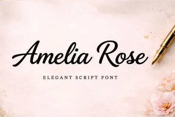
Isabella Monroe is a fluid slanted script in which the strokes flow with a light ink-pen weight, the joins stay fine and the letters lean together as one line of handwriting.
Paid link
Get this fontProject & layout blueprintsAt-a-glance maker compatibility
Weld or Unite overlapping script joins into one continuous vector path before sending to the blade.
Visual anatomy & craft review
The capital I opens with a narrow looped stem and the letters after it run in an unbroken rhythm: the s reverses through two soft curves, the a closes a small bowl, the b rises into a plain stem, the l loops high and the second capital follows with a wide sweep. Weight varies only slightly between downstrokes and joins, which keeps the line light and even rather than calligraphic. The slant is consistent, so a two-word name reads as one continuous piece of writing at 26 pt and holds at 12 pt on a label. Because the joins are fine, the face needs a smoother stock and a decent print size to stay clean. The marble surface, the black ink, the small botanical element in the corner and the tracked caption are presentation; the script is the two words.
Fluid · Slanted · Inked
Two-font hierarchy recipes
Tested contrast partners — pairing Isabella Monroe with grounded secondary typography.
Isabella Monroe + Flowsky Editorial
Anchors Isabella Monroe's fluid strokes with crisp Roman proportions on wedding suites, headers and packaging.
Inspect Flowsky Editorial specimen
Isabella Monroe + Homies
Keeps small-scale dates, URLs, nutrition facts and care instructions crisp and legible below script titles.
Inspect Homies specimenPractical applications
Concrete hierarchy, scale and production guidance tailored to Isabella Monroe’s stroke geometry.
The ink-pen flow gives a classic card its handwriting without ornament, and the light weight holds both names at 24 pt on a modest format.
Hierarchy & layout recipe
Print a 120 by 180 mm card: set both names at 24 pt on one line, set the date in an 8 pt caps serif beneath, and leave 18 mm of margin at each side so the final sweep stays inside the trim.
Pre-production check
A light slanted script printed on textured card breaks at the joins; check the proof on the chosen stock and use its smoother face for the names.
The fluid slant makes a wordmark feel written rather than set, and the fine joins still read at 13 pt on a business card.
Hierarchy & layout recipe
Print a 90 by 50 mm card: set the studio name at 13 pt across the upper third, set the contact block in a 6 pt sans below, and keep 9 mm of clearance under the descender so the card stays balanced.
Pre-production check
Fine joins can drop out on a small card; check the printed card at actual size and open the two tightest joins before the run.
The light script makes a plain place card feel written by hand, and the even flow keeps a long guest name readable at 15 pt.
Hierarchy & layout recipe
Print a 90 by 50 mm place card: set the guest name at 15 pt, set the table number in a 7 pt caps sans at the right, and keep 7 mm from the fold so the descender never crosses the crease.
Pre-production check
A long name at 15 pt can push the table number off the card; check the longest name in the seating list and set it on two lines rather than condensing.
Technical & licence verification
Confirm included OTF/TTF/WOFF formats, full glyph tables and licence coverage on the live store page before batch production.
Closest visual alternatives
Matched across letterform anatomy, stroke behaviour and craft applications.
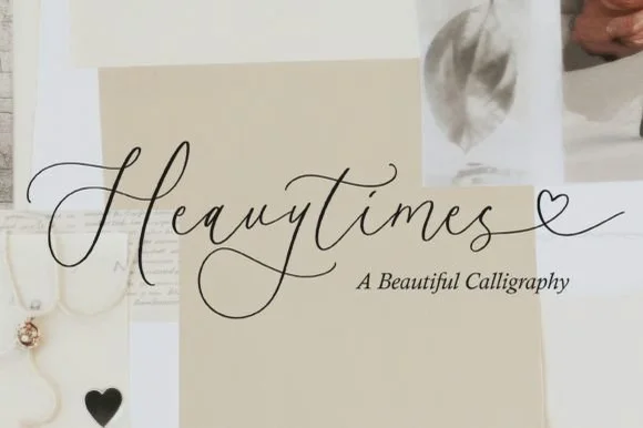
Delicate heart-tail fine calligraphy with tall loops and open spacing
Heavytimes is delicate fine calligraphy in which the tall loops stay open, the letters are spaced generously and the exit tail runs into a small open heart before finishing.
Ideas for this font
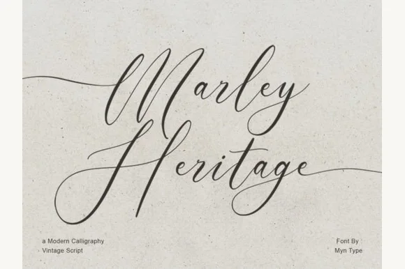
Modern calligraphy script with long tails
Marley Heritage is a modern calligraphy script in black on speckled paper: thin modulated strokes, oversized looping capitals, a lowercase that stays low and wide, and tails that run far beyond the words, so the pair reads as a signature written with a flexible nib on old stock.
Ideas for this font
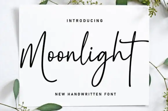
Monoline handwriting with long open loops
Moonlight is a monoline handwriting script in black on a white card propped against a pale surface: a thin even stroke, a tall M that opens into a big loop, an extended crossbar on the t and a long descending tail, with eucalyptus sprigs around the card.
Ideas for this font
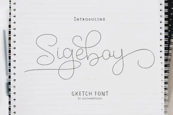
Hairline looping sketch script
Sigeboy is a hairline looping sketch script in black on a spiral notebook: very fine monoline strokes, huge open loops, a low body and a long underline that runs beneath the word and curls at the end.
Ideas for this font
Same independent foundry
Allow optional Google Analytics to measure visits and catalogue actions. Your search words and notes are not included. Privacy & storage