Editorial Serif Anchor

Luxury Romantic + Rosemode
Anchors Luxury Romantic's fluid strokes with crisp Roman proportions on wedding suites, headers and packaging.
Inspect Rosemode specimenDisclosure: MakerFileHub may earn a commission from qualifying purchases via paid links on this page. How our links work.
Heart-swash formal calligraphy with heavy stems and wide open loops
Luxury Romantic is a formal calligraphy script in which the heavy stems alternate with fine hairlines, the capitals open into wide heart-shaped swashes and the loops run far beyond the letter body.
Paid link
Get this fontProject & layout blueprintsAt-a-glance maker compatibility
Weld or Unite overlapping script joins into one continuous vector path before sending to the blade.
Visual anatomy & craft review
The capital L opens with a broad looped stem that crosses itself and finishes in a heart-shaped swash, and the capital R repeats the gesture on the second word, which is what gives the composition its symmetry. The lowercase keeps a strong contrast: thick downstrokes, hairline upstrokes, small loops on the l and the d and a long curved descender on the y that sweeps under the line. Because the loops leave the letter body, the pair fills a wide format without extra ornament. The hairlines are the fragile part — they need a coated stock and a generous size, and at 30 pt the counters still open cleanly. The dark rose ground, the pink ink and the small arched caption are presentation; the script is the two words.
Romantic · Swashed · Formal
Two-font hierarchy recipes
Tested contrast partners — pairing Luxury Romantic with grounded secondary typography.
Luxury Romantic + Rosemode
Anchors Luxury Romantic's fluid strokes with crisp Roman proportions on wedding suites, headers and packaging.
Inspect Rosemode specimen
Luxury Romantic + Mango Dream
Keeps small-scale dates, URLs, nutrition facts and care instructions crisp and legible below script titles.
Inspect Mango Dream specimenPractical applications
Concrete hierarchy, scale and production guidance tailored to Luxury Romantic’s stroke geometry.
The heart swashes give a valentine its ornament without an illustration, while the heavy stems keep the words readable at 30 pt.
Hierarchy & layout recipe
Print on a 148 by 105 mm card: set the greeting at 30 pt across the centre, set the dedication in a 7 pt caps serif at the foot, and keep 15 mm of margin so the swashes do not touch the trim.
Pre-production check
Hairline upstrokes under 0.15 mm drop out on uncoated stock; ask the printer for their minimum line and thicken the hairlines, never the stems.
The formal script makes a plain place card feel engraved, and the heavy stems hold at 16 pt even when the guest name runs long across the card.
Hierarchy & layout recipe
Print on a 90 by 50 mm place card: set the guest name at 16 pt, set the table number in a 7 pt caps serif at the right, and keep 8 mm from the fold so the descender does not cross the crease.
Pre-production check
A long name with wide loops can run to the card edge; check the longest name in the list and set it on two lines rather than condensing the script.
The swashed script gives a small label the luxury register, and the contrast survives at 12 pt when the label is printed on coated stock.
Hierarchy & layout recipe
Print on a 45 by 70 mm coated label: set the product name at 12 pt, keep the volume in a 5 pt caps sans at the foot, and leave 5 mm of margin so the heart swash is not clipped by the die.
Pre-production check
Foil on a swashed script bridges at the hairline joins; check a foil dummy at final size and break the swash rather than thickening the hairline.
Technical & licence verification
Confirm included OTF/TTF/WOFF formats, full glyph tables and licence coverage on the live store page before batch production.
Closest visual alternatives
Matched across letterform anatomy, stroke behaviour and craft applications.
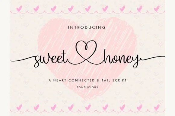
Delicate tall-heart-connected & long-tailed handwritten script
Sweet Honey is an airy handwritten script linking lowercase words through a tall central open-heart loop and sweeping side tails.
Ideas for this font
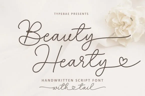
Airy romantic calligraphy script with heart-looped exit tails
Beauty Hearty is a slender, wide-looped handwritten calligraphy script featuring dramatic crossbars and dainty heart-tipped terminal tails.
Ideas for this font
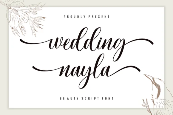
Modern wedding calligraphy script with sweeping lead-in & end tails
Wedding Nayla is a romantic modern bridal script featuring long, graceful horizontal entry and exit tails built for signs, hangers, and invitations.
Ideas for this font
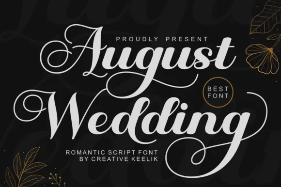
PUA-encoded lush romantic bridal calligraphy script
August Wedding is a PUA-encoded modern bridal calligraphy script pairing thick, vinyl-sturdy downstrokes with sweeping 'A/W/g' swash loops!
Ideas for this font
Allow optional Google Analytics to measure visits and catalogue actions. Your search words and notes are not included. Privacy & storage