Editorial Serif Anchor

Adellisa + Vanielst Elegant Serif Display Stylistic
Anchors Adellisa's fluid strokes with crisp Roman proportions on wedding suites, headers and packaging.
Inspect Vanielst Elegant Serif Display Stylistic specimenDisclosure: MakerFileHub may earn a commission from qualifying purchases via paid links on this page. How our links work.
True single-line formal calligraphy with even weight and open loops
Adellisa is a true single-line formal calligraphy in which every stroke is the same weight, the loops stay open and the joins cross cleanly on a level baseline.
Paid link
Get this fontProject & layout blueprintsAt-a-glance maker compatibility
Set Cricut or Silhouette operation to Pen, Foil Quill, or Laser Score — not Basic Blade Cut.
Visual anatomy & craft review
The capital A opens with a loop that rises above the cap line and closes into a narrow bowl, and the letters after it hold a formal rhythm: the d and the l rise into tall open loops, the e loops back through its own bowl, the s reverses tightly and the i carries a small round dot. Because the line is a true single weight, there is no contrast at all: the joins, the stems and the loops are all drawn at one thickness, which is what makes the face suitable for engraving, monoline plotting and foil where a shaded script would fill in. The loops stay open enough to read at 18 pt, and the ends taper slightly. The botanical corners, the pale ground and the two caption lines are presentation; the calligraphy is the word.
Single-line · Formal · Looped
Two-font hierarchy recipes
Tested contrast partners — pairing Adellisa with grounded secondary typography.
Adellisa + Vanielst Elegant Serif Display Stylistic
Anchors Adellisa's fluid strokes with crisp Roman proportions on wedding suites, headers and packaging.
Inspect Vanielst Elegant Serif Display Stylistic specimen
Adellisa + Headline
Keeps small-scale dates, URLs, nutrition facts and care instructions crisp and legible below script titles.
Inspect Headline specimenPractical applications
Concrete hierarchy, scale and production guidance tailored to Adellisa’s stroke geometry.
A single-weight script survives engraving and foil without filling in, and the formal loops keep a pair of names at 26 pt readable on textured stock.
Hierarchy & layout recipe
Set both names at 26 pt on a 120 by 180 mm card, set the details in a small caps serif at 8 pt, and hold 16 mm between the names and the details block.
Pre-production check
Engraving a single-line script needs a minimum stroke; confirm the etcher's limit and thicken the whole line rather than only the joins.
The even line keeps a printed thank-you quiet and formal, and the open loops read at 20 pt where a lighter script would break up.
Hierarchy & layout recipe
Set the message at 20 pt on a 105 by 148 mm card, keep the supplier name in a 7 pt caps serif, and hold 14 mm between the message and the contact block.
Pre-production check
A monoline script printed on uncoated card can look grey; check the proof and choose a darker ink rather than a heavier line.
The single weight suits a small label cut by a die, and the open loops stay legible at 11 pt on a forty millimetre gift tag.
Hierarchy & layout recipe
Set the greeting at 11 pt on a 40 by 60 mm tag, keep both names in a 5 pt sans beneath it, and leave a clear 10 mm band at the top for the ribbon hole.
Pre-production check
A monoline loop close to a punch tears when the tag is tied; check the artwork against the hole and move the line down.
Technical & licence verification
Confirm included OTF/TTF/WOFF formats, full glyph tables and licence coverage on the live store page before batch production.
Closest visual alternatives
Matched across letterform anatomy, stroke behaviour and craft applications.
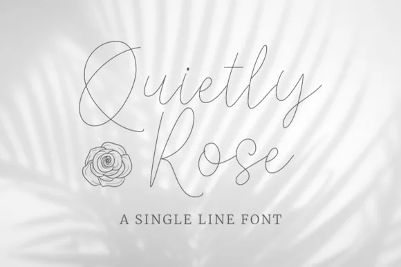
Single-line hairline script with wide elegant loops
Quietly Rose is a single-line script in which the stroke never changes width, the loops open wide and the letters lean gently, so a phrase reads as a pencil line drawn quickly over a photograph.
Ideas for this font
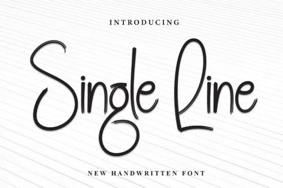
Single-stroke handwriting with soft shadow
Single Line is a handwritten face in black on ruled paper: a thin single-stroke hand with tall looping capitals, unjoined letters and a soft shadow, set as two words on a plain lined sheet.
Ideas for this font
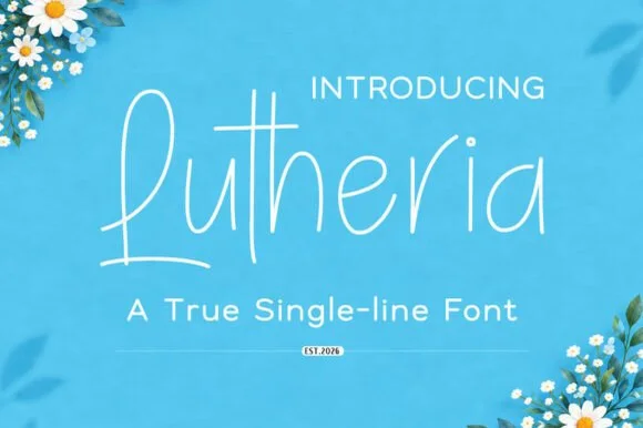
Upright single-line casual script with a very light even stroke
Lutheria is a true single-line script in which the stroke never thickens, the letters stay upright and the joins are open, so a word reads as something written with a fine pen at an even pace.
Ideas for this font
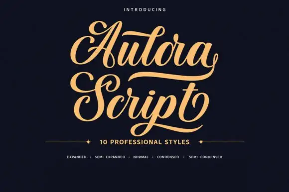
Bold curled script with heavy swash capitals and multiple widths
Aulora Script is a bold curled script whose capitals carry heavy swashes and whose letters are drawn in several widths, so a title can be set expanded or condensed without losing its character.
Ideas for this font
Same independent foundry
Allow optional Google Analytics to measure visits and catalogue actions. Your search words and notes are not included. Privacy & storage