Editorial Serif Anchor

Wisteria Tale + Gorga
Anchors Wisteria Tale's fluid strokes with crisp Roman proportions on wedding suites, headers and packaging.
Inspect Gorga specimenDisclosure: MakerFileHub may earn a commission from qualifying purchases via paid links on this page. How our links work.
Whimsical handwritten script with cork-screw curls and tall capitals
Wisteria Tale is a whimsical handwritten script in which the capitals climb into corkscrew curls, the joins stay monoline and the terminals spiral, so a two-word title reads as something written with a fine pen on a card.
Paid link
Get this fontProject & layout blueprintsAt-a-glance maker compatibility
Weld or Unite overlapping script joins into one continuous vector path before sending to the blade.
Visual anatomy & craft review
The W opens into two tall curls, the i carries a light dot, the s wobbles a shallow spine, the t crosses a high bar, the e turns a round eye and the final a finishes a spiral, all at a monoline weight with tall ascenders and generous loops. The curls are the character: they add height rather than weight, which is why the sample sets two stacked words with wide leading and lets the spirals fill the space. Because the stroke is even, the face holds at 22 pt and prints in one colour, but the spirals need a smooth stock to survive. The tulle photograph, the small italic credit lines and the studio note are presentation; the cream script words are the face.
Whimsical · Curled · Monoline
Two-font hierarchy recipes
Tested contrast partners — pairing Wisteria Tale with grounded secondary typography.
Wisteria Tale + Gorga
Anchors Wisteria Tale's fluid strokes with crisp Roman proportions on wedding suites, headers and packaging.
Inspect Gorga specimen
Wisteria Tale + Cultivo
Keeps small-scale dates, URLs, nutrition facts and care instructions crisp and legible below script titles.
Inspect Cultivo specimenPractical applications
Concrete hierarchy, scale and production guidance tailored to Wisteria Tale’s stroke geometry.
The curls give a light invitation its character, and the monoline stays open at 26 pt on a smooth card without any flourish added.
Hierarchy & layout recipe
Print a 130 by 180 mm card: set both names at 26 pt on two lines with 1.6 line spacing, set the details in an 8 pt caps serif beneath, and keep 20 mm of margin so the corkscrew capitals finish inside the trim.
Pre-production check
Corkscrew capitals on stacked lines tangle at tight leading; check the printed card and open the spacing before reducing the size.
The curled script suits a light spring greeting, and the even stroke prints clearly at 24 pt on a matte card in one colour.
Hierarchy & layout recipe
Print an A6 card: set the greeting at 24 pt across the middle, set the date in a 9 pt sans beneath, and keep 12 mm of margin so the terminal spirals are inside the trim.
Pre-production check
A terminal spiral printed at the trim looks cut off; check the card and keep every spiral 8 mm inside the edge.
The handwritten curls give a florist a personal mark, and the monoline holds a short shop name at 20 pt on a kraft label.
Hierarchy & layout recipe
Print a 60 by 40 mm label: set the shop name at 20 pt, set the phone line in a 6 pt sans at the foot, and keep 5 mm of white so the tall curl is not clipped by the die.
Pre-production check
A monoline printed on kraft drink the ink unevenly; check the label and specify a coated stock if the curls look broken.
Technical & licence verification
Confirm included OTF/TTF/WOFF formats, full glyph tables and licence coverage on the live store page before batch production.
Closest visual alternatives
Matched across letterform anatomy, stroke behaviour and craft applications.
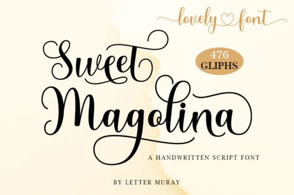
Hand-lettered looping script
Sweet Magolina is a hand-lettered script in black on cream: a light mono-linear stroke, oversized looped capitals, a low bounce and long swashes that leave the word, with a large glyph count that supplies alternates, so the pair reads as lettering drawn for a stationery set.
Ideas for this font
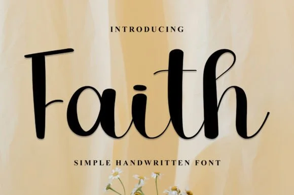
Semi-serifed upright calligraphy & storybook script
Faith (by Kongsi.Co) is a tidy, upright handwritten script pairing classic flat-bar serifed capitals with smooth, legible cursive lowercase.
Ideas for this font
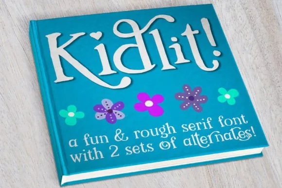
Hand-drawn bouncy storybook serif with curled ascenders
Kidlit is a lively hand-drawn serif with organic, slightly wiggly stems, curled ascender tops, and multi-set alternates.
Ideas for this font
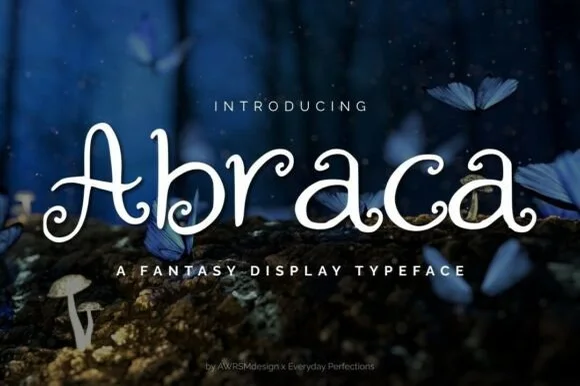
Whimsical spiral-curled enchanted fairytale display serif (OTF & TTF)
Abraca is an enchanted storybook display serif curling delicate fairytale spirals into the bowls and terminals of 'A', 'b', 'r', 'a', and 'c' (OTF & TTF)!
Ideas for this font
Same independent foundry
Allow optional Google Analytics to measure visits and catalogue actions. Your search words and notes are not included. Privacy & storage