High-Contrast Display Serif

Embroidery Graphic + Auretha
Pairs sculptural editorial warmth with Embroidery Graphic's clean modern geometry.
Inspect Auretha specimenDisclosure: MakerFileHub may earn a commission from qualifying purchases via paid links on this page. How our links work.
Playful geometric display with tall ascenders and open loops
Embroidery Graphic is a playful display sans in which the strokes stay even, the ascenders run tall and a few letters open into loops, so a two-word title reads as a friendly sign rather than as a neutral grotesque.
Paid link
Get this fontProject & layout blueprintsAt-a-glance maker compatibility
Sturdy stroke walls and open counters weed cleanly on adhesive vinyl, HTV apparel film, and cut cardstock.
Visual anatomy & craft review
The E sets three even arms, the m turns two flat shoulders, the b rises a tall ascender into a loop, the r keeps a straight arm, the o stays a wide circle and the G carries a low spur, all at an even monoline weight with open counters and a light change in rhythm at the loops. The tall ascender is the character: it lifts the mixed-case line and keeps the word airy, which is why the sample sets two stacked words at a generous spacing. Because the strokes are even, the face holds from 22 pt to a board and prints in one colour; the loops need a little tracking to stay open. The pale fabric ground, the spools, the small buttons and the caption below are presentation; the black display words are the face.
Playful · Geometric · Tall
Two-font hierarchy recipes
Tested contrast partners — pairing Embroidery Graphic with grounded secondary typography.
Embroidery Graphic + Auretha
Pairs sculptural editorial warmth with Embroidery Graphic's clean modern geometry.
Inspect Auretha specimen
Embroidery Graphic + Esmeralda
Introduces organic movement on pull-quotes, signatures and gift tags.
Inspect Esmeralda specimenPractical applications
Concrete hierarchy, scale and production guidance tailored to Embroidery Graphic’s stroke geometry.
The even strokes and the open loops suit a textile craft identity, and a two-word studio name holds on a small label at 20 pt.
Hierarchy & layout recipe
Print a 70 by 45 mm label: set the studio name at 20 pt in mixed case, set the material line in a 7 pt sans beneath, and keep 5 mm of border so the tall ascenders are inside the die.
Pre-production check
A tall ascender cut by a label die looks clipped; check the imposed label and lower the word by 2 mm rather than reducing the size.
The playful rhythm reads from the end of a corridor, and the even weight keeps a class notice legible at 30 pt on plain paper.
Hierarchy & layout recipe
Print an A4 notice: set the class name at 30 pt, set the times in a 12 pt sans beneath, and keep 18 mm of margin so the looped letters have air at the top of the sheet.
Pre-production check
Loops printed tight against a margin look cropped; check the sheet and shift the word down by 5 mm.
The friendly shapes suit a craft market stall banner, and the even monoline reads across a hall at 70 mm in one flat ink.
Hierarchy & layout recipe
Print a 1200 by 300 mm banner: set the headline at 70 mm, set the stall number in a 20 pt caps beneath, and keep 35 mm of border so the tall ascenders are not trimmed by the hem.
Pre-production check
A banner hem sewn through the descender space shortens the visible line; check the finished banner and keep every stroke 30 mm inside the hem.
Technical & licence verification
Confirm included OTF/TTF/WOFF formats, full glyph tables and licence coverage on the live store page before batch production.
Closest visual alternatives
Matched across letterform anatomy, stroke behaviour and craft applications.
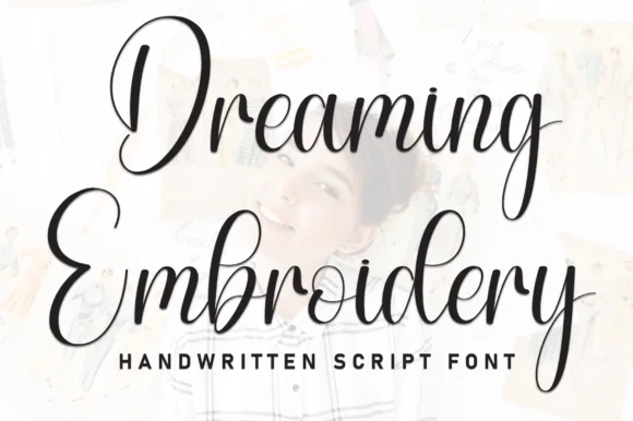
Brush script with heavy downstrokes and tall looped capitals
Dreaming Embroidery is a brush script in which the downstrokes run heavy, the upstrokes thin out and the capitals climb into tall loops, so a two-word title reads as handwriting made with a loaded brush pen.
Ideas for this font
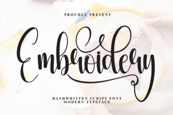
Flourished craft calligraphy with tall loops and a sweeping terminal swash
Embroidery is a flourished calligraphic script in which the ascenders rise into tall loops, the capital opens with a wide curve and the word ends in a swash that sweeps below the line and curls back.
Ideas for this font
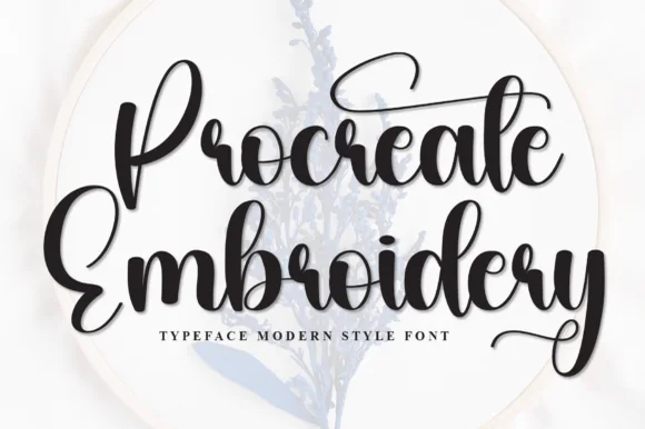
Thick bouncy brush-hoop calligraphy
Procreate Embroidery is a thick bouncy brush script in black on a pale hoop: fat rounded strokes, tight loops, a capital P drawn with a long entry and a capital E whose top arm lifts into a curl, sold for digitised embroidery and craft lettering.
Ideas for this font
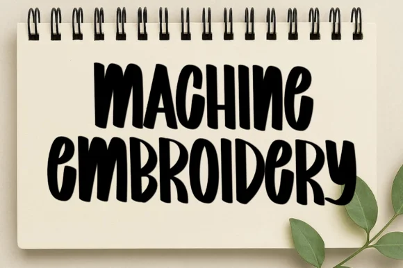
Tall condensed brushed capitals with dry, uneven edges
Machine Embroidery is a tall condensed capital alphabet in which the strokes stretch upward, the edges stay dry and uneven, and the weight changes across each letter, so a word reads as something brushed onto a notebook cover.
Ideas for this font
Same independent foundry
Allow optional Google Analytics to measure visits and catalogue actions. Your search words and notes are not included. Privacy & storage