High-Contrast Display Serif

Barleto + Svara
Pairs sculptural editorial warmth with Barleto's clean modern geometry.
Inspect Svara specimenDisclosure: MakerFileHub may earn a commission from qualifying purchases via paid links on this page. How our links work.
Geometric single-line sans with tall open letters and hairline weight
Barleto is a geometric sans built as a single line: the strokes never thicken, the letters run tall and open, and the whole alphabet stays at a hairline weight that reads as technical drawing.
Paid link
Get this fontProject & layout blueprintsAt-a-glance maker compatibility
Set Cricut or Silhouette operation to Pen, Foil Quill, or Laser Score — not Basic Blade Cut.
Visual anatomy & craft review
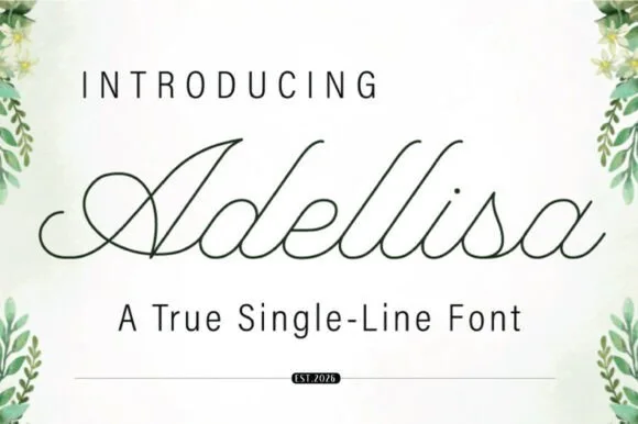
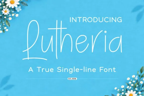
The capital B closes two open bowls against a straight stem, the a is single storey with a light bowl, the r keeps a short arm and the t crosses with a thin bar, all at one constant weight. Because nothing is filled in, the face behaves like plotted lettering, which is why it suits captions, diagrams and architectural stationery. The x-height is tall and the spacing is generous, so a line of text stays legible at 9 pt even at this weight. The counters are wide rather than closed, which keeps the hairline from thinning visually at small sizes. At display sizes the face needs a coated stock to survive printing, and reverse-out printing is the safer route. The green ground, the white ink, the blossoms in the corners and the two caption lines are presentation; the typeface is the word.
Geometric · Single-line · Airy
Two-font hierarchy recipes
Tested contrast partners — pairing Barleto with grounded secondary typography.
Barleto + Svara
Pairs sculptural editorial warmth with Barleto's clean modern geometry.
Inspect Svara specimen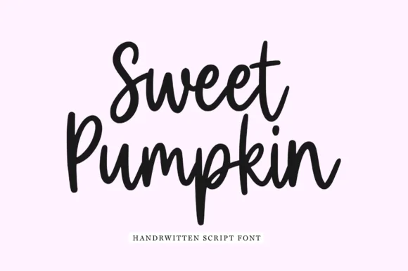
Barleto + Sweet Pumpkin
Introduces organic movement on pull-quotes, signatures and gift tags.
Inspect Sweet Pumpkin specimenPractical applications
Concrete hierarchy, scale and production guidance tailored to Barleto’s stroke geometry.
The single-line geometry reads as drawing rather than as marketing, and the hairline holds at 9 pt in a caption where a filled sans would feel loud.
Hierarchy & layout recipe
Print an A5 letterhead: set the studio name at 18 pt at the head, set the address in a 7.5 pt single-line weight at the foot, and keep a 20 mm margin so the hairline letters are not lost against the paper edge.
Pre-production check
Hairlines under 0.15 mm vanish on an office laser printer; check one printed sheet on the actual stock and specify the print method before sending files.
The airy alphabet keeps catalogue captions quiet under photography, and the generous spacing holds legibility at 8.5 pt across a long run.
Hierarchy & layout recipe
Print an A4 catalogue page: set the caption at 8.5 pt across a 60 mm measure, set the item number in the same weight at 7 pt, and keep the caption 4 mm clear of the image edge so the hairlines do not merge into the photograph.
Pre-production check
Hairlines over a printed image lose definition; check a press sheet and place captions on the paper ground rather than over the picture.
The single line gives a minimal invitation its restraint, and the tall open letters let a long venue name sit on one line at 11 pt.
Hierarchy & layout recipe
Print a 105 by 210 mm card: set both names at 20 pt, set the venue and time in an 11 pt single-line weight beneath, and hold 14 mm between the two blocks so the airy spacing does not collapse.
Pre-production check
A hairline invitation can look unfinished in a dark ink; check the proof and reverse it out of a tinted panel if the weight feels too faint.
Technical & licence verification
Confirm included OTF/TTF/WOFF formats, full glyph tables and licence coverage on the live store page before batch production.
Closest visual alternatives
Matched across letterform anatomy, stroke behaviour and craft applications.
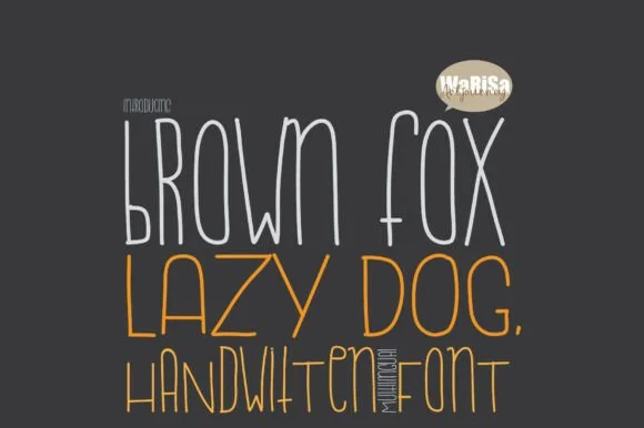
Tall condensed Cricut-Draw & plotter single-line print font
Brown Fox Lazy Dog is a tall, condensed hairline sketch font purpose-built for Cricut Draw pens, Foil Quill, and engraving plotters.
Ideas for this font
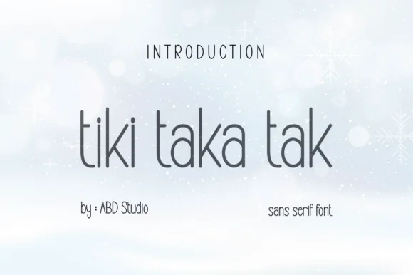
Tall slender minimalist geometric hairline sans serif
Tiki Taka Tak is actually a sleek, minimalist tall geometric sans serif (zero tropical tiki motifs!) built for clean modern branding.
Ideas for this font
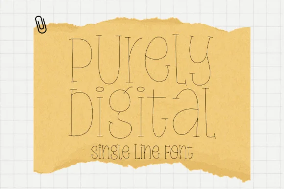
Single-line hairline display with doubled strokes
Purely Digital is a single-line display in ink on tan torn paper: letters drawn as a hairline contour with a second line inside them, very tall and narrow, with open counters and no fill anywhere.
Ideas for this font
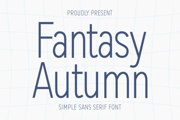
Tall hairline-light minimalist architectural sans serif
Fantasy Autumn is a tall, feather-light minimalist sans serif with slender vertical stems, high waistlines, and airy modern calm (zero autumn clipart!).
Ideas for this font
Same independent foundry
Allow optional Google Analytics to measure visits and catalogue actions. Your search words and notes are not included. Privacy & storage