High-Contrast Display Serif

Life Planner Duo + Cronelo
Pairs sculptural editorial warmth with Life Planner Duo's clean modern geometry.
Inspect Cronelo specimenDisclosure: MakerFileHub may earn a commission from qualifying purchases via paid links on this page. How our links work.
Planner duo pairing a thin rounded sans with a bolder cut
Life Planner is a two-cut family in which a thin rounded sans carries the headline and a bolder cut sets the supporting line, so a simple layout gets hierarchy from one family.
Paid link
Get this fontProject & layout blueprintsAt-a-glance maker compatibility
Sturdy stroke walls and open counters weed cleanly on adhesive vinyl, HTV apparel film, and cut cardstock.
Visual anatomy & craft review
The l rises on a thin stem, the i carries a floating dot, the f turns a light arm, the e closes a round eye, the p drops a thin stem and the a stays a single-storey oval, all at a thin monoline weight with fully rounded ends and wide open counters; the bold cut thickens every stroke without changing the skeleton. The pairing is the character: the two cuts share proportions, which is why the sample sets a place-holder title in the thin cut with a subtitle in the bold beneath. Both hold from 20 pt and print cleanly on plain paper. The lined notebook ground, the small stickers and the arrow doodle are presentation; the black sans lines are the family.
Planner · Rounded · Duo
Two-font hierarchy recipes
Tested contrast partners — pairing Life Planner Duo with grounded secondary typography.
Life Planner Duo + Cronelo
Pairs sculptural editorial warmth with Life Planner Duo's clean modern geometry.
Inspect Cronelo specimen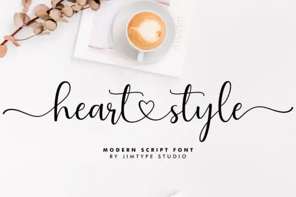
Life Planner Duo + Heart Style
Introduces organic movement on pull-quotes, signatures and gift tags.
Inspect Heart Style specimenPractical applications
Concrete hierarchy, scale and production guidance tailored to Life Planner Duo’s stroke geometry.
The thin rounded sans suits a printable planner, and the bold cut gives the header a second level at 30 pt and 16 pt on plain paper.
Hierarchy & layout recipe
Print an A4 planner page: set the header at 30 pt in the thin cut, set the section labels at 16 pt in the bold cut, and keep 18 mm of margin so the round ends sit inside the printable area.
Pre-production check
A thin stem printed at 30 pt on a home printer can break up; check the sheet and keep the header at 30 pt or above.
The plain rounded duo gives a coach a calm mark, and the two cuts set a name and a strapline without a second family at 24 pt and 14 pt.
Hierarchy & layout recipe
Print an 85 by 55 mm card: set the name at 24 pt in the thin cut, set the strapline at 14 pt in the bold cut beneath, and keep 10 mm of white so the round ends have air.
Pre-production check
Two rounded cuts set too close look like one clumsy line; check the card and keep at least 6 mm between them.
The clean rounded letters suit a folder label, and the bold cut holds a subject name at 18 pt on a printed strip in one ink.
Hierarchy & layout recipe
Print a 90 by 40 mm strip: set the subject at 18 pt in the bold cut, keep 5 mm of clear border, and laminate with a matte pouch so the strip does not glare on the shelf.
Pre-production check
A glossy laminate hides the thin cut entirely; check the finished strip and use matte film.
Technical & licence verification
Confirm included OTF/TTF/WOFF formats, full glyph tables and licence coverage on the live store page before batch production.
Closest visual alternatives
Matched across letterform anatomy, stroke behaviour and craft applications.

Slim contemporary geometric sans with architectural cuts
Bielchon is a crisp, light-to-regular modern sans-serif featuring tall x-height, circular bowls, and subtle stencil-like notched joins.
Ideas for this font
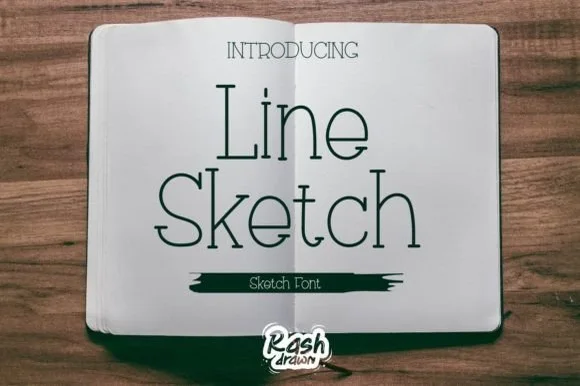
Thin monoline sketch serif
Line Sketch is a thin monoline serif in black on paper: tall narrow letterforms, hairlines of even weight, slab-ish serifs drawn with a slight wobble, and a hand-ruled feel that makes the two words look drawn with a fine pen rather than set from a font.
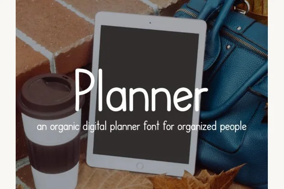
Neat iPad Apple-Pencil monoline digital-planner print sans
Planner is a tidy, upright monoline print font engineered specifically to look like neat Apple-Pencil handwriting inside GoodNotes & Notability planners!
Ideas for this font
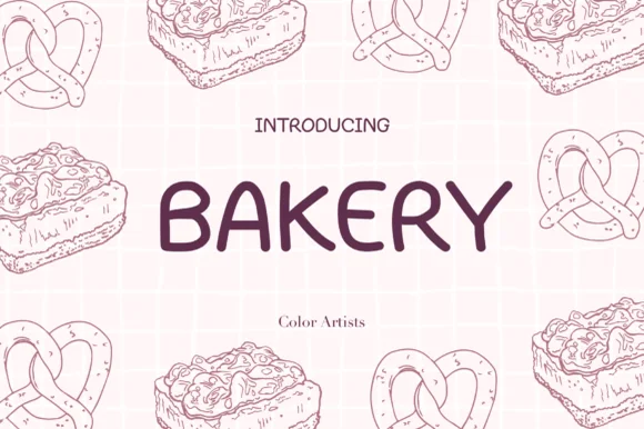
Clean wide-stance casual felt-pen uppercase sans
Bakery (by MyFontsShop) is a clean, wide-stance hand-printed sans serif (disconnected, NOT a cursive script!) with open counters and calm clarity.
Ideas for this font
Allow optional Google Analytics to measure visits and catalogue actions. Your search words and notes are not included. Privacy & storage