High-Contrast Display Serif

Tiki Taka Tak + Flowsky Editorial
Pairs sculptural editorial warmth with Tiki Taka Tak's clean modern geometry.
Inspect Flowsky Editorial specimenDisclosure: MakerFileHub may earn a commission from qualifying purchases via paid links on this page. How our links work.
Tall slender minimalist geometric hairline sans serif
Tiki Taka Tak is actually a sleek, minimalist tall geometric sans serif (zero tropical tiki motifs!) built for clean modern branding.
Paid link
Get this fontProject & layout blueprintsAt-a-glance maker compatibility
Set Cricut or Silhouette operation to Pen, Foil Quill, or Laser Score — not Basic Blade Cut.
Visual anatomy & craft review
Tiki Taka Tak is not a tropical novelty face at all: it is a tall geometric sans with a hairline weight, straight-sided ascenders, perfectly oval bowls and a tight vertical rhythm. The proportions are narrow enough to stack a two-word heading in a narrow column, and because the strokes are uniform, the face reproduces exactly at small sizes on screens and in plotted line work. It is a quiet, architectural alphabet, best used where the shape of the letterform rather than its texture carries the page, and it needs generous tracking to stop the thin verticals from merging at a distance.
Clean-minimal · Tall-slender · Airy
Two-font hierarchy recipes
Tested contrast partners — pairing Tiki Taka Tak with grounded secondary typography.
Tiki Taka Tak + Flowsky Editorial
Pairs sculptural editorial warmth with Tiki Taka Tak's clean modern geometry.
Inspect Flowsky Editorial specimen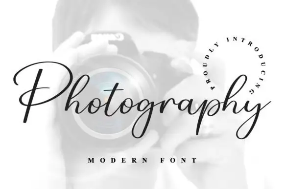
Tiki Taka Tak + Photography Font
Introduces organic movement on pull-quotes, signatures and gift tags.
Inspect Photography Font specimenPractical applications
Concrete hierarchy, scale and production guidance tailored to Tiki Taka Tak’s stroke geometry.
Hairline geometry reads as clinical rather than festive, which is how a contemporary sun-care brand distinguishes itself from beach graphics. Narrow proportions fit a full product name vertically on a slim bottle, and the uniform strokes stay crisp on a small etched label.
Hierarchy & layout recipe
Bottle 38 mm diameter, label 90 x 55 mm wrap, name 9 pt letterspaced 160 units, volume 5 pt. Business card 85 x 55 mm, name 8 pt, role 5.5 pt, 6 mm margins. Luggage tag 54 x 90 mm, name 7 pt, slot 5 mm clear.
Pre-production check
Letterspaced hairlines at 9 pt on an uncoated label will feather and the thin stems vanish. Specify a coated or synthetic label on a sunscreen bottle, and check one label after 24 hours of contact with the product itself.
The face carries no decorative incident, so it lets pricing and hierarchy do the work, which is what a pared-back restaurant needs from its print. Uniform thin strokes plot cleanly from a pen on an envelope, where a contrast serif would skip and skip again on the return strokes.
Hierarchy & layout recipe
Menu 210 x 320 mm, section heads 11 pt, dishes 9/14 pt, prices right-aligned on a 6 mm decimal column, 20 mm margins. Envelope 220 x 110 mm, address block 8 pt on a 5 mm baseline from the left trim. Signage 400 x 200 mm, word 60 mm, 40 mm margins.
Pre-production check
A 0.25 mm single-stroke plot at 8 pt skips on textured envelope paper. Test the plotter on the actual stock, drop to the machine's slowest speed, and check that the crossbar of the 't' closes rather than leaving a gap.
Tall narrow sans capitals behave like a drawn axis on a cover, so a single word can align with a building's verticals in the photograph behind it. The absence of texture keeps a caption system honest at 7 pt, where a distressed or high-contrast face would fail.
Hierarchy & layout recipe
Cover 210 x 297 mm, title 54 pt set vertically, 20 mm from the left trim, issue data 7 pt at the foot. Caption system 6.5/9.5 pt, hanging indent 5 mm, 60 units tracking. Index page three columns of 55 mm with 6 mm gutters.
Pre-production check
Vitrine and gallery captions are often printed at 12 pt on acrylic and read at two metres; hairline verticals then vibrate. Print a 1:1 test on the actual substrate and check the legibility distance before fixing the size.
Technical & licence verification
Confirm included OTF/TTF/WOFF formats, full glyph tables and licence coverage on the live store page before batch production.
Closest visual alternatives
Matched across letterform anatomy, stroke behaviour and craft applications.
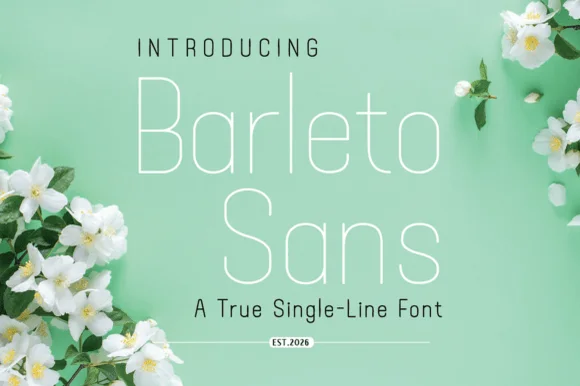
Geometric single-line sans with tall open letters and hairline weight
Barleto is a geometric sans built as a single line: the strokes never thicken, the letters run tall and open, and the whole alphabet stays at a hairline weight that reads as technical drawing.
Ideas for this font
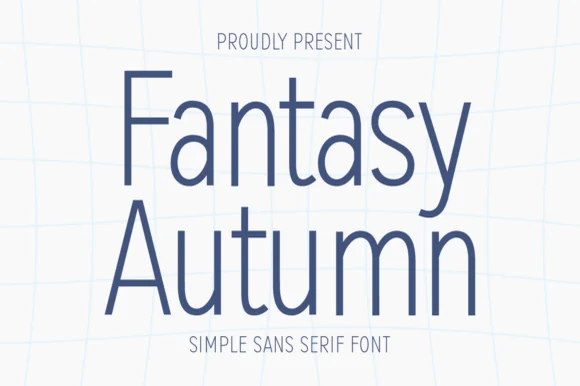
Tall hairline-light minimalist architectural sans serif
Fantasy Autumn is a tall, feather-light minimalist sans serif with slender vertical stems, high waistlines, and airy modern calm (zero autumn clipart!).
Ideas for this font
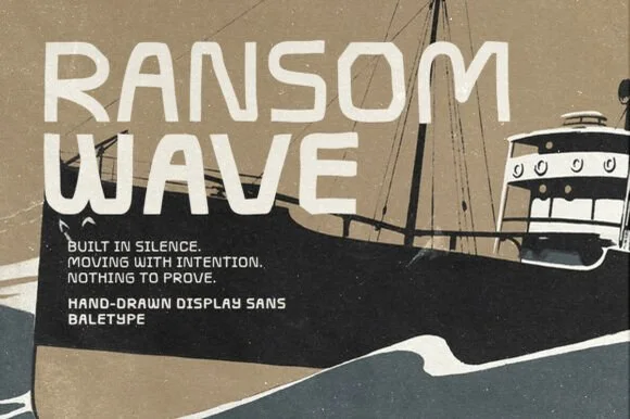
Hand-drawn display sans
Ransom Wave is a hand-drawn display sans in cream on a muted travel poster: wide caps with slightly irregular strokes, cut terminals and an open R, set over a screen-printed ship, with a block of small caps copy at the left and a two-line signature at the foot.
Ideas for this font
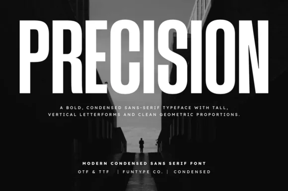
Tall ultra-condensed geometric headline grotesk
Precision is a bold, ultra-condensed sans serif typeface with tall vertical pillars, tight flat-sided counters, and clean modernist snap.
Ideas for this font
Allow optional Google Analytics to measure visits and catalogue actions. Your search words and notes are not included. Privacy & storage