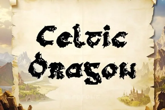
High-Contrast Display Serif

Atomic Md + Brenco
Pairs sculptural editorial warmth with Atomic Md's clean modern geometry.
Inspect Brenco specimenDisclosure: MakerFileHub may earn a commission from qualifying purchases via paid links on this page. How our links work.
Clean medium-bold corporate & laboratory neo-grotesk sans
Atomic Md is a crisp, high-legibility medium-bold neo-grotesk sans engineered for clean tech branding, UI dashboards, and modern signage.
Paid link
Get this fontProject & layout blueprintsAt-a-glance maker compatibility
Sturdy stroke walls and open counters weed cleanly on adhesive vinyl, HTV apparel film, and cut cardstock.
Visual anatomy & craft review
Atomic Md is a clean medium-bold neo-grotesk with flat terminals, sturdy stems and a generous x-height, drawn for interface and signage work where nothing should draw attention to itself. Because the weight sits in the middle of the range, it holds a 60 pt headline and a 10 pt label without a second family, and the flat terminals print without the ragged edges that a humanist curve produces on cheap stock. It is a workhorse: the counters are open, the spacing is even, and it is judged on how quickly a reader finds the value rather than on character.
Lab-precision · Neo-grotesk-bold · UI-workhorse
Two-font hierarchy recipes
Tested contrast partners — pairing Atomic Md with grounded secondary typography.
Atomic Md + Brenco
Pairs sculptural editorial warmth with Atomic Md's clean modern geometry.
Inspect Brenco specimen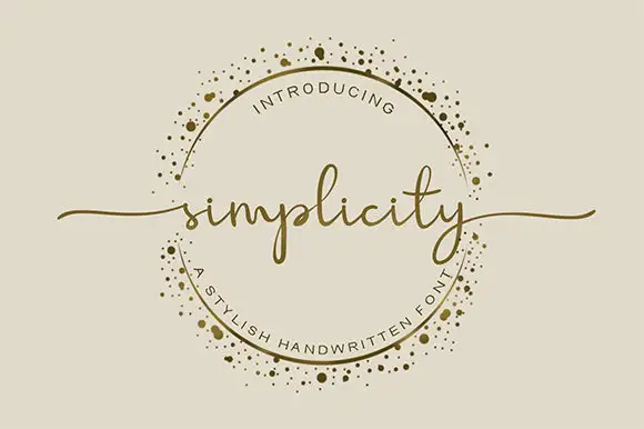
Atomic Md + Simplicity
Introduces organic movement on pull-quotes, signatures and gift tags.
Inspect Simplicity specimenPractical applications
Concrete hierarchy, scale and production guidance tailored to Atomic Md’s stroke geometry.
A medium-weight neo-grotesk keeps a technical brand quiet and consistent across a screen and a wall, which is what a laboratory or software company needs. Flat terminals survive small UI sizes without anti-aliasing artefacts.
Hierarchy & layout recipe
Signage 600 x 200 mm, word 90 mm, 50 mm margins. UI 1440 px canvas, body 15 px on a 24 px line height, labels 12 px. Card 85 x 55 mm, name 9 pt, role 7 pt, 8 mm margins.
Pre-production check
A 12 px label on a low-DPI monitor at 60 percent scaling loses its flat terminals and looks lighter than the spec. Check the interface at the scaling end users actually run, and raise the label to 13 px if the stroke thins.
Neutral letterforms let numbers and captions carry the hierarchy, which is what a technical report needs. The face holds a 8 pt footnote in a dense appendix without clogging.
Hierarchy & layout recipe
Report 210 x 297 mm, cover title 40 pt, body 9.5/14 pt on a 150 mm measure, 20 mm margins. Appendix tables 8/11 pt with 0.5 pt rules. Programme A5, session titles 12 pt, times 8 pt.
Pre-production check
Dense appendix tables at 8 pt need a minimum 0.5 pt rule or the rows fuse when the PDF is printed at 600 dpi. Check one printed table page, and open the row height if the rules ghost.
A quiet grotesk reads as an instruction rather than a warning, which is the right tone for a lab rule that must be followed daily. Heavy-ish stems survive a laminated A3 seen from two metres.
Hierarchy & layout recipe
Poster A3, heading 90 pt, rules 18/26 pt, 30 mm margins and 20 mm clear of any fixing. Syllabus A4, headings 14 pt, body 9.5/13 pt, 20 mm margins. Label 70 x 30 mm, word 8 mm, 3 mm border and 2 mm corner radius.
Pre-production check
Safety posters are laminated and hung near a window, where a mid-weight sans fades in reflected light. Print one poster on the intended stock and check it at the actual wall position before ordering a set.
Technical & licence verification
Confirm included OTF/TTF/WOFF formats, full glyph tables and licence coverage on the live store page before batch production.
Closest visual alternatives
Matched across letterform anatomy, stroke behaviour and craft applications.
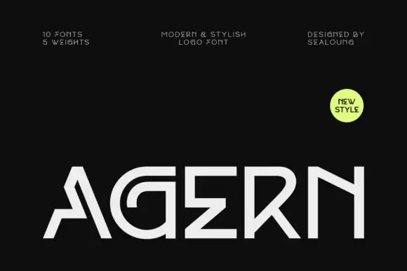
Angular geometric capitals with open joins and a curved G
Agern is a wide geometric logo sans in caps, with squared bowls, joins cut at an angle and a very open skeleton, drawn to hold a short brand name at large sizes.
Ideas for this font

8-weight + Variable contemporary condensed grotesk (170+ languages)
Bargain Condensed is a full 8-weight + Variable (100–800) condensed grotesk sans supporting uppercase, lowercase, and 170+ languages.
Ideas for this font

Slim contemporary geometric sans with architectural cuts
Bielchon is a crisp, light-to-regular modern sans-serif featuring tall x-height, circular bowls, and subtle stencil-like notched joins.
Ideas for this font

Bold neo-grotesk display sans with hooked double-story g
Memoir Slang is a heavy, tight-set modern sans-serif distinguished by crisp neo-grotesk geometry and sharp, horned ear details.
Ideas for this font
Same independent foundry
Allow optional Google Analytics to measure visits and catalogue actions. Your search words and notes are not included. Privacy & storage