High-Contrast Display Serif

Fantasy Autumn + The Lumina Awesome
Pairs sculptural editorial warmth with Fantasy Autumn's clean modern geometry.
Inspect The Lumina Awesome specimenDisclosure: MakerFileHub may earn a commission from qualifying purchases via paid links on this page. How our links work.
Tall hairline-light minimalist architectural sans serif
Fantasy Autumn is a tall, feather-light minimalist sans serif with slender vertical stems, high waistlines, and airy modern calm (zero autumn clipart!).
Paid link
Get this fontProject & layout blueprintsAt-a-glance maker compatibility
Set Cricut or Silhouette operation to Pen, Foil Quill, or Laser Score — not Basic Blade Cut.
Visual anatomy & craft review
Fantasy Autumn is a hairline-light minimalist sans with tall slender stems, a high waistline, a single-storey a and generous air around the letters, drawn for calm architectural layout rather than display impact. Because the stroke is very light, the face needs roughly 20 mm before it survives print, and it is at its best on smooth uncoated stocks where the line stays continuous. It is a titling and caption face for galleries, studios and editorial work, and it should never be set small on absorbent paper.
Hairline-minimal · Tall-airy · Quiet-modern
Two-font hierarchy recipes
Tested contrast partners — pairing Fantasy Autumn with grounded secondary typography.
Fantasy Autumn + The Lumina Awesome
Pairs sculptural editorial warmth with Fantasy Autumn's clean modern geometry.
Inspect The Lumina Awesome specimen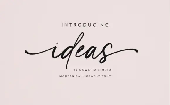
Fantasy Autumn + Ideas
Introduces organic movement on pull-quotes, signatures and gift tags.
Inspect Ideas specimenPractical applications
Concrete hierarchy, scale and production guidance tailored to Fantasy Autumn’s stroke geometry.
Feather-light stems read as drafting rather than display, which suits a gallery or a monograph. Tall proportions stack a title in a narrow column with air around it.
Hierarchy & layout recipe
Poster A1, title 160 mm, details 24/30 pt, 40 mm margins. Monograph 240 x 300 mm, title 54 pt, captions 9/13 pt. Caption card 100 x 60 mm, object 9 pt, data 7 pt.
Pre-production check
A 7 pt hairline on a caption card disappears at 40 cm under gallery light. Keep captions in a heavier companion and reserve this face for the object name, checking one at its viewing distance.
Light stems read as a quiet brand mark, which is what an architecture or ceramics studio wants. The high waistline gives a short word a calm rhythm.
Hierarchy & layout recipe
Card 85 x 55 mm, name 9 pt, role 6 pt, 6 mm margins. Label 70 x 40 mm, name 8 pt, 3 mm border and 3 mm die margin. Sign 600 x 200 mm, word 90 mm, 50 mm margins with 20 mm from the frame.
Pre-production check
Cards are printed on uncoated stock that draws ink, and a hairline at 9 pt thickens unevenly. Print one proof on the actual card, and move the name to a heavier cut if the stroke mottles.
Airy letterforms read as a considered invitation rather than a decorated one, which suits a studio workshop. Tall stems hold a long workshop name in a narrow format.
Hierarchy & layout recipe
Invitation A6, heading 14 mm, details 4.5 mm, 12 mm margins. Catalogue cover 170 x 240 mm, title 46 pt, 18 mm margins. Card 105 x 148 mm, heading 16 mm, list 7/10 pt.
Pre-production check
A6 invitations are trimmed from a larger sheet and a hairline crossing the trim gets cut through. Keep 8 mm clear of every trim edge, and check one finished card against the bleed.
Technical & licence verification
Confirm included OTF/TTF/WOFF formats, full glyph tables and licence coverage on the live store page before batch production.
Closest visual alternatives
Matched across letterform anatomy, stroke behaviour and craft applications.
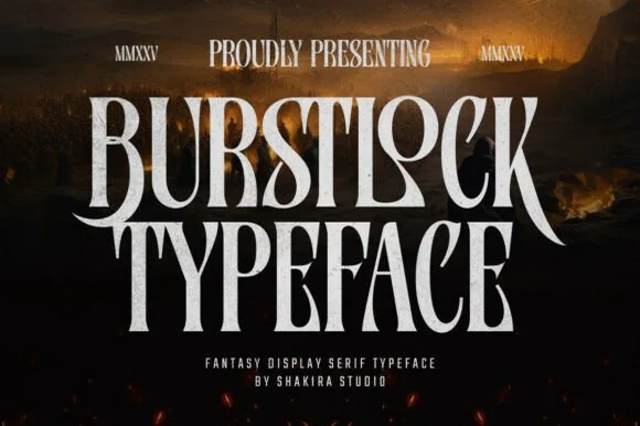
Tall condensed sword-winged dark-fantasy display serif
Burstlock is a dramatic, tall condensed fantasy serif whipping sweeping sword-blade legs off 'R' and 'K' for game titles and dark-fantasy covers!
Ideas for this font
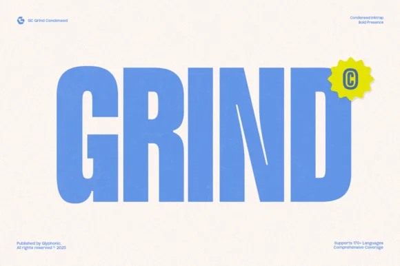
Heavy condensed inktrap display sans
Gc Grind is a bold condensed sans-serif engineered with subtle corner inktraps and flat industrial curves across 170+ languages.
Ideas for this font
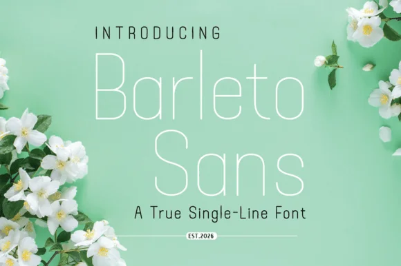
Geometric single-line sans with tall open letters and hairline weight
Barleto is a geometric sans built as a single line: the strokes never thicken, the letters run tall and open, and the whole alphabet stays at a hairline weight that reads as technical drawing.
Ideas for this font

Bold flat-sided condensed poster grotesk
Taught is a heavy, flat-sided condensed sans-serif with tight interior counters and commanding vertical headline presence.
Ideas for this font
Same independent foundry
Allow optional Google Analytics to measure visits and catalogue actions. Your search words and notes are not included. Privacy & storage