High-Contrast Display Serif

Rustic Calm + Worldstar
Pairs sculptural editorial warmth with Rustic Calm's clean modern geometry.
Inspect Worldstar specimenDisclosure: MakerFileHub may earn a commission from qualifying purchases via paid links on this page. How our links work.
Clean tall rounded monoline geometric sans serif
Rustic Calm is a serene, 100% smooth tall monoline sans serif (zero rustic distressing!) with rounded terminals and wide open bowls.
Paid link
Get this fontProject & layout blueprintsAt-a-glance maker compatibility
Fine grain and micro-texture excel in 300 DPI print, sublimation, and screen print rather than small vinyl weeding.
Visual anatomy & craft review
Rustic Calm is a tall monoline geometric sans with rounded terminals, wide open bowls and perfectly even stroke weight, deliberately free of distressing, so a word reads as a quiet modern sign rather than a rustic display. The even weight keeps it legible at 9 pt, and the open bowls make it work at 200 mm without any detail loss. It needs roughly 20 mm for the rounded terminals to read, and it is best in jet black on a pale ground or in one ink on kraft.
Minimalist-calm · Smooth-monoline · Zero-grunge
Two-font hierarchy recipes
Tested contrast partners — pairing Rustic Calm with grounded secondary typography.
Rustic Calm + Worldstar
Pairs sculptural editorial warmth with Rustic Calm's clean modern geometry.
Inspect Worldstar specimen
Rustic Calm + Thick Black
Introduces organic movement on pull-quotes, signatures and gift tags.
Inspect Thick Black specimenPractical applications
Concrete hierarchy, scale and production guidance tailored to Rustic Calm’s stroke geometry.
An even monoline sans reads as a calm modern studio, which is what a small design practice prints on a carton. The open bowls hold a long name at 20 pt, and one ink on coated board keeps the range coherent.
Hierarchy & layout recipe
Carton 55 x 140 x 30 mm, name 20 pt, weight 5.5 pt, 8 mm margins. Label 40 x 70 mm, name 12 pt, 4 mm top arc. Card 85 x 55 mm, name 10 pt, role 5.5 pt.
Pre-production check
A 5.5 pt weight line in a monoline sans on a carton edge closes its counters and reads as a dotted rule. Keep fine print at 7 pt, and check one assembled carton before the order.
A quiet monoline reads as a considered thank-you rather than a decorative card, which is what a staff note needs. The even weight holds at 9 pt on cream stock, and the rounded terminals keep the tone warm.
Hierarchy & layout recipe
Card 148 x 105 mm, heading 16 mm, message 8/11 pt, 12 mm margins. Note 105 x 148 mm, greeting 18 mm, message 8/11 pt. Print 210 x 297 mm, word 60 mm, 30 mm margins.
Pre-production check
Laid card shows its ribbing through a 0.4 mm monoline and the message reads as grey texture. Print on smooth cream stock or raise the message to 9 pt, and check one proof before the batch.
An even monoline sans suits a pared-back wedding, which is what a city ceremony prints. The tall forms stack a long double surname on a narrow card, and the open bowls carry details at 9 pt without competing.
Hierarchy & layout recipe
Invitation 105 x 180 mm, names 22 mm, details 8/11 pt, 12 mm margins. Menu 120 x 210 mm, header 14 pt, dishes 9/13 pt. Plan 420 x 297 mm, names 9 pt on a 12 pt leading.
Pre-production check
A seating plan at 9 pt in a monoline sans makes two similar surnames look alike and guests swap seats. Keep plan names at 10 pt, and proof the list against the RSVPs twice.
Technical & licence verification
Confirm included OTF/TTF/WOFF formats, full glyph tables and licence coverage on the live store page before batch production.
Closest visual alternatives
Matched across letterform anatomy, stroke behaviour and craft applications.
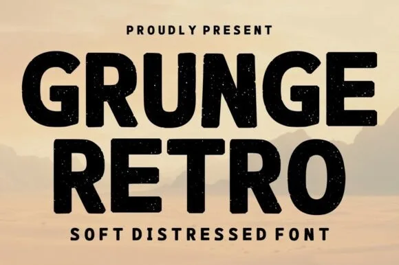
Bold soft-distressed vintage geometric sans display
Grunge Retro is a wide, bold geometric sans display font carrying rounded corners and light, tasteful vintage speckle wear.
Ideas for this font
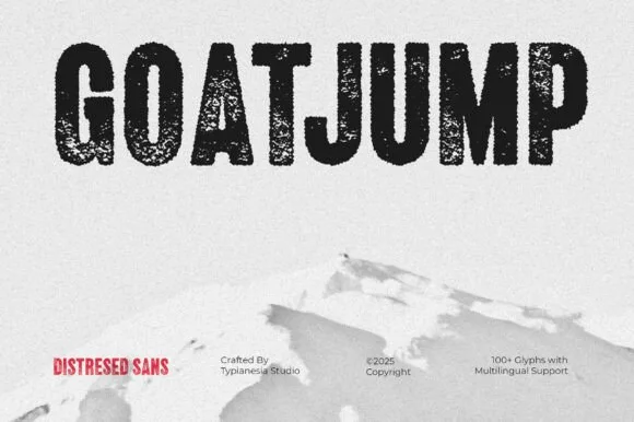
Tall condensed dry-roller & woodblock distressed sans (100+ glyphs, Multilingual)
Goatjump is a commanding, tall condensed distressed sans (100+ glyphs, Multilingual) stamped with vertical woodgrain & dry-roller grit!
Ideas for this font
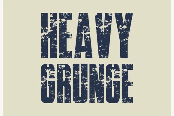
Tall condensed asphalt-scuffed grunge grotesk
Heavy Grunge is a tall, condensed distressed sans-serif font stamped with authentic scratched-asphalt and worn-paint texture.
Ideas for this font
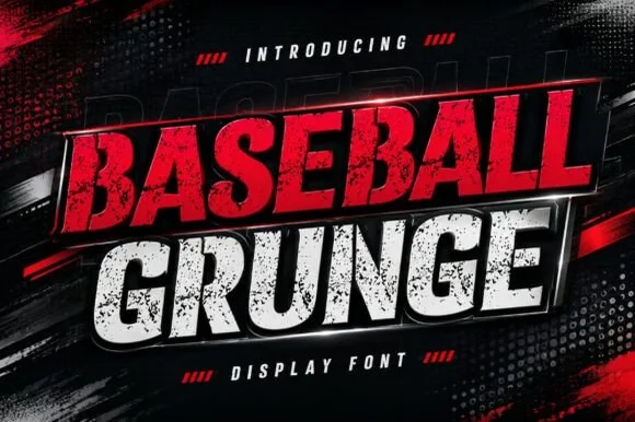
Slanted heavy distressed athletic & racing sans
Baseball Grunge (by Dreamspace.studio) is a forward-slanted, heavy athletic sans scarred with gritty chalk-and-asphalt distress streaks.
Ideas for this font
Same independent foundry
Allow optional Google Analytics to measure visits and catalogue actions. Your search words and notes are not included. Privacy & storage