High-Contrast Display Serif

Little Farmhouse + The Lumina Awesome
Pairs sculptural editorial warmth with Little Farmhouse's clean modern geometry.
Inspect The Lumina Awesome specimenDisclosure: MakerFileHub may earn a commission from qualifying purchases via paid links on this page. How our links work.
Tall minimalist sans & wide fine-line farmhouse script duo
Little Farmhouse pairs a tall, narrow rounded sans-serif with a delicate, wide-tracked monoline cursive.
Paid link
Get this fontProject & layout blueprintsAt-a-glance maker compatibility
Weld or Unite overlapping script joins into one continuous vector path before sending to the blade.
Visual anatomy & craft review
On the framed white card mockup, warm taupe capitals 'LITTLE' stand tall and widely spaced behind dark charcoal script 'farmhouse', whose long entry and exit tails extend past both edges of the sans word while the lowercase 'f' drops a deep narrow loop. PUA encoding provides easy access to the extended end swashes. The layering is the fragile part: the script is cut as a separate vinyl layer across the sans, so the long entry and exit tails thin out at the overlap and lift first on a textured board. Keep the script x-height at 1.5 in or above, press the sans layer down first, and test one plaque before painting a set.
Rustic · Airy · Balanced
Two-font hierarchy recipes
Tested contrast partners — pairing Little Farmhouse with grounded secondary typography.
Little Farmhouse + The Lumina Awesome
Pairs sculptural editorial warmth with Little Farmhouse's clean modern geometry.
Inspect The Lumina Awesome specimen
Little Farmhouse + Handmade Calligraphy
Introduces organic movement on pull-quotes, signatures and gift tags.
Inspect Handmade Calligraphy specimenPractical applications
Concrete hierarchy, scale and production guidance tailored to Little Farmhouse’s stroke geometry.
Layering dark cursive across the lower third of tall neutral capitals delivers the classic modern-farmhouse plaque hierarchy.
Hierarchy & layout recipe
Track the sans capitals out to +120 in muted tan or gray at 2.8 in height across a 24 in panel with 2 in margins, then center the dark script word at 1.6 in across their lower stems.
Pre-production check
When cutting stencil film for wood painting, keep the fine script above 1.5 in x-height so narrow 'f' and 'a' bridges hold firm against bleed.
The quiet geometric sans keeps venue names and dates crisp from twenty feet while the airy script softens key words like 'welcome'.
Hierarchy & layout recipe
Set 'WELCOME TO THE WEDDING OF' in the tall sans at 3 in and spotlight the couple's surname in the tailed script at 6 in across a 24x36 in wood board with a 2 in border.
Pre-production check
If overlapping vinyl layers, press the background sans layer first and trim a thin knockout gap or layer smooth matte vinyl cleanly on top.
A tracked-out narrow sans carries a product name across a crate while the wide script signs it, so one label reads as a manufactured mark and a hand-made one at once. The pair also survives a single ink, which is what a market stall actually prints in.
Hierarchy & layout recipe
Crate stencil 400 x 200 mm, sans tracked +120 at 80 mm with 12 mm bridges, script 40 mm centred on the lower stems with 10 mm margins. Jar label 70 x 50 mm, sans 14 mm, script 8 mm, 5 mm margins and 3 mm to the die line.
Pre-production check
On a 70 x 50 mm jar label the fine script drops below 8 mm and the tails silt into the kraft. Raise the label script to 11 mm or set the sans alone, and print one label before the batch.
Technical & licence verification
Confirm included OTF/TTF/WOFF formats, full glyph tables and licence coverage on the live store page before batch production.
Closest visual alternatives
Matched across letterform anatomy, stroke behaviour and craft applications.
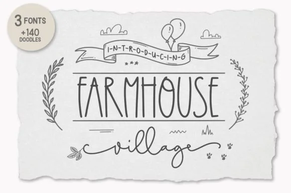
3-font farmhouse family (Tall Sans, Script & 140+ Doodles)
Farmhouse Village is a complete 3-font cottage toolkit bundling a tall narrow farmhouse sans, a winged monoline script, and 140+ hand-drawn doodles!
Ideas for this font
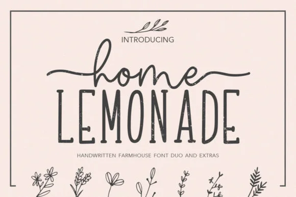
Farmhouse monoline script, tall narrow sans & botanical extras
Home Lemonade is a coordinated farmhouse font duo pairing a wide-tailed monoline cursive script, a tall skinny uppercase sans, and floral doodles.
Ideas for this font
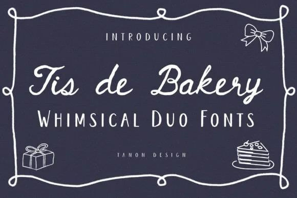
Whimsical cafe monoline script + quirky tall serif/sans duo
Tis De Bakery is a charming bistro font duo pairing a relaxed monoline cursive script with a tall, whimsical semi-serif uppercase font!
Ideas for this font
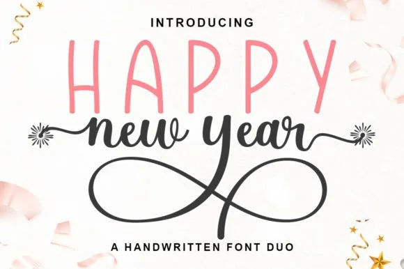
Tall skinny marker sans & firework-swashed monoline script duo
Happy New Year Duo pairs a tall, airy hand-drawn uppercase sans with a looping monoline cursive script tipped by firework-burst swashes.
Ideas for this font
Same independent foundry
Allow optional Google Analytics to measure visits and catalogue actions. Your search words and notes are not included. Privacy & storage