High-Contrast Display Serif

Qunotz + Things
Pairs sculptural editorial warmth with Qunotz's clean modern geometry.
Inspect Things specimenDisclosure: MakerFileHub may earn a commission from qualifying purchases via paid links on this page. How our links work.
Very fine geometric mixed case with a large open Q sweep and circular o
Qunotz shows pale slender lettering on navy: the Q is a large nearly circular form that opens near its lower edge and sweeps into a long flat tail, while the u and n keep simple rounded turns, the o stays circular and the t carries a light crossbar above a curved foot.
Paid link
Get this fontProject & layout blueprintsAt-a-glance maker compatibility
Sturdy stroke walls and open counters weed cleanly on adhesive vinyl, HTV apparel film, and cut cardstock.
Visual anatomy & craft review
The strokes stay very fine and even, the round letters close as true circles, the ascenders stay plain and the Q departs by opening and sending its tail out. The open Q is the character: one letter breaks the geometry of the row, which is why the sample sets a single name on a dark ground. Because the strokes are hairlines, keep 26 pt as the floor on coated stock and give the flat tail 16 mm of clearance. The flat Q tail is the piece that needs its own ground: it runs out of the bowl, so 16 mm of clear space keeps it apart, and the hairlines fill on uncoated stock under 26 pt.
Fine · Geometric · Open Q
Two-font hierarchy recipes
Tested contrast partners — pairing Qunotz with grounded secondary typography.
Qunotz + Things
Pairs sculptural editorial warmth with Qunotz's clean modern geometry.
Inspect Things specimen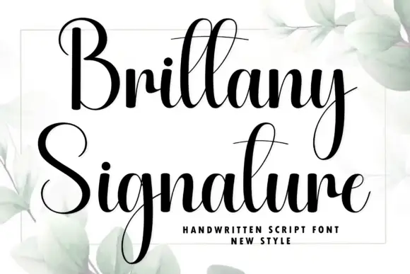
Qunotz + Brittany Signature
Introduces organic movement on pull-quotes, signatures and gift tags.
Inspect Brittany Signature specimenPractical applications
Concrete hierarchy, scale and production guidance tailored to Qunotz’s stroke geometry.
The fine geometry gives a studio a quiet mark, and the open Q supplies the single distinctive letter at 24 pt on a card.
Hierarchy & layout recipe
Print an 85 by 55 mm card: set the wordmark at 24 pt, keep 14 mm of clear ground at the right for the flat tail, and set the address in a 7 pt caps at the foot with 8 mm of space.
Pre-production check
The open Q can read as a broken O at small sizes; check the wordmark at 20 pt before approving the card.
The slender caps keep a cover restrained, and the circular bowls hold a one-word title at 62 pt on a coated page, where the fine geometry reads as a quiet editorial mark rather than a shouted masthead.
Hierarchy & layout recipe
Print an A4 cover: set the title at 62 pt, keep 22 mm of clear ground around it, and set the cover lines at 9 pt in a small caps along the foot of the page.
Pre-production check
Hairlines printed over a coloured field grey out; check the cover and keep the title on the pale area.
The fine letters suit a narrow bottle label, and the circular o stays clear at 20 pt on a 40 mm panel, provided the panel is white and the print run is short enough to check a proof first.
Hierarchy & layout recipe
Print a 40 by 70 mm label: set the brand at 20 pt, keep the Q tail inside the panel by 5 mm, and set the volume in a 5 pt caps at the foot with 4 mm of clear ground.
Pre-production check
A flat tail cut by the die looks like a fault; check the artwork and keep 6 mm of border on each side.
Technical & licence verification
Confirm included OTF/TTF/WOFF formats, full glyph tables and licence coverage on the live store page before batch production.
Closest visual alternatives
Matched across letterform anatomy, stroke behaviour and craft applications.
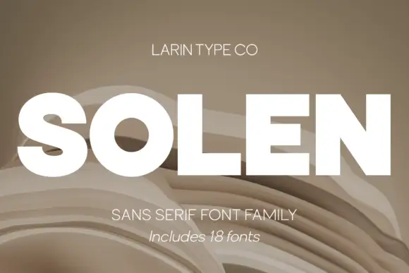
Heavy neutral grotesque family with italic
Solen is a heavy neutral sans shown as a white caps wordmark on layered beige paper folds, presented as an eighteen-font family: thick uniform strokes, tight apertures and an italic companion that gives the same weight a forward lean.
Ideas for this font

Heavy mixed case with broad bowls and closely packed short lowercase
Base Edge sets a heavy grotesque in cream over a dark glass tower, the strokes thick, the terminals flat and the spacing tight enough that the words read as one block of light.
Ideas for this font
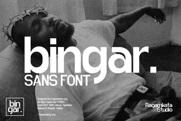
Heavy rounded lowercase with square i dot and a long curved g descender
Bingar shows a large white lowercase name over a grainy monochrome sculpture photograph, where broad bowls and heavy upright strokes make the row substantial, the square i dot, open r shoulder and curling g descender add distinct details and a square full stop ends the displayed word.
Ideas for this font
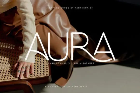
Light rounded capitals with long curved A bars and an extended R leg
Aura shows pale thin capitals over a dark fashion photograph, where near-even rounded strokes build an open U and a broad R bowl, the first A carries a long curved cross-stroke that sweeps toward the centre and the R leg continues below the final A as a broad flowing curve.
Ideas for this font
Allow optional Google Analytics to measure visits and catalogue actions. Your search words and notes are not included. Privacy & storage