High-Contrast Display Serif

Hellebore + Augler
Pairs sculptural editorial warmth with Hellebore's clean modern geometry.
Inspect Augler specimenDisclosure: MakerFileHub may earn a commission from qualifying purchases via paid links on this page. How our links work.
Wide sci-fi sans with squared counters and chamfered junctions
Hellebore is a wide techno sans in which the counters are squared, the junctions are chamfered and every letter sits on a broad horizontal footprint, so a word reads as a title sequence rather than as signage.
Paid link
Get this fontProject & layout blueprintsAt-a-glance maker compatibility
Sturdy stroke walls and open counters weed cleanly on adhesive vinyl, HTV apparel film, and cut cardstock.
Visual anatomy & craft review
The capital H holds two thick stems and a wide bar, the E carries three flat arms, the L keeps one arm and a broad foot, and the O closes a rectangular counter with chamfered corners, all at a heavy even weight with no contrast. The width is the character: a six-letter word stretches across a wide format at a modest point size, which is how the face suits film titles and equipment panels. Chamfers at the junctions keep the shapes from looking like plain blocks, and they are the detail that fails first at small sizes, where the corners fill in. Counters stay open at 30 pt. The planet backdrop, the horizon, the orange rim light, the thin rules and the two caption lines are presentation; the typeface is the word.
Cybernetic · Wide · Squared
Two-font hierarchy recipes
Tested contrast partners — pairing Hellebore with grounded secondary typography.
Hellebore + Augler
Pairs sculptural editorial warmth with Hellebore's clean modern geometry.
Inspect Augler specimen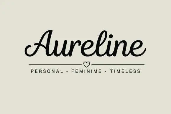
Hellebore + Aureline
Introduces organic movement on pull-quotes, signatures and gift tags.
Inspect Aureline specimenPractical applications
Concrete hierarchy, scale and production guidance tailored to Hellebore’s stroke geometry.
The wide squared letters stretch across a cover at 72 pt and read as a title sequence, which is exactly the register a genre cover needs.
Hierarchy & layout recipe
Print an A4 cover: set the title at 72 pt across the middle, set the author in a 10 pt caps sans beneath, and keep 15 mm of margin so the chamfered corners are not trimmed by the bleed.
Pre-production check
A chamfer under 1 mm fills in at 72 pt on a matte stock; check the proof and widen the cut rather than the stroke.
The squared alphabet holds at 11 pt on a ticket and gives a small printed piece the look of an access pass, which suits an event audience.
Hierarchy & layout recipe
Print a 90 by 50 mm ticket: set the event name at 11 pt, set the seat and time in a 6 pt caps sans at the foot, and keep 5 mm of margin so the wide letters do not run into the perforation line.
Pre-production check
A perforation crossing a wide letter tears the shape; check the artwork against the perforation position and keep the title clear of the tear line.
The wide squared face reads at 9 pt on a printed panel mock-up and keeps a technical label legible without the softness of a rounded sans.
Hierarchy & layout recipe
Print a 420 by 120 mm panel: set the panel label at 9 pt with 40 percent extra tracking, set the warning line in a 7 pt caps sans beneath, and keep 8 mm of clear panel around each block so the chamfers stay visible.
Pre-production check
Extra tracking on a wide face quickly runs past a fixed panel; check the longest word at final size and reduce tracking before reducing the point size.
Technical & licence verification
Confirm included OTF/TTF/WOFF formats, full glyph tables and licence coverage on the live store page before batch production.
Closest visual alternatives
Matched across letterform anatomy, stroke behaviour and craft applications.
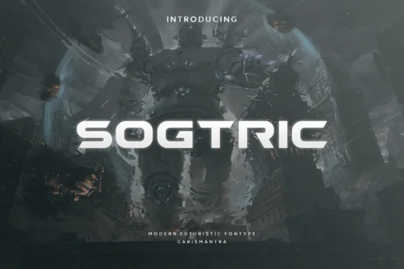
Wide geometric sans for futuristic display
Sogtric is a wide geometric sans in white caps over dark science-fiction city art: even stroke weight throughout, near-square counters and a flat-sided O that make it read as signage projected onto a night skyline rather than a text face.
Ideas for this font
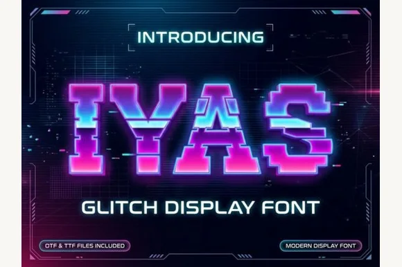
Sliced horizontal glitch pixel caps with displaced rows
Iyas is a pixel capital alphabet in which each letter is sliced into horizontal bands and some bands are displaced sideways, so a word reads as a signal breaking up on a screen.
Ideas for this font
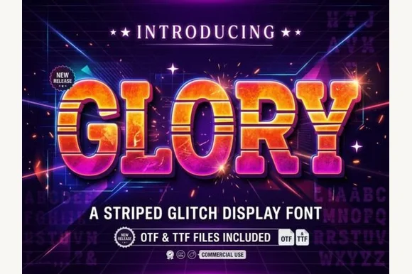
Scanline-striped retrowave block with chunky bevels
Glory is a chunky arcade block in which every letter carries horizontal scanline gaps, so a word reads as a stretched slice of a 1980s title screen rather than as flat lettering.
Ideas for this font
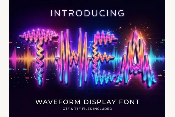
Letters drawn as oscillating audio waveforms with a bright glow along each stroke
Thea is a display alphabet in which every stroke is drawn as an oscillating audio waveform, so a word reads as a signal trace rather than as lettering, with the shape still legible from the amplitude envelope.
Ideas for this font
Same independent foundry
Allow optional Google Analytics to measure visits and catalogue actions. Your search words and notes are not included. Privacy & storage