Modern Grotesque Body

Strong + Cenura
Creates crisp high-hierarchy contrast beneath Strong headlines across menus, websites and labels.
Inspect Cenura specimenDisclosure: MakerFileHub may earn a commission from qualifying purchases via paid links on this page. How our links work.
Heavy broad capitals with sharp fine serifs
Strong shows white serif capitals with substantial curved stems and fine pointed serifs over a shadowed room, where the O is broad and round, the R carries a thick low diagonal leg and the G finishes in a firm horizontal bar with a small flower badge above the row.
Paid link
Get this fontProject & layout blueprintsAt-a-glance maker compatibility
Crisp hairline serifs shine on stationery, foil stamping, and packaging; add slight offset for small decals.
Visual anatomy & craft review
The stems stay thick, the serifs taper to points, the bowls open round and the terminals close flat. That closing bar is the character: the word reads as a bold editorial serif rather than a slab, which is why the sample sits large over an interior photograph. The room and the badge belong to the cover, and the caption claims weight and durability that type cannot promise. Keep 44 pt for a display row and 14 pt for text, and check whether your file carries more than one weight.
Heavy broad capitals with sharp fine serifs
Two-font hierarchy recipes
Tested contrast partners — pairing Strong with grounded secondary typography.
Strong + Cenura
Creates crisp high-hierarchy contrast beneath Strong headlines across menus, websites and labels.
Inspect Cenura specimen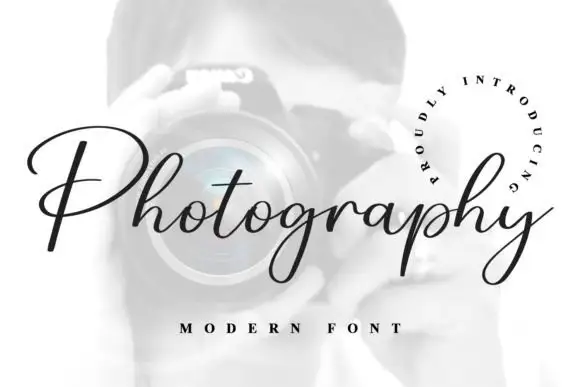
Strong + Photography Font
Adds a warm human signature touch for 1-to-3-word callouts without competing against structured serif capitals.
Inspect Photography Font specimenPractical applications
Concrete hierarchy, scale and production guidance tailored to Strong’s stroke geometry.
The bold serif gives a business masthead real authority, and the firm horizontal bar keeps the logo crisp when reproduced small.
Hierarchy & layout recipe
Print a 210 by 280 mm cover: set the masthead at 70 pt on one row, keep 26 mm of clear ground beneath before the cover lines at 9 pt, and keep 20 mm of margin at each side.
Pre-production check
Only one weight is demonstrated on the cover; check your file before planning a headline hierarchy.
The pointed serifs give a law practice a formal mark, and the substantial curved stems hold up on a brass door plate at 40 mm.
Hierarchy & layout recipe
Etch a 300 by 100 mm plate: set the wordmark at 28 pt on one row, keep 14 mm of clear ground beneath before the street at 8 pt, and keep 16 mm of margin for the fixings.
Pre-production check
Feeding the artwork onto a plate rounds the fine points; check it at final size before the etch.
The bold weight carries a school prospectus heading, and the open bowls keep a long institution name legible on a cover.
Hierarchy & layout recipe
Print an A4 cover: set the heading at 40 pt across two rows, keep 20 mm of clear ground beneath before the subtitle at 12 pt, and keep 22 mm of margin all round.
Pre-production check
Durability wording on the cover is marketing; check the printed stock rather than the claim.
Technical & licence verification
Confirm included OTF/TTF/WOFF formats, full glyph tables and licence coverage on the live store page before batch production.
Closest visual alternatives
Matched across letterform anatomy, stroke behaviour and craft applications.
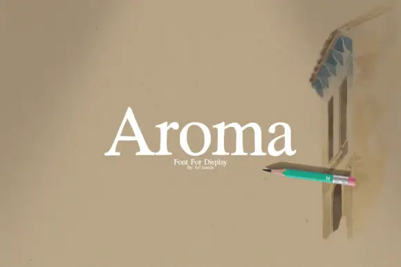
Open mixed case serif with a triangular capital and short flared feet
Aroma is an open mixed-case serif in which the capital A closes as a triangle with a low bar, the feet flare briefly and the letters keep generous space, so a single word reads as a quiet display face.
Ideas for this font
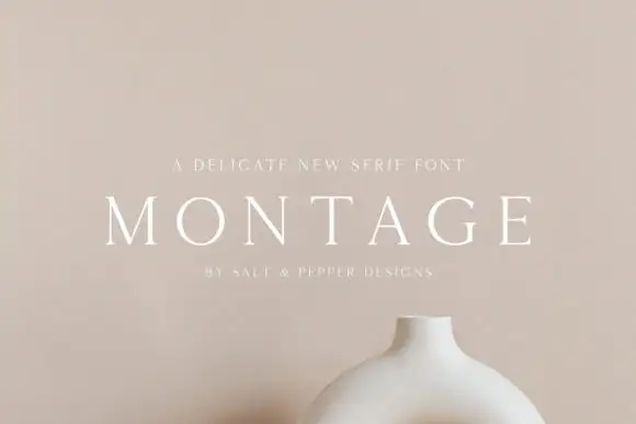
Delicate high-contrast serif
Montage is a delicate serif in white on a soft beige field: very fine hairlines, wide letterspacing, thin bracketed serifs and a high waist, set in caps on one line with a tracked line above and an attribution beneath, on a still life of a ceramic vessel.
Ideas for this font

Tall light capitals with long overlapping crossbars
Beach Dates is a tall light capital face in which the C and D open broad curves, the serifs taper finely and the H crossbar reaches left into the C while the T bar stretches across the row below, so two stacked words lock into one form.
Ideas for this font
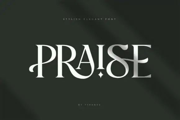
Elegant display serif with thinned stems and star-cut counters
Praise is an elegant display serif in which the stems narrow to blades, the feet flatten into hairline serifs and one counter opens as a small star, so a single word reads as a fashion masthead with one deliberate interruption.
Ideas for this font
Same independent foundry
Allow optional Google Analytics to measure visits and catalogue actions. Your search words and notes are not included. Privacy & storage