Neutral Sans Workhorse

Chicago Ornament + Bargain Condensed
Lets Chicago Ornament own the focal silhouette while handling secondary copy, sizing and subheads cleanly.
Inspect Bargain Condensed specimenDisclosure: MakerFileHub may earn a commission from qualifying purchases via paid links on this page. How our links work.
Handcrafted vintage-ornamental condensed poster serif-display
Chicago Ornament is a tall, hand-inked condensed display typeface with softly flared terminals, high-waisted bars, and subtle sign-painter grit.
Paid link
Get this fontProject & layout blueprintsAt-a-glance maker compatibility
Sturdy stroke walls and open counters weed cleanly on adhesive vinyl, HTV apparel film, and cut cardstock.
Visual anatomy & craft review
Chicago Ornament is a handcrafted ornamental condensed display serif in which the stems are dense with carved detail: small diamonds, hatching and scroll fins run up the vertical, the serifs split into curls and the caps carry a drawing rather than a letter shape. The ornament fills the stem, so the counters stay narrow and the smallest fin is what closes first. It needs roughly 36 mm for the hatching and the scroll fin to read, and it is best in one dense ink on cream and sand tones, or a single deep colour on a pale poster stock.
Urban-vintage · Condensed · Hand-inked
Two-font hierarchy recipes
Tested contrast partners — pairing Chicago Ornament with grounded secondary typography.
Chicago Ornament + Bargain Condensed
Lets Chicago Ornament own the focal silhouette while handling secondary copy, sizing and subheads cleanly.
Inspect Bargain Condensed specimen
Chicago Ornament + Mewah
Grounds bold display lettering with classic typographic authority on posters, badges and apparel.
Inspect Mewah specimenPractical applications
Concrete hierarchy, scale and production guidance tailored to Chicago Ornament’s stroke geometry.
An ornamental condensed serif reads as a carved masthead rather than a modern headline, which is what an issue about craft or heritage wants. The carved stems give the title a solid texture at 72 pt, and the narrow counters keep a long word inside the 210 mm measure without tracking out.
Hierarchy & layout recipe
Opener 210 x 297 mm, title 72 pt with 10 mm ornament clearance, standfirst 11/15 pt, body 9/13 pt, 18 mm margins. Poster insert 148 x 210 mm, word 40 mm, 12 mm margins. Section head 30 pt.
Pre-production check
At 30 pt on a section head the hatching fills and the word prints as a solid carved bar with no legible letters. Keep the face at 48 pt and above, and proof one opener at 1:1 before the run.
A carved ornamental serif reads as an engraved perfume carton rather than a modern label, which is what a small perfumer wants on its box. The ornament gives the house name texture at 28 mm, and one deep ink on uncoated board keeps the fins open where a coated sheet would fill them.
Hierarchy & layout recipe
Carton 60 x 160 x 30 mm, word 26 mm with 8 mm ornament clearance, 8 mm margins. Wax-seal label 40 mm round, initial 12 mm, 3 mm die margin. Card 85 x 55 mm, word 16 mm, 5 mm margins.
Pre-production check
On a 40 mm seal the ornament turns to noise and the initial reads as a blot in the wax. Use a plain cut for the seal and keep the carved face on the carton, then press one seal before the run.
A carved condensed serif gives a concert season the weight of a printed bill rather than a modern flyer, which suits a chamber series in a small hall. The ornament holds at 100 mm on a poster, and one ink prints the poster, the programme cover and the tickets in a single order.
Hierarchy & layout recipe
Poster A2, word 100 mm with 12 mm ornament clearance, dates 34 mm, 20 mm margins. Programme cover A5, title 40 pt, 12 mm margins. Ticket 100 x 50 mm, word 12 mm, 4 mm perforation.
Pre-production check
A 100 x 50 mm ticket at 12 mm loses the ornament entirely and the word reads as a plain condensed serif with dirty edges. Print tickets from the plain cut and keep the ornament for the poster, then check one ticket before the batch.
Technical & licence verification
Confirm included OTF/TTF/WOFF formats, full glyph tables and licence coverage on the live store page before batch production.
Closest visual alternatives
Matched across letterform anatomy, stroke behaviour and craft applications.
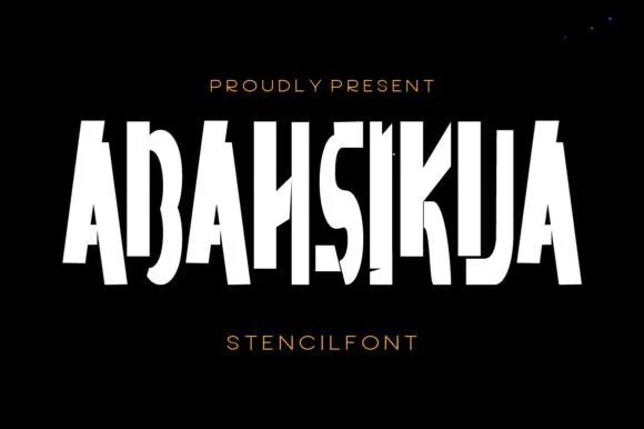
Tall condensed diagonal-sliced architectural stencil display
Abahsikua is a tall, condensed modern stencil display font sliced by bold diagonal negative-space cuts across geometric block pillars.
Ideas for this font
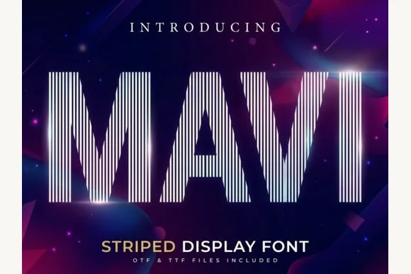
Tall condensed vertical-pinstripe optical display
Mavi is a towering condensed display font built entirely from crisp vertical parallel pinstripes sliced into bold geometric silhouettes.
Ideas for this font
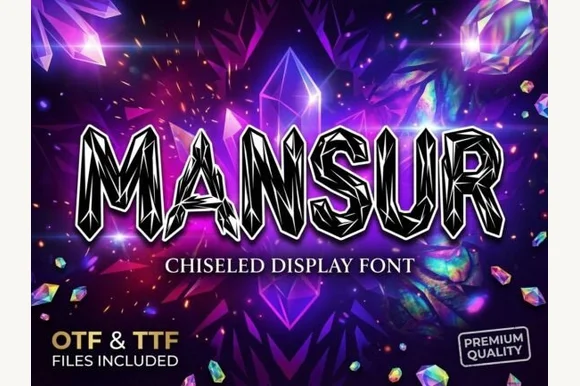
Chiselled crystal-faceted display
Mansur is a chiselled display in black with white keylines on a gem-lit purple scene: each letter is built from flat crystal facets, with sharp points at the terminals and a highlight line that divides every face, so the word reads as carved stone rather than as drawn type.
Ideas for this font
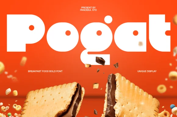
Ultra-fat heavy-packaging & cereal-box geometric display
Pogat is an ultra-heavy, slab-thick retro packaging font with massive ink mass and tiny circular pinhole counters built for snack and food branding!
Ideas for this font
Same independent foundry
Allow optional Google Analytics to measure visits and catalogue actions. Your search words and notes are not included. Privacy & storage