Modern Grotesque Body

Kidlit + Headline
Creates crisp high-hierarchy contrast beneath Kidlit headlines across menus, websites and labels.
Inspect Headline specimenDisclosure: MakerFileHub may earn a commission from qualifying purchases via paid links on this page. How our links work.
Hand-drawn bouncy storybook serif with curled ascenders
Kidlit is a lively hand-drawn serif with organic, slightly wiggly stems, curled ascender tops, and multi-set alternates.
Paid link
Get this fontProject & layout blueprintsAt-a-glance maker compatibility
Fine grain and micro-texture excel in 300 DPI print, sublimation, and screen print rather than small vinyl weeding.
Visual anatomy & craft review
Kidlit is a hand-drawn bouncy storybook serif with curled ascenders: soft bracketed stems, a small x-height, letters that hop along the baseline and ascenders that curl over like a fern. It is a children's-book face, so it wants air and one warm ink rather than a busy illustration behind it. The curls are the finest element and they close into a hook once the face is reduced. It needs roughly 26 mm for the curl and the serif to read, and it is best one dark ink on a cream ground.
Wobbly · Cheerful · Literary
Two-font hierarchy recipes
Tested contrast partners — pairing Kidlit with grounded secondary typography.
Kidlit + Headline
Creates crisp high-hierarchy contrast beneath Kidlit headlines across menus, websites and labels.
Inspect Headline specimen
Kidlit + Welcome
Adds a warm human signature touch for 1-to-3-word callouts without competing against structured serif capitals.
Inspect Welcome specimenPractical applications
Concrete hierarchy, scale and production guidance tailored to Kidlit’s stroke geometry.
A bouncy storybook serif reads as a drawn title rather than a typeset one, which is what a small press wants on a cover. The curls hold at 72 pt on a cover, and the text face carries the chapter openers.
Hierarchy & layout recipe
Cover 148 x 210 mm, title 72 pt with 14 mm curl clearance, 14 mm margins, author line 14 pt. Chapter opener 18 pt with 4 mm letterspace. Imprint 105 x 148 mm, text 10/14 pt, 12 mm margins and a 40 mm rail for the folio.
Pre-production check
At 18 pt on a chapter opener the curls fill into hooks and the head reads as a barbed bar. Keep the display cut at 30 pt and above, and proof one spread at 1:1.
A curled storybook serif makes a child's party look drawn rather than printed. The curls hold at 44 mm on a topper, and one vinyl colour covers the topper and the invite print.
Hierarchy & layout recipe
Invite A6, word 40 mm with 12 mm curl clearance, details 8/11 pt, 12 mm margins. Topper 130 x 110 mm, word 48 mm with a 6 mm stick slot and 12 mm clear. Cup wrap 200 x 90 mm, word 20 mm, 12 mm from the rim.
Pre-production check
A 130 mm vinyl topper at 48 mm has curls that weld shut during weeding and the letters fill in. Keep the curl gap at 3 mm or above, and weed one topper before the party.
A bouncy serif reads as a hand-lettered library sign rather than a printed notice. The curls hold at 90 mm on a sign, and one ink prints the sign and the stickers in one pass.
Hierarchy & layout recipe
Sign 600 x 400 mm, word 90 mm with 12 mm curl clearance, 25 mm margins. Bookplate 90 x 60 mm, word 18 mm, 6 mm margins. Sticker 60 mm round, word 12 mm, 3 mm die margin.
Pre-production check
At 12 mm on a 60 mm sticker the curls close into solid hooks and the word reads as a blob. Raise the sticker word to 18 mm, and print one sheet before the run.
Technical & licence verification
Confirm included OTF/TTF/WOFF formats, full glyph tables and licence coverage on the live store page before batch production.
Closest visual alternatives
Matched across letterform anatomy, stroke behaviour and craft applications.
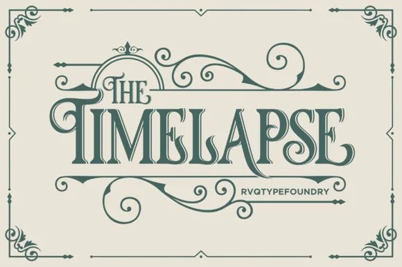
Swashed Victorian storybook & apothecary display serif
Timelapse is an ornate Victorian display serif crowned with spiraling vine swashes, teardrop terminals, and vintage apothecary charm.
Ideas for this font
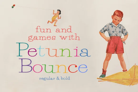
Quirky playful serif with a bounce and hand-drawn alternates
Petunia Bounce is a quirky serif in which the letters step up and down, the serifs stay soft and the alternates swap in rounder forms, so a two-word title reads as a children's book headline rather than as a text face.
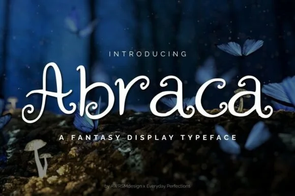
Whimsical spiral-curled enchanted fairytale display serif (OTF & TTF)
Abraca is an enchanted storybook display serif curling delicate fairytale spirals into the bowls and terminals of 'A', 'b', 'r', 'a', and 'c' (OTF & TTF)!
Ideas for this font
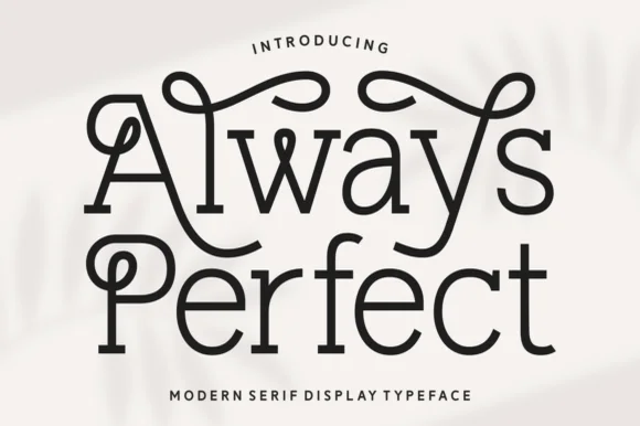
Looped monoline Art-Nouveau & storybook swash serif
Always Perfect is a playful monoline swash serif whose tall stems curl into sweeping overhead loops, ball-tipped hooks, and linked ligatures.
Ideas for this font
Same independent foundry
Allow optional Google Analytics to measure visits and catalogue actions. Your search words and notes are not included. Privacy & storage