Neutral Sans Workhorse

Beardsons + Monure
Lets Beardsons own the focal silhouette while handling secondary copy, sizing and subheads cleanly.
Inspect Monure specimenDisclosure: MakerFileHub may earn a commission from qualifying purchases via paid links on this page. How our links work.
Curled high-contrast capitals with offset inline-like decoration
Beardsons rises diagonally across an ornate olive cover, where white capitals carry thin internal lines, narrow waists and extended curled terminals around the opening B and the central S, a dark red offset behind the letters adds depth and fine gold foliage frames the name.
Paid link
Get this fontProject & layout blueprintsAt-a-glance maker compatibility
Cut solid base, outline, and shadow layers in separate vinyl colors and align on registration marks.
Visual anatomy & craft review
The stems stay narrow at the waist and wide at the terminals, the internal hairlines cut through the bodies and the offset duplicates the contour behind. That layered offset is the character: the word reads as a carved Victorian sign rather than a flat lettering job, which is why the sample runs on a diagonal across a bordered field. The gold foliage, the border and the banners are artwork. Keep 44 pt so the thin inner lines survive, allow 12 mm for the offset and check the diagonal at the trim.
Curled high-contrast capitals with offset inline-like decoration
Two-font hierarchy recipes
Tested contrast partners — pairing Beardsons with grounded secondary typography.
Beardsons + Monure
Lets Beardsons own the focal silhouette while handling secondary copy, sizing and subheads cleanly.
Inspect Monure specimen
Beardsons + Mewah
Grounds bold display lettering with classic typographic authority on posters, badges and apparel.
Inspect Mewah specimenPractical applications
Concrete hierarchy, scale and production guidance tailored to Beardsons’s stroke geometry.
The layered Victorian capitals give a small brewery bottle heritage, and the offset supplies depth without a printed shadow.
Hierarchy & layout recipe
Print a 55 by 85 mm label: set the brewery name at 22 pt on one row, keep 10 mm of clear ground beneath before the strength at 7 pt, and keep 8 mm to the die edge for the offset.
Pre-production check
The inner hairlines fill under 18 pt; check the plate proof and hold the name at 20 pt or above.
The diagonal rise and the ornament suit a period heritage fair sign, where the lettering carries the whole stall identity.
Hierarchy & layout recipe
Print a 700 by 400 mm board: set the fair name at 60 mm on a rising diagonal of 12 degrees, keep 26 mm of clear ground beneath before the dates at 15 pt, and keep 30 mm of border so the curls stay whole.
Pre-production check
A long name on a diagonal needs extra width; check your own text before setting the angle.
The ornate capitals set a feature opener with period weight, and the offset keeps the row distinct over a photographic ground.
Hierarchy & layout recipe
Print a 210 by 280 mm cover: set the cover line at 56 pt on one row, keep 24 mm of clear ground beneath before the standfirst at 10 pt, and keep 22 mm of margin at each side.
Pre-production check
The gold foliage is cover art; check the files before planning any ornament with the type.
Technical & licence verification
Confirm included OTF/TTF/WOFF formats, full glyph tables and licence coverage on the live store page before batch production.
Closest visual alternatives
Matched across letterform anatomy, stroke behaviour and craft applications.
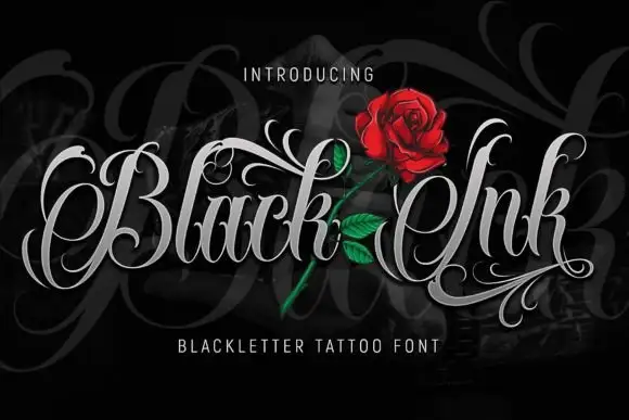
Fine-contrast ornamental lettering with looping capitals and long swashes
Black Ink sets a blackletter in silver on black, opens every capital into a swash and lets the flourishes cross the word, so the lettering reads as a tattoo design rather than as a heading.
Ideas for this font
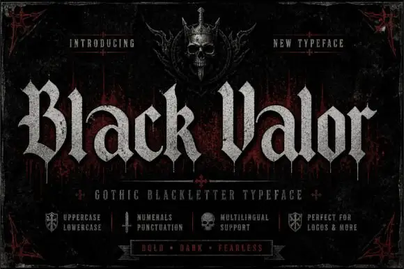
Broad blackletter with curved a shoulders and hooked capitals
Black Valor sets a gothic blackletter in distressed white on a black ground, with broad strokes, curled lowercase shoulders and hooked capitals whose ends finish in fine diamond points.
Ideas for this font
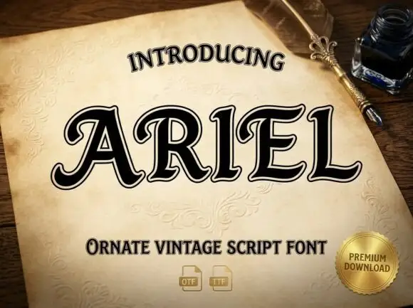
Heavy outlined capitals with curled terminals and small curved interior cut-ins
Ariel is a heavy ornamental display script: thick swelling strokes, curled entry and exit ligatures, and a white inline drawn inside a heavy dark edge so the letters look carved and lit.
Ideas for this font
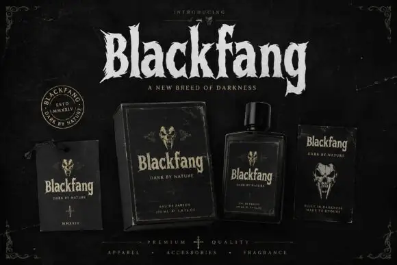
Ragged Gothic lettering with torn points and uneven bowls
Blackfang is a gothic display face with sharp spiked terminals and a smooth filled contour, shown here across a hang tag, a box, a bottle and a folded card.
Ideas for this font
Same independent foundry
Allow optional Google Analytics to measure visits and catalogue actions. Your search words and notes are not included. Privacy & storage