Neutral Sans Workhorse

Gotjack + Memoir Slang
Lets Gotjack own the focal silhouette while handling secondary copy, sizing and subheads cleanly.
Inspect Memoir Slang specimenDisclosure: MakerFileHub may earn a commission from qualifying purchases via paid links on this page. How our links work.
1970s/80s Bronze-Age comic-book cover masthead display
Gotjack is a punchy 1970s/80s vintage comic-book cover font built for slanted 3D block extrusions, pulp westerns, and retro pop-art tees!
Paid link
Get this fontProject & layout blueprintsAt-a-glance maker compatibility
Sturdy stroke walls and open counters weed cleanly on adhesive vinyl, HTV apparel film, and cut cardstock.
Visual anatomy & craft review
Gotjack is a vintage comic-cover masthead display with warm cream-orange caps, a thick black ink outline and a deep slanted 3D block extrusion, so a word reads as the title of a pulp issue rather than a modern display. The extrusion is baked in and always falls to one side, which fixes the light direction, and the outline means the letters hold over a busy cover illustration. It needs roughly 34 mm for the block shadow to read as depth, and it is best in cream and orange on a printed comic cover or as one flat ink on kraft.
Bronze-Age-comic · Pulp-western · Dynamic-skew
Two-font hierarchy recipes
Tested contrast partners — pairing Gotjack with grounded secondary typography.
Gotjack + Memoir Slang
Lets Gotjack own the focal silhouette while handling secondary copy, sizing and subheads cleanly.
Inspect Memoir Slang specimen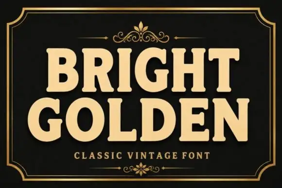
Gotjack + Bright Golden
Grounds bold display lettering with classic typographic authority on posters, badges and apparel.
Inspect Bright Golden specimenPractical applications
Concrete hierarchy, scale and production guidance tailored to Gotjack’s stroke geometry.
A slanted comic masthead reads as an issue from a spinner rack, which is what a retro-comics feature wants on a cover. The baked extrusion gives the title depth in a single print pass, and the heavy outline holds the word over full-colour art.
Hierarchy & layout recipe
Cover 170 x 260 mm, title 90 mm, cover lines 9/12 pt, 12 mm margins and 8 mm trim. Opener 420 x 297 mm, headline 120 mm, body 9/13 pt. Poster A2, word 280 mm, details 22/28 pt, 30 mm margins.
Pre-production check
The extrusion extends past the type box and is trimmed when the cover is fitted to a template. Declare the full artwork box including the shadow, and check one proof with trim marks before the run.
Comic masthead lettering reads as a shop that sells back issues, which is what a small comic store paints on a window. The heavy outline holds at 160 mm in vinyl, and the extrusion gives the name depth without a second colour.
Hierarchy & layout recipe
Sign 900 x 400 mm, word 160 mm, 60 mm margins and 25 mm frame clearance. Sticker 90 x 60 mm, word 18 mm, 3 mm die margin. Merch print 280 x 160 mm, word 60 mm, 40 mm margins.
Pre-production check
A 90 mm sticker cannot hold the extrusion plus a die margin and the shadow is cut off flat. Keep the word at 22 mm so the shadow stays inside the sticker, and weed one before the sheet.
Pulp comic lettering reads as a summer fair bill, which is what a small carnival tapes to a fence. The heavy fill holds at 300 mm in one ink, and the extrusion gives the poster movement without an illustration.
Hierarchy & layout recipe
Poster A2, word 300 mm, dates 22/28 pt, 30 mm margins and 20 mm trim. Banner 2000 x 600 mm, word 340 mm, 120 mm margins with eyelets every 500 mm. Sign 900 x 400 mm, word 160 mm, 60 mm margins.
Pre-production check
A banner strung between posts bows in wind and a slanted word reads as sagging. Use a flat board for the main word, and check one banner tensioned overnight before the fair.
Technical & licence verification
Confirm included OTF/TTF/WOFF formats, full glyph tables and licence coverage on the live store page before batch production.
Closest visual alternatives
Matched across letterform anatomy, stroke behaviour and craft applications.
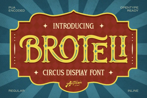
Tuscan-spurred vintage circus & carnival poster display
Broteli is a theatrical vintage carnival display font featuring bifurcated Tuscan spurs, curled terminals, and both Regular and Inline cuts.
Ideas for this font
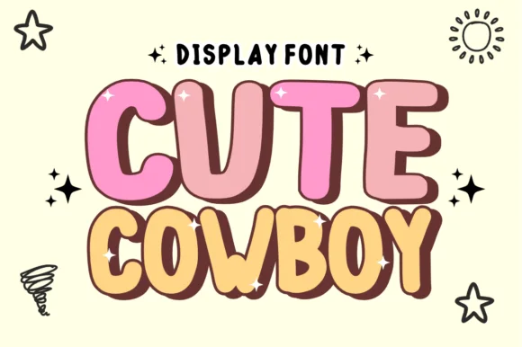
Chubby cartoon comic-sticker bubble font (NOT a slab serif!)
Cute Cowboy is actually a plump, cheerful cartoon bubble display font (zero slab serifs or spurs!) wrapped in hand-drawn comic outlines.
Ideas for this font
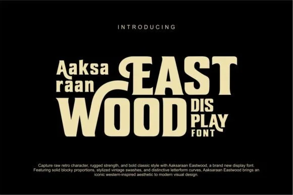
Retro Western swash-capped flared slab display
Eastwood is a bold retro-Western display font pairing chunky block proportions with sweeping horizontal swash bars and notched spurs.
Ideas for this font
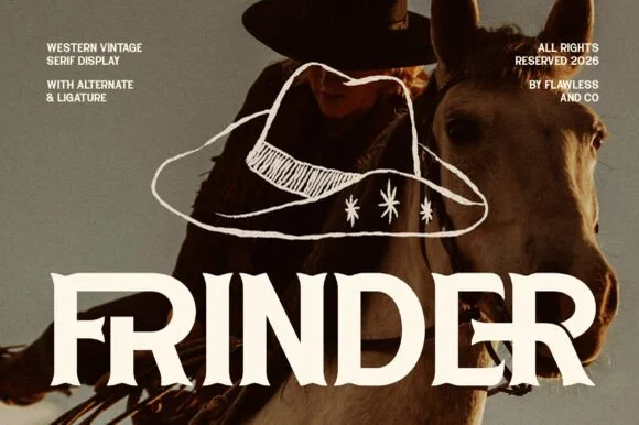
Modern sharp-spurred Western serif with interlocking ligatures
Frinder is a sharp, modern editorial Western serif combining triangular thorn spurs with custom interlocking ligatures ('DE') and hooked 'R' legs.
Ideas for this font
Allow optional Google Analytics to measure visits and catalogue actions. Your search words and notes are not included. Privacy & storage