Modern Grotesque Body

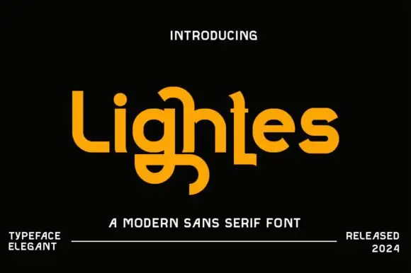
Chicago Darling + Modern Limited
Creates crisp high-hierarchy contrast beneath Chicago Darling headlines across menus, websites and labels.
Inspect Modern Limited specimenDisclosure: MakerFileHub may earn a commission from qualifying purchases via paid links on this page. How our links work.
High-contrast vintage display serif with curled ball terminals
Chicago Darling is a bold, condensed modern-vintage serif distinguished by curled spiral terminals, sparkling counters, and deep descender loops.
Paid link
Get this fontProject & layout blueprintsAt-a-glance maker compatibility
Crisp hairline serifs shine on stationery, foil stamping, and packaging; add slight offset for small decals.
Visual anatomy & craft review
Chicago Darling is a high-contrast vintage display serif with curled ball terminals: hairline thins against swollen stems, a small x-height, a high waist and terminals that roll into small balls on the a, c and r. It is the lettering of a nineteen-twenties poster and a department-store sign, so it wants size and air. The hairline thins are the finest element and they break first in print and in vinyl. It needs roughly 34 mm for the contrast and the ball terminal to read, and it is best one dark ink on a cream ground.
Editorial · Nostalgic · Ornamental
Two-font hierarchy recipes
Tested contrast partners — pairing Chicago Darling with grounded secondary typography.
Chicago Darling + Modern Limited
Creates crisp high-hierarchy contrast beneath Chicago Darling headlines across menus, websites and labels.
Inspect Modern Limited specimen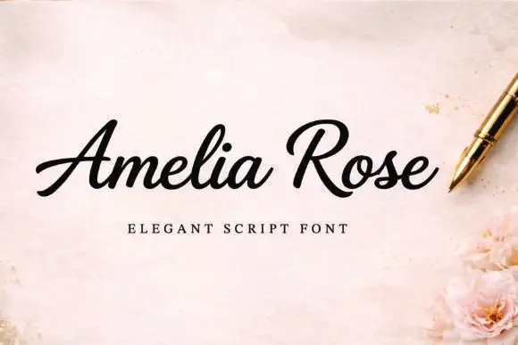
Chicago Darling + Amelia Rose
Adds a warm human signature touch for 1-to-3-word callouts without competing against structured serif capitals.
Inspect Amelia Rose specimenPractical applications
Concrete hierarchy, scale and production guidance tailored to Chicago Darling’s stroke geometry.
A high-contrast vintage serif reads as a printed department-store mark rather than a modern logo. The thins hold at 30 mm on a card, and one dark ink prints the card and the box in one order.
Hierarchy & layout recipe
Card 85 x 55 mm, word 30 mm with 8 mm terminal clearance, details 7/9 pt, 8 mm margins. Box print 150 x 100 mm, word 44 mm, 12 mm margins. Ribbon band 200 x 40 mm, word 14 mm, 6 mm margins.
Pre-production check
On a 200 x 40 mm band at 14 mm the hairline thins vanish into the paper and the word breaks into disconnected stumps. Keep the band word at 20 mm and print on coated stock, and test one band before the order.
A vintage display serif gives a magazine opener the authority of a printed masthead without a second face. The display cut carries the title at 64 pt, and the thins survive because the column is wide.
Hierarchy & layout recipe
Opener 210 x 297 mm, title 64 pt with 12 mm terminal clearance, standfirst 11/15 pt, body 9/13 pt over two columns of 82 mm, 18 mm margins and a 12 mm head. Folio 8 pt in a 40 mm rail.
Pre-production check
At 24 pt on a section head the ball terminals fill and the head reads as a barbed bar. Keep the face at 40 pt and above, and proof one spread at 1:1.
A curled vintage serif gives a formal wedding the look of engraved stationery. The display cut sets the names at 34 pt, and the thins hold on a matte stock at that size.
Hierarchy & layout recipe
Invitation 130 x 180 mm, names 34 pt with 12 mm terminal clearance, details 9/13 pt, 18 mm margins. Menu 120 x 210 mm, head 20 pt, courses 9/12 pt. Seating card 90 x 50 mm, name 16 pt, 4 mm margins.
Pre-production check
At 16 pt on a seating card the hairlines drop out and the name reads as faint stumps. Raise cards to 22 pt, and proof one card before the suite.
Technical & licence verification
Confirm included OTF/TTF/WOFF formats, full glyph tables and licence coverage on the live store page before batch production.
Closest visual alternatives
Matched across letterform anatomy, stroke behaviour and craft applications.
High-contrast condensed serif
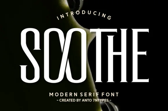
Soothe is a modern serif in cream on a dark botanical ground: very high contrast, condensed caps with hairline joins, sharp flat serifs and a circular O, set in two lines with a tracked caption beneath, so the pair reads as a fashion or beauty masthead.
Ideas for this font

Flamboyant coiled-swash couture editorial serif
Alerigue is a high-contrast luxury editorial serif distinguished by dramatic coiled spiral terminals and sweeping calligraphic ascender loops.
Ideas for this font

Bold transitional display serif with overhead canopy swash
Vanielst is a substantial, medium-high-contrast display serif highlighted by graceful overhead swash loops and crisp bracketed feet.
Ideas for this font

Warm contemporary medium-bold book & coffeehouse serif
Brenco is a grounded, medium-bold contemporary serif with sturdy bracketed feet and warm, approachable lowercase curves.
Ideas for this font
Same independent foundry
Allow optional Google Analytics to measure visits and catalogue actions. Your search words and notes are not included. Privacy & storage