Modern Grotesque Body

Timelapse + Hermano
Creates crisp high-hierarchy contrast beneath Timelapse headlines across menus, websites and labels.
Inspect Hermano specimenDisclosure: MakerFileHub may earn a commission from qualifying purchases via paid links on this page. How our links work.
Swashed Victorian storybook & apothecary display serif
Timelapse is an ornate Victorian display serif crowned with spiraling vine swashes, teardrop terminals, and vintage apothecary charm.
Paid link
Get this fontProject & layout blueprintsAt-a-glance maker compatibility
Sturdy stroke walls and open counters weed cleanly on adhesive vinyl, HTV apparel film, and cut cardstock.
Visual anatomy & craft review
Timelapse is a Victorian storybook and apothecary display serif with swashes: fine bracketed serifs against heavy stems, a small ball terminal on the diagonals, swash capitals that curl off the first letter and a slightly condensed width that keeps a long label on one line. The hairlines are the design and the swashes need side clearance. It needs roughly 30 mm for the swash and the hairline to read, and it is best in one fine ink on smooth or coated stock, or a foil impression above 40 pt where the curls still turn.
Victorian · Whimsical · Filigreed
Two-font hierarchy recipes
Tested contrast partners — pairing Timelapse with grounded secondary typography.
Timelapse + Hermano
Creates crisp high-hierarchy contrast beneath Timelapse headlines across menus, websites and labels.
Inspect Hermano specimen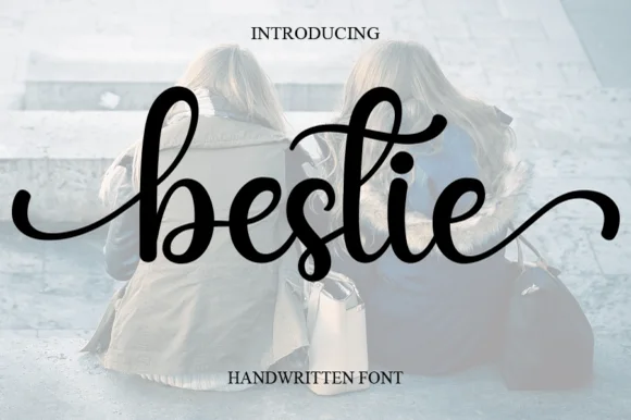
Timelapse + Bestie
Adds a warm human signature touch for 1-to-3-word callouts without competing against structured serif capitals.
Inspect Bestie specimenPractical applications
Concrete hierarchy, scale and production guidance tailored to Timelapse’s stroke geometry.
A Victorian swash serif gives a story spread the look of a printed title page. The swashes hold at 52 pt on a coated page, and the condensed width keeps a long title on one line.
Hierarchy & layout recipe
Opener 210 x 297 mm, title 52 pt with 10 mm swash clearance, standfirst 11/15 pt, body 9/13 pt over two columns of 82 mm, 18 mm margins. Drop cap 96 pt. Section head 24 pt.
Pre-production check
At 24 pt on the section head the swash closes into the next letter and the head reads as a knot. Keep the face at 40 pt and above, and proof one spread at 1:1.
A Victorian serif reads as an engraved apothecary label rather than a modern mark. The swashes hold at 26 mm on a bottle, and one fine ink prints the label and the box in one order.
Hierarchy & layout recipe
Bottle label 90 x 70 mm, word 26 mm with 10 mm swash clearance, details 7/9 pt, 5 mm margins. Box print 150 x 100 mm, word 34 mm, 10 mm margins. Card 85 x 55 mm, word 16 mm, 5 mm margins.
Pre-production check
A 90 x 70 mm label wrapped on a curve pulls the hairlines past the die line and the blade clips the swash. Pull the word in 4 mm, and check one label on an empty bottle before the run.
A Victorian serif reads as a printed country bill rather than a modern flyer. The swashes hold at 100 mm on a poster, and one ink prints the poster and the prize labels in one order.
Hierarchy & layout recipe
Poster A2, word 100 mm with 12 mm swash clearance, details 34 mm, 20 mm margins. Tent sign 600 x 400 mm, word 90 mm, 25 mm margins. Prize label 90 x 60 mm, word 18 mm, 5 mm margins.
Pre-production check
A 90 x 60 mm prize label at 18 mm fills the swash and the word reads as a stain. Raise the label word to 24 mm, and print one label before the batch.
Technical & licence verification
Confirm included OTF/TTF/WOFF formats, full glyph tables and licence coverage on the live store page before batch production.
Closest visual alternatives
Matched across letterform anatomy, stroke behaviour and craft applications.
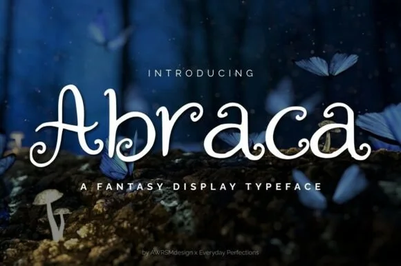
Whimsical spiral-curled enchanted fairytale display serif (OTF & TTF)
Abraca is an enchanted storybook display serif curling delicate fairytale spirals into the bowls and terminals of 'A', 'b', 'r', 'a', and 'c' (OTF & TTF)!
Ideas for this font
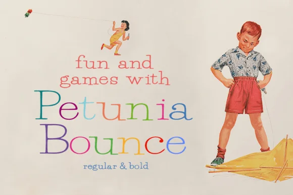
Quirky playful serif with a bounce and hand-drawn alternates
Petunia Bounce is a quirky serif in which the letters step up and down, the serifs stay soft and the alternates swap in rounder forms, so a two-word title reads as a children's book headline rather than as a text face.
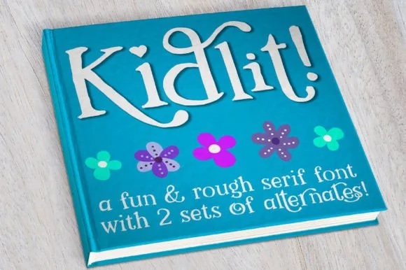
Hand-drawn bouncy storybook serif with curled ascenders
Kidlit is a lively hand-drawn serif with organic, slightly wiggly stems, curled ascender tops, and multi-set alternates.
Ideas for this font
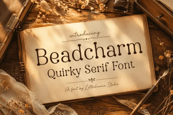
Whimsical beaded ball-terminal cottagecore serif
Beadcharm is an endearing hand-drawn serif tipping slender stems and arches with round, bead-like ball terminals!
Ideas for this font
Same independent foundry
Allow optional Google Analytics to measure visits and catalogue actions. Your search words and notes are not included. Privacy & storage