Modern Grotesque Body

Praise + Base Edge
Creates crisp high-hierarchy contrast beneath Praise headlines across menus, websites and labels.
Inspect Base Edge specimenDisclosure: MakerFileHub may earn a commission from qualifying purchases via paid links on this page. How our links work.
Elegant display serif with thinned stems and star-cut counters
Praise is an elegant display serif in which the stems narrow to blades, the feet flatten into hairline serifs and one counter opens as a small star, so a single word reads as a fashion masthead with one deliberate interruption.
Paid link
Get this fontProject & layout blueprintsAt-a-glance maker compatibility
Sturdy stroke walls and open counters weed cleanly on adhesive vinyl, HTV apparel film, and cut cardstock.
Visual anatomy & craft review
The P opens a blade-like bowl on a thin stem, the R turns a hairline leg, the A pinches to a pointed apex, the I carries a star in place of a dot, the S holds a fine spine and the E sets three thin arms, all at a high contrast with flat unbracketed serifs. The star counter is the character: it is the only ornament in the set, which is why the face carries one word and nothing else. Because the stems are thin, the face needs 40 pt upward and a coated stock, and it reads best as white on a dark ground. The dark green field, the small letter-spaced line above and the credit beneath are presentation; the light display word is the face.
Elegant · Contrast · Modern
Two-font hierarchy recipes
Tested contrast partners — pairing Praise with grounded secondary typography.
Praise + Base Edge
Creates crisp high-hierarchy contrast beneath Praise headlines across menus, websites and labels.
Inspect Base Edge specimen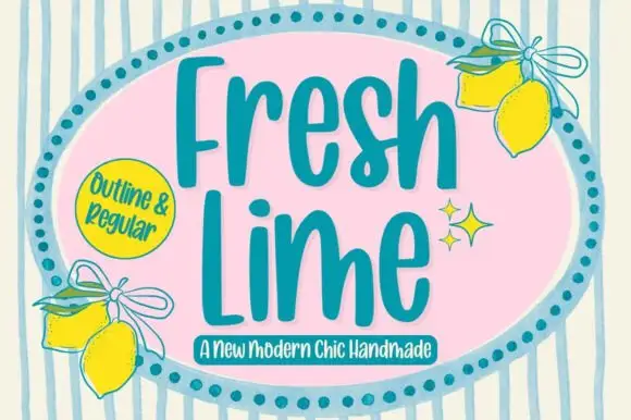
Praise + Fresh Lime
Adds a warm human signature touch for 1-to-3-word callouts without competing against structured serif capitals.
Inspect Fresh Lime specimenPractical applications
Concrete hierarchy, scale and production guidance tailored to Praise’s stroke geometry.
The blade stems hold a single word at masthead size, and the star counter gives a plain cover one memorable interruption at 130 pt.
Hierarchy & layout recipe
Print an A4 cover: set the word at 130 pt in white over the dark ground, keep 30 mm of margin, and set the issue line in a 9 pt caps sans 24 mm beneath the baseline.
Pre-production check
A blade stem thinner than 0.15 mm drops out in reverse; check the printed cover and keep the word at or above 120 pt.
The modern contrast suits a gallery identity, and the thin stems print cleanly at 26 pt on a coated card in one flat colour.
Hierarchy & layout recipe
Print an 85 by 55 mm card: set the gallery name at 26 pt, set the exhibition line in a 6 pt sans at the foot, and keep 12 mm of white under the word so the flat serifs are not crowded.
Pre-production check
A matte card pulls ink from a thin stem; check one card and specify a coated stock if the stem greys out.
The elegant serif gives a seating chart a formal head, and the fine stems stay readable at 44 pt above a long list of names.
Hierarchy & layout recipe
Print an A2 chart: set the header at 44 pt across the top, keep 30 mm between the header and the first table row, and set the table labels in a 14 pt caps serif.
Pre-production check
A high-contrast header above a busy list loses its thin strokes; check the chart from two metres and increase the size rather than the weight.
Technical & licence verification
Confirm included OTF/TTF/WOFF formats, full glyph tables and licence coverage on the live store page before batch production.
Closest visual alternatives
Matched across letterform anatomy, stroke behaviour and craft applications.
Delicate high-contrast serif
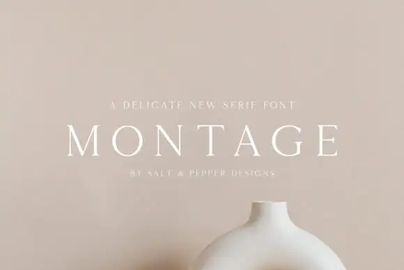
Montage is a delicate serif in white on a soft beige field: very fine hairlines, wide letterspacing, thin bracketed serifs and a high waist, set in caps on one line with a tracked line above and an attribution beneath, on a still life of a ceramic vessel.
Ideas for this font

Fine serif title with large upper and lower loops
Amilea shows pale yellow high-contrast letters with fine tapered serifs and broad rounded lowercase over a dark portrait, where a thin loop curves below the capital A and a tall upper flourish crosses the central ascender before sweeping right.

Modern combination serif with italic
Things is a modern serif in blue on white: moderate-high contrast, a wide f with an overhanging arm, a g whose descender loops fully closed, and tall ascenders, presented with a note that the family includes an italic and a paragraph of small text.
Ideas for this font
Slanted light capitals with fine serifs and selective curling extensions
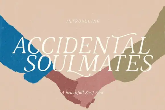
Accidental Soulmates is a slanted light serif in which the capitals lean together, the serifs stay fine and two long extensions curl above the first row and sweep below the second, so a two-line title reads as a romantic editorial head.
Ideas for this font
Same independent foundry
Allow optional Google Analytics to measure visits and catalogue actions. Your search words and notes are not included. Privacy & storage