Modern Grotesque Body

College Block 2.0 + Monure
Creates crisp high-hierarchy contrast beneath College Block 2.0 headlines across menus, websites and labels.
Inspect Monure specimenDisclosure: MakerFileHub may earn a commission from qualifying purchases via paid links on this page. How our links work.
Athletic block capitals with clipped corners and solid or hollow cover treatments
College Block 2.0 displays yellow block lettering on textured red, where the main title curves upward across a shallow arc and EST. and 2017 appear as thin hollow outlines beside a much larger solid 2.0 with clipped corners.
Paid link
Get this fontProject & layout blueprintsAt-a-glance maker compatibility
Sturdy stroke walls and open counters weed cleanly on adhesive vinyl, HTV apparel film, and cut cardstock.
Visual anatomy & craft review
The blocks stay square and heavy, the counters narrow to rectangles, the secondary words thin into outlines and the main row follows an arc. That three-level treatment is the character: the sample builds a date lockup from one face by changing scale and outline, which is why the texture sits in the ground rather than the letters. The arch is a composition choice, not a font feature. Keep 44 pt, build the arc in your layout tool and check the thin outlines at the size you plan.
Athletic block capitals with clipped corners and solid or hollow cover treatments
Two-font hierarchy recipes
Tested contrast partners — pairing College Block 2.0 with grounded secondary typography.
College Block 2.0 + Monure
Creates crisp high-hierarchy contrast beneath College Block 2.0 headlines across menus, websites and labels.
Inspect Monure specimen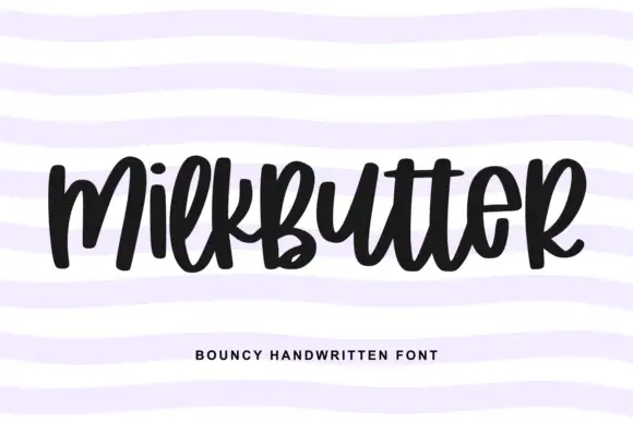
College Block 2.0 + Milkbutter
Adds a warm human signature touch for 1-to-3-word callouts without competing against structured serif capitals.
Inspect Milkbutter specimenPractical applications
Concrete hierarchy, scale and production guidance tailored to College Block 2.0’s stroke geometry.
The arched blocks and the hollow date marks suit a school anniversary print, where one face covers the name and the year.
Hierarchy & layout recipe
Print a 280 mm back panel: set the school name at 64 mm on a shallow arc, set the year at 40 mm beneath as an outline, keep 18 mm of clear ground between them, and keep 20 mm of margin from the seams.
Pre-production check
Thin hollow outlines break under a heat press; check a transfer proof before ordering the shirt run.
The college blocks read from a path, and the outline treatment keeps the secondary reunion date from competing with the name.
Hierarchy & layout recipe
Print a 700 by 300 mm panel: set the event name at 54 mm on an arc, set the year at 32 mm as an outline beneath, keep 22 mm of clear ground, and keep 26 mm of border all round.
Pre-production check
Arcs made by hand drift badly at this size; check the artwork against a printed template first.
The blocks give a campus brand a familiar register, and the hollow outline style can mark a limited edition on a small label.
Hierarchy & layout recipe
Print a 60 by 90 mm label: set the brand at 22 pt on one row, set the year at 14 pt as an outline beneath, keep 9 mm of clear ground, and keep 6 mm to the die edge.
Pre-production check
Hollow outlines under 12 pt close up; check the plate proof and hold them at 14 pt or above.
Technical & licence verification
Confirm included OTF/TTF/WOFF formats, full glyph tables and licence coverage on the live store page before batch production.
Closest visual alternatives
Matched across letterform anatomy, stroke behaviour and craft applications.
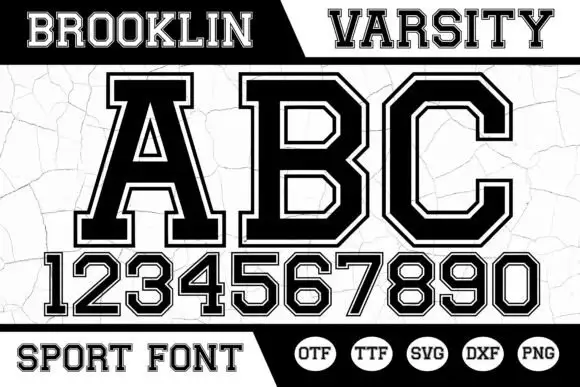
Angular bordered athletic capitals with matched numerals
Brooklin Varsity is an athletic display face: heavy capitals with sharp inner corners, a white inline border running inside each stroke, and a full numeral set drawn to the same construction.
Ideas for this font
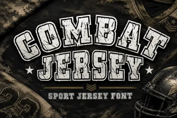
Arched athletic slabs with pale fill, dark contours and scattered chips
Combat Jersey is an athletic slab in which the upper word follows an upward arc, the lower word runs straight with rounded rectangular bowls, and a pale fill sits inside heavy dark contours scattered with small chips.
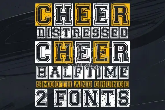
Outlined varsity capitals with a distressed twin and a squared skeleton
Cheer is a varsity capital alphabet shown as a clean outline and a distressed twin, built on a squared skeleton with an inner border and heavy slabs.
Ideas for this font
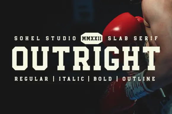
Angular athletic slab
Outright is an angular athletic slab in cream over a dark boxing photograph: wide slab caps with narrow counters, chamfered corners and flat heavy serifs, with a tracked line above broken by a small hexagonal badge and a tracked line beneath listing the four cuts.
Ideas for this font
Same independent foundry
Allow optional Google Analytics to measure visits and catalogue actions. Your search words and notes are not included. Privacy & storage