Modern Grotesque Body

Cowboy Zombie + Swaraga
Creates crisp high-hierarchy contrast beneath Cowboy Zombie headlines across menus, websites and labels.
Inspect Swaraga specimenDisclosure: MakerFileHub may earn a commission from qualifying purchases via paid links on this page. How our links work.
Tall Western slab capitals with inward midline notches and heavy angled strokes
Cowboy Zombie is a tall Western slab in which the serifs block wide, the midlines notch inward and the O closes to a narrow vertical slot, so a two-word title reads as a painted frontier board.
Paid link
Get this fontProject & layout blueprintsAt-a-glance maker compatibility
Fine grain and micro-texture excel in 300 DPI print, sublimation, and screen print rather than small vinyl weeding.
Visual anatomy & craft review
The W spreads into heavy angled strokes, the M mirrors them under a shallow apex, the O pinches to a narrow slot and the R carries a thick leg under a squared bowl, all at a display weight with slabs that run wider than the stems. The notch at the midline is the character: it splits each tall letter into two stacked blocks, which is why the sample sets a title in two rows with a rule between them. The tall proportions mean a long word fills a narrow board, so the face reads from 8 pt but wants 40 mm or more on a painted sign. The sand ground, the rope border, the stars and the small caps line are presentation.
Western · Notched · Heavy
Two-font hierarchy recipes
Tested contrast partners — pairing Cowboy Zombie with grounded secondary typography.
Cowboy Zombie + Swaraga
Creates crisp high-hierarchy contrast beneath Cowboy Zombie headlines across menus, websites and labels.
Inspect Swaraga specimen
Cowboy Zombie + Black Ink Brush
Adds a warm human signature touch for 1-to-3-word callouts without competing against structured serif capitals.
Inspect Black Ink Brush specimenPractical applications
Concrete hierarchy, scale and production guidance tailored to Cowboy Zombie’s stroke geometry.
The tall slabs read across an arena, and the notched midlines hold up at 90 mm on a painted board in two flat colours without the letters bleeding into one block.
Hierarchy & layout recipe
Paint a 900 by 400 mm board: set the title at 90 mm on two rows, keep 30 mm between the rows so the notches stay separate, and set the dates in a 20 mm caps along the lower edge.
Pre-production check
Two rows of notched caps painted close merge into one block; check the board from ten metres and open the gap rather than lowering the letters.
The frontier slabs carry a food label, and the heavy strokes stay solid at 26 pt on a 70 mm jar label with a plain subtitle.
Hierarchy & layout recipe
Print a 70 by 50 mm label: set the brand at 26 pt, set the flavour in a 8 pt caps beneath, and keep 6 mm from the die so the wide slabs are not clipped.
Pre-production check
Wide slabs run past a curved label edge; check the wrap and keep every serif 5 mm inside the visible panel.
The Western weight suits a themed supper, and the condensed caps fill a narrow poster column at 70 mm with a plain time block beneath.
Hierarchy & layout recipe
Print an A2 poster: set the title at 70 mm across the upper half, set the menu and times at 14 pt in a serif in the lower third, and keep 28 mm of border all round.
Pre-production check
A notched letter printed against a decorative border reads as damaged; check the poster and keep 25 mm of clear ground around the title block.
Technical & licence verification
Confirm included OTF/TTF/WOFF formats, full glyph tables and licence coverage on the live store page before batch production.
Closest visual alternatives
Matched across letterform anatomy, stroke behaviour and craft applications.
Narrow soft slab
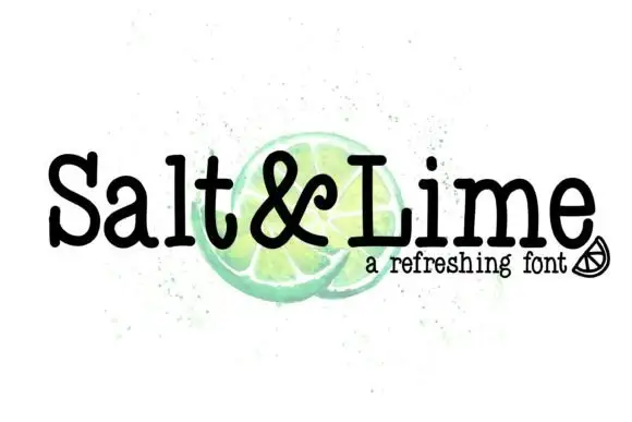
Salt & Lime is a narrow soft slab in black over a watercolour lime on white: mixed case with rounded slab endings, a tight rhythm and a large x-height, with the ampersand drawn at the same weight and a small line beneath in a tracked sans.
Ideas for this font
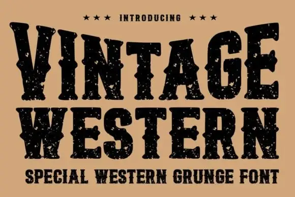
Grunge western slab
Vintage Western is a grunge western slab in black on tan: heavy bracketed serifs with deep notches, a swollen waist and thick stems, the whole surface eaten by a speckled wear, with three stars above and a tracked subtitle beneath in the same face.
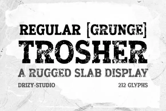
Rugged eroded slab display
Trosher is a rugged slab display in black on a mottled white ground: broad bracketed slabs with clean and heavily eroded fills, mixed case with tall ascenders and a full-width setting, with a bracketed note above, a plain line beneath and two small notes at the foot.
Ideas for this font
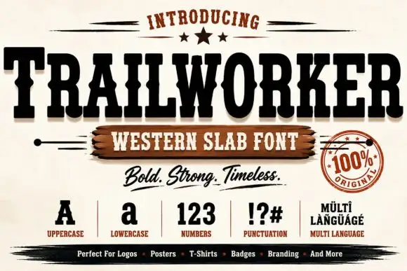
Heavy ornamental western display
Trailworker is a heavy western display in black on cream: very wide slabs with notched and inlaid strokes, spurred serifs, and a decorative centre notch on several letters, presented with a script tagline, a set of specimen glyphs and a round seal, so the sheet reads as a full western kit.
Ideas for this font
Same independent foundry
Allow optional Google Analytics to measure visits and catalogue actions. Your search words and notes are not included. Privacy & storage