 #1 · Best Overall
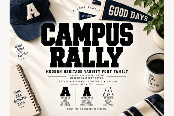
Campus Rally
3-style collegiate varsity slab family (Regular, Condensed & Outline)
Get fontPaid link
Read review ↓Disclosure: MakerFileHub may earn a commission from qualifying purchases via paid links on this page. How our links work.
Circular lockups, letterman patches & crest lettering
A badge is a lockup before it is a typeface: a curved top line, a straight middle line and a small date or place at the bottom. Campus Rally and Western Vintage handle the athletic and saloon registers, Peach Mighties and Monarch Heritage cover the soft and editorial serif sides, and Madliners and Agrifox Mestalube provide the script-plus-sans duos that badge layouts usually need.
Quick verdict
Campus Rally is the most complete badge family with outline and condensed variants, Peach Mighties is the strongest soft serif for a heritage mark, and Madliners covers the rough script and stamp duo. Western Vintage handles the saloon register.
Quick answer
Short on time? Start with our three highest-rated vintage logo badges & heritage emblems standouts before scrolling the full breakdown.
#1 · Best Overall3-style collegiate varsity slab family (Regular, Condensed & Outline)
 #2 · Runner-Up Pick
 #3 · Editor's Choice
Open-inline 1920s Art Deco architectural display serif
We kept 20 of 352 candidates, judging each inside a circular lockup rather than as a standalone headline. Weighted how the face curves along an arc, whether outline and condensed variants exist, and how small date text behaves at 6 pt.
Side-by-side summary
Compare specimens, OpenType/PUA traits and primary project roles side by side.
| Rank & Font | Style & File Specs | Best Project Fit | Store Listing |
|---|---|---|---|
| Slab SerifCollegiate | University spirit crewneck, felt pennant & graduation banner | Get fontPaid link | |
| Slab SerifFile formats | Garage metal sign, craft beer label or leather hat patch | Get fontPaid link | |
| SerifGatsby-Deco | 1920s Gatsby wedding invitation, speakeasy bar menu & table number | Get fontPaid link | |
| SerifRegal | Luxury magazine cover, fashion monograph & novel jacket | Get fontPaid link | |
| SerifVictorian-biker | Custom garage tee, coffee-roaster tin & whiskey label | Get fontPaid link |
#1 · Best OverallCampus Rally is a crisp, clean 3-style collegiate varsity slab family bundling matched Regular, Condensed, and Outline cuts.
Campus Rally is a three-style collegiate varsity slab family in a regular, a condensed and an outline cut: extended block letters with thick unbracketed slabs, a small notch on the terminals, a narrow version for long names and an outline version for layered printing. The family covers a shirt, a pennant and a certificate in one voice, and the outline cut is the weakest element in print. The regular needs roughly 30 mm, the condensed 26 mm and the outline 34 mm for their detail to read.
University spirit crewneck, felt pennant & graduation banner — Stack 2 solid uppercase rows in navy, forest green, or crimson at tight 0.92 line spacing above clean crest rules.
Zero grunge speckles—Regular and Condensed cut super cleanly on HTV, puff vinyl, and felt down to 0.55 inches.
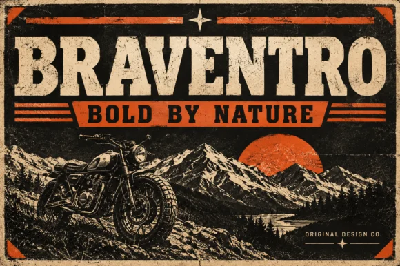
#2 · Runner-Up PickBraventro is a heavy heritage slab in which the brackets run broad, the counters stay compact and the stems carry sign-letter weight, so a two-word heading reads as a stencilled tin sign for an outdoor brand.
The B stacks two dense bowls, the R keeps a compact bowl over a heavy leg, the A carries a wide apex with a low crossbar and the V drops two thick diagonals into a narrow point, all at a sign weight with bracketed serifs and small counters. The density is the character: the letters sit close and the ink covers most of the box, which is why the sample sets a short phrase on a plain tin ground. Because the counters are small, the face wants 30 pt before they stay open, and it holds from three quarters of an inch of cap height on wood, acrylic or vinyl. The rivets, the rust texture and the small subline are presentation; the heavy slab words are the face.
Garage metal sign, craft beer label or leather hat patch — Pair with a ribbon banner subline in bold sans capitals.
OTF display font; solid bold edges cut cleanly on stencils and vinyl.
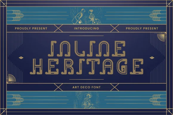
#3 · Editor's ChoiceInline Heritage - Art Deco is a geometric 1920s Art Deco display typeface carved with continuous open inline channels and curled step terminals.
Inline Heritage is a nineteen-twenties Art Deco architectural display serif drawn as an open inline: tall narrow caps, a fine channel running down each stem, stepped shoulders and a strict geometric base with sharp unbracketed feet. The channel is the whole design and it closes first at small sizes, and the tall proportion stacks a long word vertically. It needs roughly 32 mm for the channel to stay open, and it is best in one deep ink on cream, or a metallic ink on deep green where the channel prints as a bright line.
1920s Gatsby wedding invitation, speakeasy bar menu & table number — Set 2 centered uppercase lines at 42–72 pt with +20 tracking in champagne gold over deep peacock teal or black.
Open inline channels shine in gold foil stamping, flat print, and laser-engraved acrylic; scale vinyl above 2 inches if cutting.
 #4 · Top Maker Utility
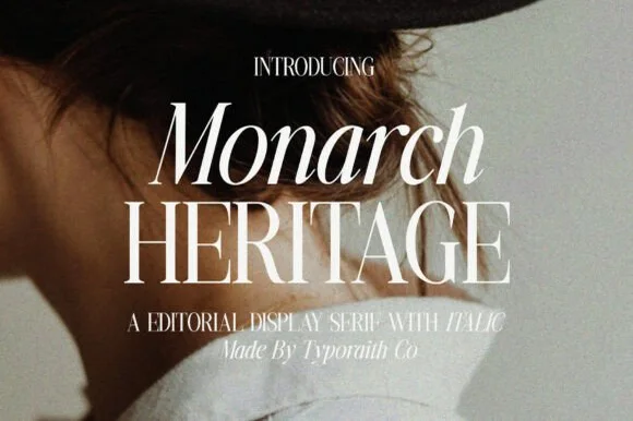
Monarch Heritage is a tall, narrow luxury editorial serif family (Regular & Italic) with crisp Didone hairlines and poised classical proportions.
Monarch Heritage is a tall high-contrast editorial display serif with a regular and an italic: thin hairlines against firm stems, sharp wedge serifs, a small ball terminal on the f and a tall ascender that gives a word vertical presence. The hairlines are the weakest part in print and the wedge serifs are what survives at display size. It needs roughly 24 mm for the wedge serif and the hairline to read, and it is best in one black on a smooth text stock, or a single deep colour on cream where the hairlines stay open.
Luxury magazine cover, fashion monograph & novel jacket — Set line one in Italic at 64 pt and line two in upright all-caps at 68 pt with tight 0.90 line spacing.
Razor-thin horizontal hairlines belong in print, foil, and high-res web/social graphics rather than blade-cut vinyl.
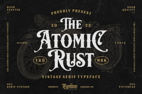 #5 · Standout Silhouette
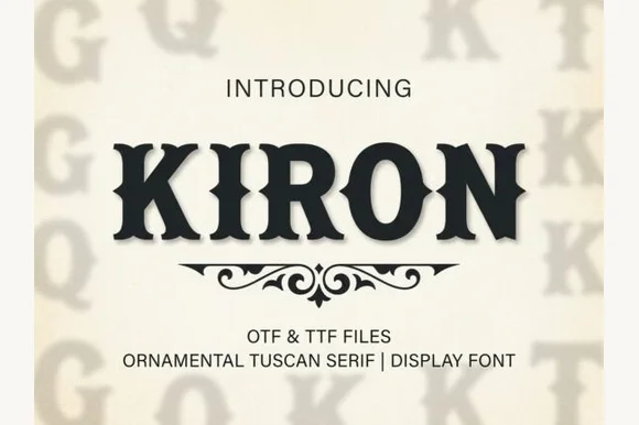
Atomic Rust is an all-caps Victorian heritage serif armed with median stem thorns, curled swash legs, and classic garage-emblem swagger.
Atomic Rust is a Victorian heritage display serif crossed with custom-motorcycle lettering: heavy stems with a thin inner line, exaggerated bracketed serifs that flare into small scrolls, and a small pinched waist on some strokes that reads as hand-painted enamel. The inner line and the scrolls are the finest elements and both close when the face is reduced. It needs roughly 32 mm for the inner line and the scroll to read, and it is best in one fine metallic on a dark ground, or a dense ink on cream with a spot varnish.
Custom garage tee, coffee-roaster tin & whiskey label — Stack 3 centered words ('THE / ATOMIC / RUST') in descending/ascending widths with tucked swash capitals on outer edges.
Because strokes are solid (not speckled with grunge), Atomic Rust cuts cleanly on 1.25 in+ HTV and sign vinyl.
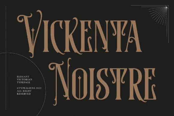 #6
Vickenta Noistre is a tall, condensed Victorian display serif adorned with median thorns, dramatic dropped capitals, and curled descenders.
Vickenta Noistre is a tall condensed Victorian thorny display serif: narrow bracketed stems, split serifs that finish in a drawn thorn, swashes that curl off the caps and a small spur on the round letters. The thorns break the silhouette and the condensation keeps a long word in a narrow board, but the thorns close first at small sizes. It needs roughly 32 mm for the thorn and the swash to read, and it is best in one dense ink on cream and stone, or a single dark red on parchment, and it should never be reversed small.
Gothic apothecary bottle, dark-academia book & tarot box — Offset two all-caps lines diagonally in antique gold or warm tan over matte charcoal with tiny corner spec blocks.
Fine horizontal crossbars and sharp side thorns are built for bottle labels, book covers, and foil—not small cut vinyl.
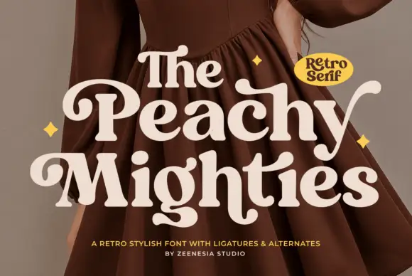 #7
Peach Mighties is a heavy soft serif in which the strokes stay thick and round, the counters shrink, the capital P curls inward and the y and lower terminals sweep out into broad soft hooks.
The P turns its bowl inward, the y drops a broad outward hook, several lower terminals finish in soft sweeps and the internal counters stay small ovals. The generous hook is the character: it gives the end of a word a gesture without adding a separate swash. Because the hooks travel, keep 20 mm at each end from 28 pt and let the spelling stay short so two hooks do not collide. The dress photograph, stars and badge in the sample are presentation; the cream lettering is the face.
A retro paper-goods name study — Use a flat lockup with space below the hooked terminals.
Check name rights, exact alternates and small counters.
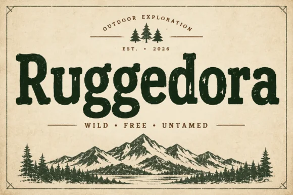 #8
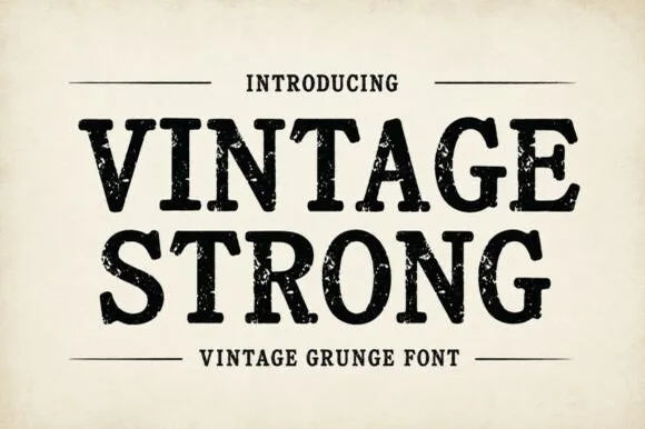
Ruggedora is a heavy, softly distressed vintage slab serif with plump rounded bowls, bracketed feet, and weathered trail-sign warmth.
Ruggedora is a worn Cooper-style vintage slab serif: heavy bracketed slabs, a rounded stem, and a surface that is chipped along the contour with small voids inside the stroke so the letter reads as letterpress kept in a drawer. The wear is drawn, so a one-colour print keeps it, and the bracket is what closes first at small sizes. It needs roughly 30 mm for the bracket and the chips to read, and it is best in one dense ink on kraft and newsprint, or white on a dark board where the chips print as lights.
Campfire enamel mug, national-park patch & overland decal — Center the main title in forest green, rust, or charcoal above wide-tracked sans mottoes ('WILD · FREE · UNTAMED') and pine icons.
Solid interior letter bodies allow clean HTV and outdoor car-decal weeding down to 0.85 inches.
 #9
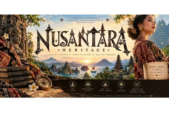
Nusantara Heritage is an ornate cultural display serif inspired by Indonesian archipelago temple carvings, tropical flora, and traditional craft motifs.
Nusantara Heritage is an ornate cultural display serif crowned with flame-carved finials, foliate curl spurs along the stems and PUA-encoded craft motifs, so a word reads as a carved temple panel rather than a decorated title. The carving sits inside and above the letter, which means the face needs size for the motifs to read, and the serifs stay legible at 20 pt. It needs roughly 32 mm for the carving to hold, and it is best in charcoal on pale parchment or in gold on deep indigo.
Single-origin Sumatra/Java coffee bag, spice box & resort sign — Set 1 hero uppercase word at 48–84 pt with a smaller wide-tracked serif subword ('· HERITAGE ·') centered underneath.
Detailed foliate finials reproduce best on printed coffee pouches, embossed boxes, laser wood plaques, and web headers (WOFF2 included).
 #10
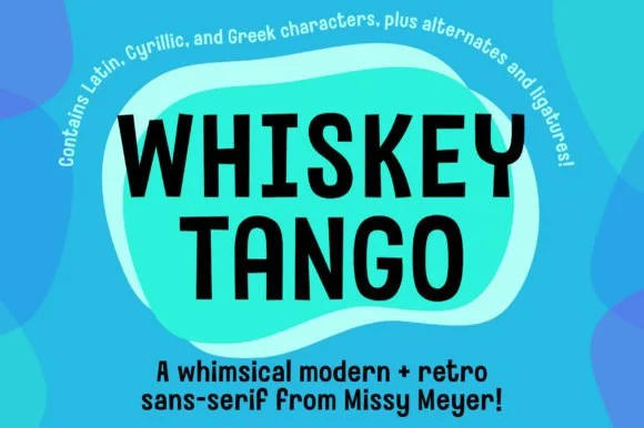
Whiskey Tango is a lively, tall-and-narrow rounded sans-serif packed with Latin, Cyrillic, and Greek support plus over 110 PUA alternates.
Whiskey Tango is a tall condensed rounded retro sans with more than a hundred and ten private-use extras: squeezed caps with soft corners and a high waist, plus swash letters, ligatures, tails and ornaments reached through alternate keystrokes. It is a packaging face, so it wants a tall panel and a single flat ink rather than a soft ground. The soft corners are the finest element and they plug first at small sizes. It needs roughly 26 mm for the corner and the condensed stem to read, and it is best one flat ink on kraft or white board.
Retro travel poster, podcast cover & cocktail menu — Stack two-word drink or episode titles in 48 pt uppercase at tight 0.95 line-height, using mixed-case Whiskey Tango or a light sans for descriptions.
Rounded stroke ends and generous counters make this one of the cleanest tall sans faces to cut on Oracal 651 or HTV even at 0.65 in.
 #11
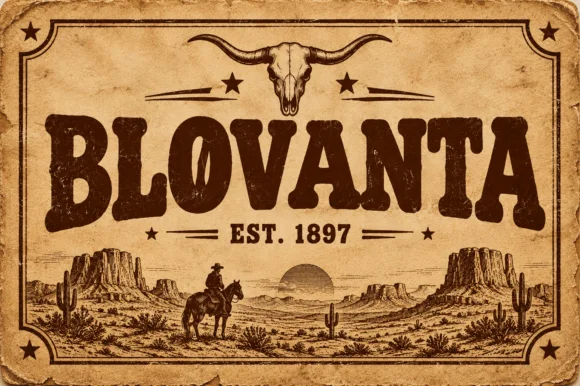
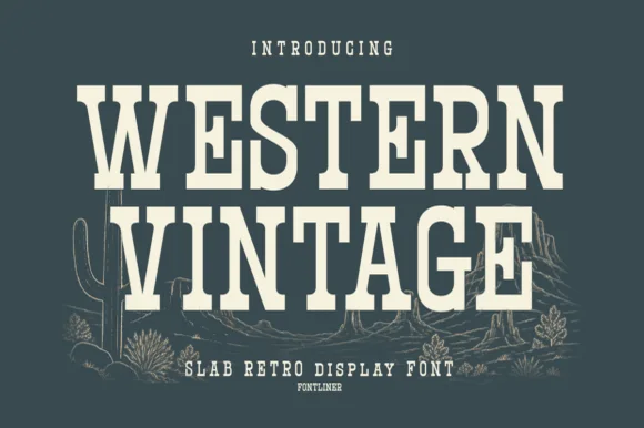
Western Vintage is a bold, condensed slab serif with crisp bracketed block feet and tall frontier poster proportions.
Western Vintage is a tall condensed Western saloon slab serif: heavy squared slabs on a narrow body, a very tall ascender, a spurred stem and a set of inline and shadow companions in the same proportions. It is the lettering of a saloon sign and a rodeo poster, so it wants height and one flat ink rather than a soft palette. The slab spurs are the finest element and they fill first at small sizes. It needs roughly 38 mm for the slab and the spur to read, and it is best on a painted board or a kraft ground.
Small-batch hot sauce, BBQ rub & smokehouse label — Arch 'WESTERN' or the brand title slightly at +15 tracking above a horizontal divider rule and a bold heat-level badge.
Straight block slabs and open counters weed cleanly on adhesive vinyl, stencil film, and leather laser-engraving down to 0.6 in.
 #12
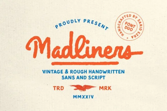
Madliners is a warm vintage monoline font duo combining a thick, rough-edged connected script (with underline tail) and a matching stamp sans.
Madliners is a duo: a rough-edged vintage monoline script with a shaky even line, plus a stamp-textured sans for the supporting details. The script carries personality and the sans carries information, so a sign uses two voices from one family. The rough edge is drawn into the contour, so a one-colour print keeps it, and the monoline survives small sizes better than a contrast script. The script needs roughly 22 mm and the stamp sans 12 mm for the texturing to read.
Retro surf-wax tin, skate-shop tee & craft-beer coaster — Arch the sans eyebrow ('PROUDLY PRESENT'), center vermilion Madliners Script with its tail underline, and stack teal sans below.
Gentle outer roughness (no tiny internal pinholes!) cuts cleanly on 1.1 in+ HTV and sticker vinyl—weld script joins first!
 #13
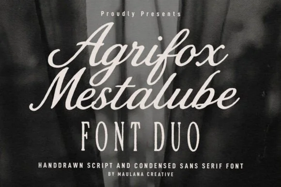
Agrifox Mestalube is a high-contrast heritage font duo pairing a juicy slanted brush script with a tall, airy monoline condensed sans.
Agrifox Mestalube is a duo of a bold retro brush script and a tall skinny condensed sans, so one line is spoken in brush and the next is stated in a narrow cap column. The script has thick connectors and a slight bounce, the sans is a flat-sided column with tight sidebearings, and the pair shares a warm mid-century tone. It needs roughly 26 mm for the script and roughly 12 mm for the sans, and it is best in burnt orange or ink on cream and kraft.
menswear / barber label, coffee-roast bag & leather apron — Stack 1–2 brush Script words (72 pt) above wide-tracked Agrifox Condensed Sans caps (44 pt).
Both fonts feature sturdy, vinyl-safe stroke weights—Weld cursive joins on the Script and cut cleanly down to 0.85 in!
 #14
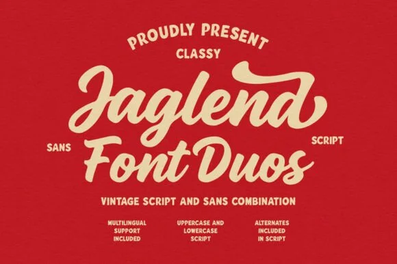
Jaglend Font Duo pairs a thick, creamy vintage sign-painter brush script with a sturdy, hand-drawn condensed uppercase sans companion.
Jaglend Font Duo pairs a retro sign-painter brush script with a rugged condensed sans: the script carries a loaded stroke with small flicks and connected letters on a firm slant and a shallow bounce, while the sans is narrow with uneven edges that read as a sanded board for lists and prices. The two voices share one palette, so a window, a price list and a card can be built from one family without a third face. The script's flicks are the finest element and they close first at small sizes, while the condensed sans stacks a long service list in a narrow panel without wrapping. The script needs roughly 24 mm and the condensed sans 18 mm for their detail to read.
BBQ rub tin, craft soda label & barbershop window sign — Arch the sans uppercase header over a large slanted Jaglend Script centerpiece and anchor with tracked sans footers.
Broad solid brush strokes cut cleanly on HTV, sticker vinyl, and wood-sign stencils—weld script connections before cutting.
 #15
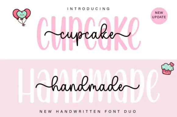
Cupcake Handmade Duo places tall narrow rounded letters in pale pink behind a smaller connected script line in black, twice on one cover, where the script carries long outer tails and looped k and h forms while a balloon pair, a cupcake drawing and an update badge sit in the corners.
The caps stay tall and narrow, the script stays compact and continuous, the loops open large and the tails run wide past the caps on both sides. That size gap is the character, because the script sits inside the cap row rather than under it. The balloons, the cupcake and the badge are separate sample elements, so do not count them as part of the type. Keep 34 pt for the caps and 16 pt for the script, and check the k and h loops against your margins before locking the lockup.
A cupcake-table heading — Place the capital title above, not behind, the script; put flavours and dietary information in a plain panel below.
Check both supplied styles and essential food information separately.
 #16
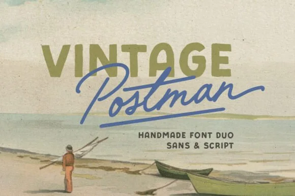
Vintage Postman pairs a sturdy retro sans with the look of a soft rubber stamp and a brisk monoline brush script: the olive sans holds a solid horizontal line while the angled script cuts across the baseline with a hand-signed slant.
The sans cut keeps even stems, softly rounded corners and a slightly uneven impression, and the script cut draws a monoline stroke at a steady width with a sharp slant and quick connectors. The pairing of a grounded row and an angled line is the character: one gives structure and the other gives motion, which is why the sample sets the olive words above the blue signature. Because the script slants, keep 18 mm between the rows and 20 mm at the right for the exit; the sans stays readable from 0.35 inches of pen height.
Coffee bag label, travel poster or surf-shop tee — Set the geographical or brand noun in all-caps sans and overlap the descriptor in angled script.
Check light organic edge texture on the sans if cutting decals under 1.5 inches.
 #17
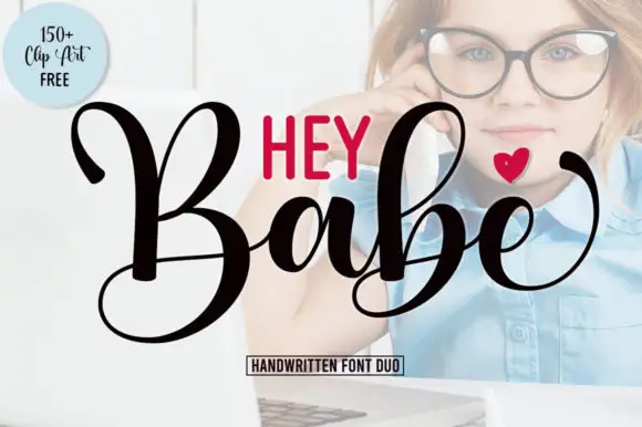
Hey Babe is a duo of a heavy looping script with tall capitals and a smaller rounded sans, arranged so a bold script line carries the design and the sans supplies the second voice.
The script half opens with a large B whose loop rises above the cap line and crosses its own stem, and the letters after it keep that weight: the a closes a round bowl, the b repeats the tall loop, the e curls its exit and the final e lifts away with a flourish. Weight is heavy and constant, joins stay as thick as the stems and the ends curl rather than taper, which gives the phrase its confident tone. The second half is a compact rounded sans in capitals with even strokes, and in the sample it sits above the script as a short label, which is how the pair is usually layered. The photograph behind, the black and red inks, the small heart and the boxed caption are presentation; the duo is the two lines.
A short affectionate cover — Place small print above the script and sender below its lowest loop.
Verify heart availability and included extras separately.
 #18
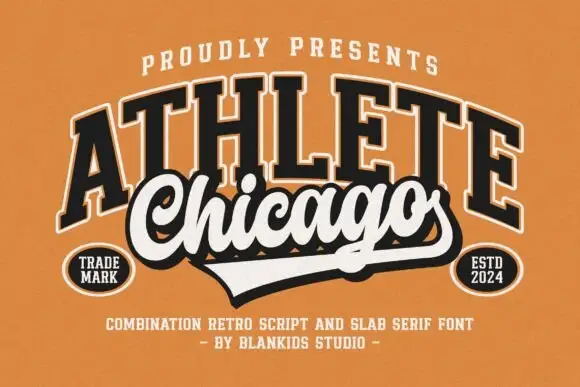
Chicago Athlete pairs a tall arched slab word with a thick flowing script below, where the script carries round loops and a long terminal that forms the lower edge of a badge.
The slabs stay tall and arched, the script thickens and flows, the loops close round and the final stroke flattens out to close the shape at the bottom. That shared edge is the character: the two members read as one badge rather than two lines, which is why the cover binds them with cream borders and shadows. The overlap is a designed lockup and not an automatic alignment, so build the arch and the edge yourself and check that any two words will actually meet that way.
A neighbourhood club identity study — Keep the slab row above the script and allow the lower tail to define the badge edge.
Verify both supplied styles and confirm any club or location naming rights.
 #19
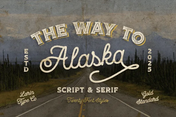
Way to Alaska is a monumental 20-font vintage signboard superfamily by Pasha Larin pairing heritage brush scripts with arched Western/signboard serifs!
Way to Alaska is a twenty-font vintage signboard superfamily built around a heritage script and a companion serif, with layered shadows, inlines, outlines and small ornaments that all share one skeleton. The size of the family means a whole shopfront can be built from one voice, but the layers must be picked deliberately or a panel turns into a stack of outlines. The script needs roughly 24 mm and the serif 20 mm for their detail to read, and two inks cover most of the family.
Craft distillery / brewery badge, coffee roaster & apparel line — Arch the vintage Serif ('THE WAY TO', 54 pt) above sweeping 'Alaska' Script (110 pt) flanked by vertical 'ESTD / 2026' stamps!
Use the clean solid styles for crisp Cricut HTV, Oracal 651 & laser engraving; use textured/inline styles for DTF, print & labels!
 #20
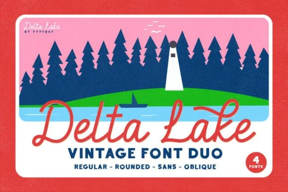
Delta Lake Font is a 4-font vintage outdoor duo bundling matched Script (Regular & Rounded tails) and bold camp Sans (Regular & Oblique).
Delta Lake Font is a four-cut vintage national-park and lake-camp duo: a regular, a rounded, a sans and an oblique, all drawn on the same slightly inked skeleton with a small badge-friendly weight. The cuts share metrics so a line can mix a regular name with a sans caption, and the rounded cut is the softest of the four. It needs roughly 22 mm for the inked edge and the rounded terminal to read, and it is best in one deep green or brown on cream and buff stock, where the ink edge prints as a slightly worn rule.
Lake-house boat towel, camp enamel mug & cabin sign — Set 'Lake [Name]' in coral or cream Delta Lake Script with side tails over tracked navy Delta Lake Sans below.
Both the sturdy monoline script and bold camp sans cut and weed super cleanly on HTV, boat vinyl, and wood stencils (weld script!).
Practical buyer checklist
Key cutting, printing and pairing answers before choosing a vintage logo badges & heritage emblems typeface.
Use the curve or warp tool with a gentle arc and then adjust individual letters so their verticals stay upright. In a real badge, letters on an arch keep vertical stems rather than tilting outward, which is what separates a designed badge from a distorted line.
The arched name at 12 pt or more, and the date or place line at 6 pt minimum. Below 6 pt the small text fills in even on coated stock, so simplify the badge rather than shrinking the type.
Yes, at 8 inches or more, with a single-colour silhouette. Fine distress and hairline rules will not survive the blade, so choose a clean weight and add the wear by hand if the shopfront needs it.
Most include both, but the ampersand is often the weak glyph. Check it at final size, and check that the numerals match the letters in weight, since a date line exposes a mismatched numeral set immediately.
Keep exploring
Explore adjacent maker roundups or check our practical pre-production checklists.
21 curated fonts · Previews & pairings
39 curated fonts · Previews & pairings
23 curated fonts · Previews & pairings
33 curated fonts · Previews & pairings
Guides: Invitation font checklist · Vinyl & cutting checklist · How to pair script & sans fonts
Allow optional Google Analytics to measure visits and catalogue actions. Your search words and notes are not included. Privacy & storage