 #1 · Best Overall
Disclosure: MakerFileHub may earn a commission from qualifying purchases via paid links on this page. How our links work.
Stars, stripes, letterman patches & heritage slabs
14 Best 4th of July & Americana Fonts
Americana typography borrows from three sources: the varsity letterman jacket, the roadside heritage sign, and the hand-painted parade banner. Campus Rally and Bryn build the letterman and patch treatments, Braventro and Sport League keep the heavy heritage slab, and Patriotic Usa adds the star-and-stripe alphabet that most July projects actually want. Highway Heritage covers the Route 66 duo.
Quick verdict
Patriotic Usa is the most direct 4th of July alphabet, Campus Rally covers a letterman-style shirt, and Braventro handles heritage signage. Highway Heritage is the pick for a roadside or small-town look.
Quick answer
Top 3 4th of July & Americana picks right now.
Short on time? Start with our three highest-rated 4th of July & Americana standouts before scrolling the full breakdown.
#1 · Best Overall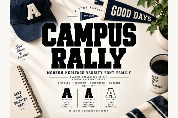 #2 · Runner-Up Pick
Campus Rally
3-style collegiate varsity slab family (Regular, Condensed & Outline)
Get fontPaid link
Read review ↓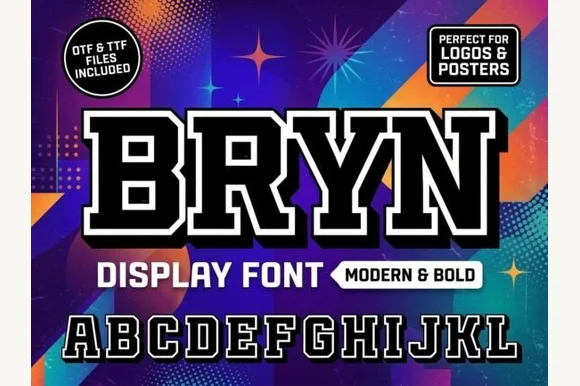 #3 · Editor's Choice
How we tested & selected these 14 fonts
We kept 14 of 514 candidates, a tight pool because the theme is easy to fake. Judged on whether stars and stripes are drawn into the letterform, how the patch and outline treatments align, and whether the face reads as American heritage rather than as a generic athletic slab.
Side-by-side summary
Top 5 4th of July & Americana picks at a glance.
Compare specimens, OpenType/PUA traits and primary project roles side by side.
| Rank & Font | Style & File Specs | Best Project Fit | Store Listing |
|---|---|---|---|
| DisplayVarsity-flag | 4th of July baseball tournament jersey, koozie & banner | Get fontPaid link | |
| Slab SerifCollegiate | University spirit crewneck, felt pennant & graduation banner | Get fontPaid link | |
| Slab SerifLetterman-patch | Senior letterman poster, esports team banner & grad yard sign | Get fontPaid link | |
| Slab SerifPatriotic | 4th of July porch plank, Memorial Day tee or brewery sign | Get fontPaid link | |
| Slab SerifFile formats | Garage metal sign, craft beer label or leather hat patch | Get fontPaid link |
Serifs & Slab Serifs
14 fonts#1 · Best OverallPatriotic Usa
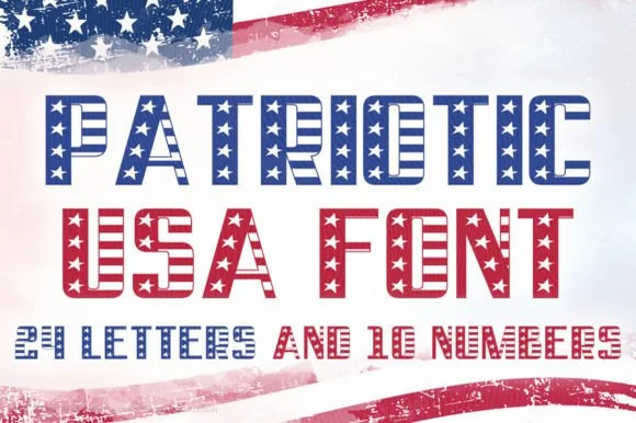
Patriotic USA is a display in which every letter is filled with the United States flag: the upper word in white stars on a blue field and the lower in red and white stripes, both built on the same heavy square-shouldered skeleton.
The two lines share a skeleton of wide caps with flat shoulders and thick stems, and the difference between them is the fill: the first is a blue field carrying white stars that follow the letter's shape, the second is a stack of red and white stripes cut to the letter's outline. Because the pattern is clipped rather than placed, the word reads as a flag rather than as a flag behind a word, and the stripes stay level across every letter, which is what makes the pair look printed rather than assembled. The counters are wide, so the pattern is legible inside each stroke, and the letterspacing is tight, which keeps the pattern continuous across the word. The ground is a white field with a blurred flag at the top, and the caption beneath is set in a small tracked sans.
Recommended project & layout
4th of July baseball tournament jersey, koozie & banner — Set team name in navy on row one over red on row two, with large 2-digit flag numbers on the back.
Before you cut or print
HEADS-UP: Specimen explicitly notes '24 LETTERS AND 10 NUMBERS'—test every letter of your specific phrase before finalizing, and produce via DTF/sublimation!
Best paired with
Get fontPaid link
#2 · Runner-Up PickCampus Rally
Campus Rally is a crisp, clean 3-style collegiate varsity slab family bundling matched Regular, Condensed, and Outline cuts.
Campus Rally is a three-style collegiate varsity slab family in a regular, a condensed and an outline cut: extended block letters with thick unbracketed slabs, a small notch on the terminals, a narrow version for long names and an outline version for layered printing. The family covers a shirt, a pennant and a certificate in one voice, and the outline cut is the weakest element in print. The regular needs roughly 30 mm, the condensed 26 mm and the outline 34 mm for their detail to read.
Recommended project & layout
University spirit crewneck, felt pennant & graduation banner — Stack 2 solid uppercase rows in navy, forest green, or crimson at tight 0.92 line spacing above clean crest rules.
Before you cut or print
Zero grunge speckles—Regular and Condensed cut super cleanly on HTV, puff vinyl, and felt down to 0.55 inches.
Best paired with
Get fontPaid link
#3 · Editor's ChoiceBryn
Bryn is a bold modern varsity slab serif featuring built-in inner-gap outlines across every uppercase letter for instant chenille-patch impact (OTF & TTF).
Bryn is a bold varsity slab with a built-in double outline across every uppercase letter, so a word arrives already looking like a chenille patch without a designer adding a stroke. The block forms are massive, the inner gap is consistent, and the outline is cut as part of the glyph, which means the gap cannot drift when the artwork is scaled. It needs roughly 25 mm for the inner gap to stay open in print, and it reads as a school or team mark rather than a text face; the outline makes it a one-colour graphic, not a layerable typeface.
Recommended project & layout
Senior letterman poster, esports team banner & grad yard sign — Set short 3-to-7-letter initials or names huge (76–150 pt) over vibrant team colors.
Before you cut or print
Built-in double outline prints super sharp on yard signs, DTF hoodies, and Print-Then-Cut stickers (size above 1.8 in if blade-cutting vinyl!).
Best paired with
Get fontPaid link
 #4 · Top Maker Utility
Liberty Stencil
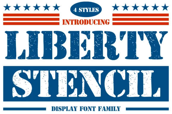
Liberty Stencil offers a four-style Americana slab-stencil family drawn from 1776 heritage crates, Independence Day banners and rugged apparel, where bracketed slab serifs meet crisp centre bridges instead of the flat shoulders of a modern military stencil.
The feet carry real brackets, the bridges cut through the middle of each letter and the weight stays even enough to hold up in a two-colour layout. The bracket is the character: the face looks cut from a wooden crate rather than sprayed through a metal mask, which is why the sample leans on a heritage palette. Four styles exist in the family, but the specimen shows one at a time, so confirm which cut your file contains and keep 40 pt before the narrow bridges close in print.
Recommended project & layout
4th of July porch plank, Memorial Day tee or brewery sign — Use the clean/solid style from the 4-font pack for vinyl stencils and textured styles for print.
Before you cut or print
Verify clean vs distressed style selection before sending to a cutting machine.
Best paired with
Get fontPaid link
 #5 · Standout Silhouette
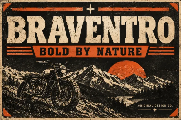
Braventro
Braventro is a heavy heritage slab in which the brackets run broad, the counters stay compact and the stems carry sign-letter weight, so a two-word heading reads as a stencilled tin sign for an outdoor brand.
The B stacks two dense bowls, the R keeps a compact bowl over a heavy leg, the A carries a wide apex with a low crossbar and the V drops two thick diagonals into a narrow point, all at a sign weight with bracketed serifs and small counters. The density is the character: the letters sit close and the ink covers most of the box, which is why the sample sets a short phrase on a plain tin ground. Because the counters are small, the face wants 30 pt before they stay open, and it holds from three quarters of an inch of cap height on wood, acrylic or vinyl. The rivets, the rust texture and the small subline are presentation; the heavy slab words are the face.
Recommended project & layout
Garage metal sign, craft beer label or leather hat patch — Pair with a ribbon banner subline in bold sans capitals.
Before you cut or print
OTF display font; solid bold edges cut cleanly on stencils and vinyl.
Best paired with
Get fontPaid link
 #6
Sport League
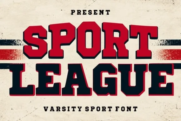
Sport League is a powerhouse collegiate varsity slab serif featuring ultra-chunky octagonal letters framed in a crisp offset athletic border.
A two-tone collegiate varsity block shown on weathered cream stadium banner stock with red and black stripes: stacked words pair crimson-filled and navy-filled octagonal capitals inside clean dark or red outer outlines, so the line reads as a stadium banner rather than a decorated slab. The outline is even and follows the block exactly, which is what makes the two-colour fill sit cleanly, and the octagonal corners give the face its college proportions. The banner and the stripes are staging. Because the cores are solid and the borders are straight, the face holds at a distance and cuts cleanly.
Recommended project & layout
Championship banner, football/baseball hoodie & locker sign — Color row one varsity crimson and row two deep navy at 64–120 pt flanked by horizontal jersey stripes.
Before you cut or print
Heavy solid letter cores + clean straight borders cut cleanly on 1.4 in+ athletic HTV and print boldly via DTF.
Best paired with
Get fontPaid link
 #7
Highway Heritage
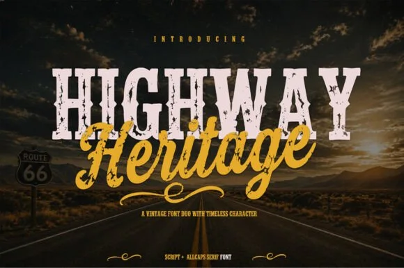
Highway Heritage is a rugged Americana font duo pairing an eroded, stamp-distressed all-caps slab serif with an energetic sign-painter brush script!
Highway Heritage is an Americana duo: an eroded, stamp-distressed all-caps slab serif paired with an energetic sign-painter brush script, so a headline can be stamped first and then signed over the top. The distress sits inside the slab while the script stays smooth, and that contrast is what the pair trades on, together with a bone-and-mustard palette borrowed from roadside signage. The slab needs roughly 30 mm for the erosion to read as wear rather than as a dirty print, and the duo is best on twilight photography, weathered board or kraft.
Recommended project & layout
Motorcycle/overland tee, craft root-beer label & garage sign — Set the distressed All-Caps Slab huge (88 pt) and overlap the Brush Script (72 pt) across its lower edge in vintage gold.
Before you cut or print
Internal grunge texture inside the Slab Serif is built for DTF shirts, sublimation, and screen print—while the smooth Brush Script also cuts HTV!
Best paired with
Get fontPaid link
 #8
Varsity Chicago
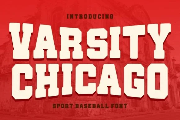
Varsity Chicago is a chunky baseball capital alphabet in which the stems are wide, the corners step in and out, and the fit is tight, so a two-word title reads as a stitched team name on a jersey.
The V cuts two thick diagonals into a flat base, the A holds a low bar, the R turns a stepped leg, the S notches its spine, the I carries wide serifs and the T spreads a heavy arm, all at a single heavy weight with stepped corners and flat terminals. The stepped corner is the character: it looks like a cut felt letter rather than a drawn one, which is why the sample sets two stacked words edge to edge. Because the shapes are solid and open, the face holds from 30 pt upward and cuts well in vinyl or felt; it needs tracking rather than kerning. The red ground, the faded brick photograph and the small lines above and below are presentation; the cream varsity words are the face.
Recommended project & layout
Vintage baseball tee, pennant or sports bar sign — Set stacked all-caps in cream on crimson, navy or forest green shirts.
Before you cut or print
Smooth solid vector edges cut cleanly on HTV, vinyl and felt pennants.
Best paired with
Get fontPaid link
 #9
Varsity Spirit
Varsity Spirit is a layered varsity capital alphabet in which each letter carries an inline stroke, a keyline and a set of matching numerals, so a team name reads as the appliqué on a college jacket.
The V cuts two thick diagonals with an inline running between them, the S holds a stepped spine, the A pinches a flat apex, the R turns a notched leg and the numerals carry the same inline and keyline, all at a heavy slab weight with square serifs. The inline is the character: it divides each stroke into two bands, which is why the sample sets a stacked word above a full numeral line. Because the inline is narrow, the face needs 40 pt before it stays open, and each layer has to be a clean vector for a vinyl or embroidery cut. The white timber ground, the format strip and the small badge are presentation; the black and white layered words are the face.
Recommended project & layout
A school-spirit event poster — Put a broad title over a separate plain schedule and keep the inner lines away from background patterns.
Before you cut or print
Check every required numeral and letter rather than assuming the sample alphabet is complete.
Best paired with
Get fontPaid link
 #10
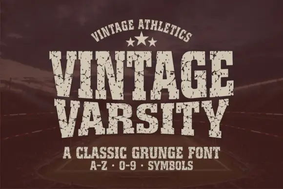
Vintage Varsity
Vintage Varsity is a condensed athletic capital alphabet with heavy flat slabs and a cracked wear texture, so a short word reads as a printed team jersey from decades ago.
The letters are narrow and tall: the V closes to a sharp point, the A keeps a low bar, the R carries a straight leg and the S reverses through flat terminals, with slabs at every stem and no bracketing. The wear is drawn into the letterforms rather than applied as an effect: cracks run through the slabs and a few counters show chipped edges, which is what gives the face its printed-jersey look. Weight is heavy and uniform, the fit is tight enough that a long team name holds a single line, and because the texture is coarse the face needs a decent size to stay legible. The dark ground, the cream ink, the star rule and the two small caption lines are presentation; the typeface is the two words.
Recommended project & layout
A reunion match poster — Keep dates and scores in a clean companion face.
Before you cut or print
Inspect cracks in the narrowest strokes.
Best paired with
Get fontPaid link
 #11
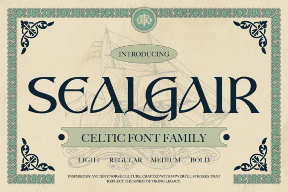
Sealgair
Sealgair is a four-weight Celtic display serif blending chiseled wedge terminals with sinuous interlocking crossbars and descender hooks.
Sealgair is an ornamental Celtic and Norse display serif family: sturdy stems with woven knotwork filling the counters, angular shoulder ornaments and a second cut whose interlacing runs thinner for a smaller line. The family is a carved-inscription look, so it belongs on a sign, a plaque and a cover rather than a paragraph. The knotwork is the finest element and it fills into a solid plate when the face is reduced. It needs roughly 44 mm for the weave to read, and it is best one dark ink on a stone-toned ground or carved in relief.
Recommended project & layout
Craft whiskey, meadery, or Highland pub bottle label — Set the spirit or pub name in Sealgair Bold all-caps across the label chest, using Regular or Light for batch numbers and tasting notes.
Before you cut or print
For laser-engraved oak barrels, leather coasters, or Slate plaques, choose Medium or Bold so fine wedge serifs engrave crisply.
Best paired with
Get fontPaid link
 #12
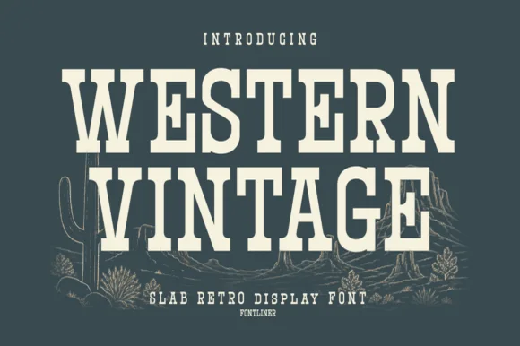
Western Vintage
Western Vintage is a bold, condensed slab serif with crisp bracketed block feet and tall frontier poster proportions.
Western Vintage is a tall condensed Western saloon slab serif: heavy squared slabs on a narrow body, a very tall ascender, a spurred stem and a set of inline and shadow companions in the same proportions. It is the lettering of a saloon sign and a rodeo poster, so it wants height and one flat ink rather than a soft palette. The slab spurs are the finest element and they fill first at small sizes. It needs roughly 38 mm for the slab and the spur to read, and it is best on a painted board or a kraft ground.
Recommended project & layout
Small-batch hot sauce, BBQ rub & smokehouse label — Arch 'WESTERN' or the brand title slightly at +15 tracking above a horizontal divider rule and a bold heat-level badge.
Before you cut or print
Straight block slabs and open counters weed cleanly on adhesive vinyl, stencil film, and leather laser-engraving down to 0.6 in.
Best paired with
Get fontPaid link
 #13
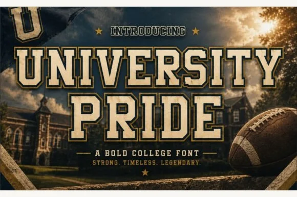
University Pride
University Pride is a commanding collegiate varsity slab serif featuring chamfered block stems framed by a crisp outer contour line.
University Pride is a double-outlined collegiate stadium varsity slab: extended block letters with a hard keyline inside a second keyline, thick unbracketed slabs and a small inward notch on the terminals that reads as a stadium banner. The double outline doubles the footprint and the inner line closes first. It needs roughly 32 mm for the second keyline and the notch to read, and it is best in two flat inks on jersey and banner mesh, or three inks where paper forms the second line.
Recommended project & layout
Alumni sweatshirt, homecoming banner & varsity jacket — Set school or department names across a 10-inch chest arch above flanked star dividers and graduation years.
Before you cut or print
Because every letter carries a thin outer border gap, cut HTV at 1.4 inches tall or larger, or use DTF/screen print for smaller crest text.
Best paired with
Get fontPaid link
 #14
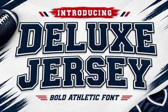
Deluxe Jersey
Deluxe Jersey is a classic double-outlined collegiate varsity slab serif built for athletic chests, senior jerseys, and team banners.
Deluxe Jersey is a collegiate varsity block slab with an inline border: extended block letters with thick unbracketed slabs, a thin keyline running just inside the outer edge and a small notch on the terminals that reads as a stitched jersey patch. The inline border doubles the footprint and closes first when the face is reduced. It needs roughly 32 mm for the border and the notch to read, and it is best in two flat inks on jersey, or one thread colour on a patch where the border becomes an inner stitch line.
Recommended project & layout
Senior-night jersey chest, spirit hoodie & megaphone decal — Arch the school or team name slightly across a 10.5-inch chest width above large centered player numerals.
Before you cut or print
Because the built-in outer outline creates a thin channel around every letter, scale HTV cuts to at least 1.5 inches tall or use DTF/sublimation for tiny badges.
Best paired with
Get fontPaid link
Practical buyer checklist
Frequently asked questions.
Key cutting, printing and pairing answers before choosing a 4th of July & Americana typeface.
Which fonts are best for a 4th of July shirt?
Heavy varsity slabs and the stars-and-stripes alphabets, cut at 2 inches or more. Anything with fine star detail needs printing rather than cutting, or the stars tear away during weeding.
Can letterman patch fonts be cut in two layers?
Yes, that is their purpose. Cut the outer patch and the inner letter as separate pieces, press the patch first, let it cool, then align the inner layer. Keep the border at least 3 mm wide so it stays visible after pressing.
How do I keep a patriotic design from looking dated?
Restrict the palette to two colours plus cream, use one decorated element, and set the rest of the type in a plain sans. The reference then reads as heritage rather than as a seasonal novelty.
Do Americana fonts include numbers for a year or a date?
Most varsity slabs do, and the stars-and-stripes sets usually include 0 to 9. Check the numeral set early if the design needs a year, since patterned alphabets sometimes leave numbers plain.
Keep exploring
Related collections & guides.
Explore adjacent maker roundups or check our practical pre-production checklists.
01 / Cricut & Craft
Stencil & bridged laser-cut
13 curated fonts · Previews & pairings
02 / Type Styles
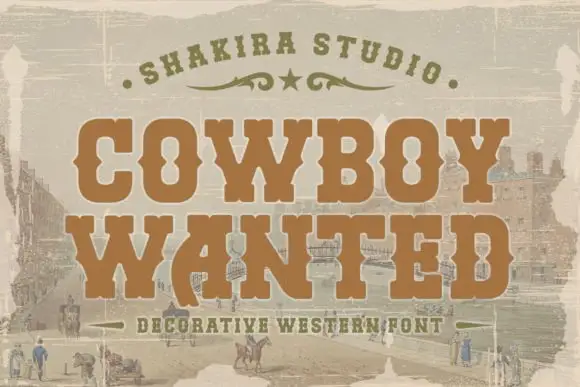
Western & vintage label
23 curated fonts · Previews & pairings
03 / Branding & Print
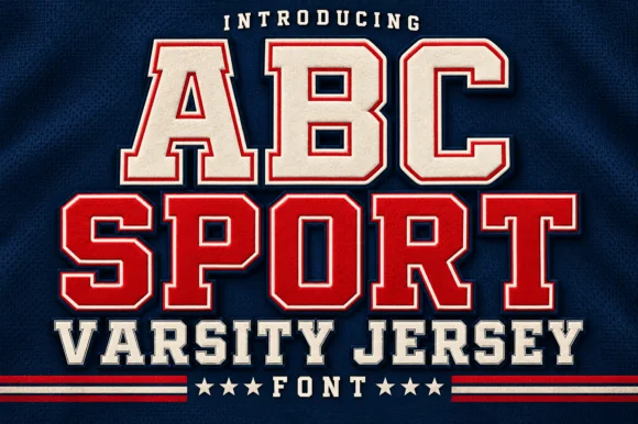
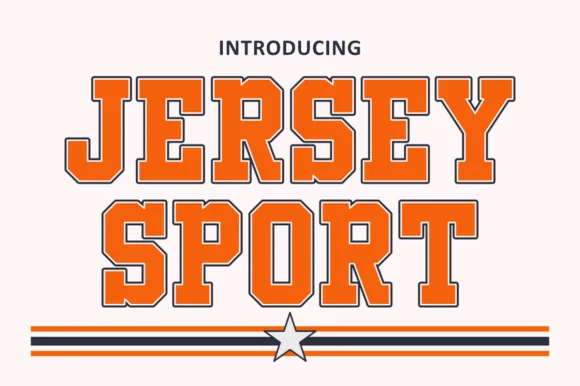
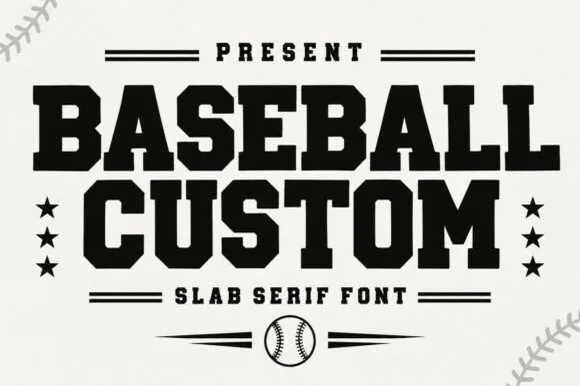
Varsity & athletic
25 curated fonts · Previews & pairings



04 / Cricut & Craft
T-shirts, hoodies & HTV apparel
33 curated fonts · Previews & pairings
Guides: Invitation font checklist · Vinyl & cutting checklist · How to pair script & sans fonts