Modern Grotesque Body

Planner Highland + Kohilo
Creates crisp high-hierarchy contrast beneath Planner Highland headlines across menus, websites and labels.
Inspect Kohilo specimenDisclosure: MakerFileHub may earn a commission from qualifying purchases via paid links on this page. How our links work.
Tall friendly rounded planner slab
Planner Highland blends tall, space-saving condensed proportions with warm, softly rounded slab serifs, built for KDP covers, journals and labels where the high vertical efficiency lets longer section titles fit neatly into narrow planner columns and pantry labels.
Paid link
Get this fontProject & layout blueprintsAt-a-glance maker compatibility
Sturdy stroke walls and open counters weed cleanly on adhesive vinyl, HTV apparel film, and cut cardstock.
Visual anatomy & craft review
The stems stay tall and close, the serifs round off, the proportions compress and the weight stays friendly. That vertical efficiency is the character: a long section title fits a narrow column without dropping below a readable size, which is why the sample targets planners and spines. KDP covers need bleed and a safe margin, so build the layout at trim size, keep 14 pt as the floor on a spine and check how the rounded feet behave under 12 pt.
Warm · Tall-slab · Clear
Two-font hierarchy recipes
Tested contrast partners — pairing Planner Highland with grounded secondary typography.
Planner Highland + Kohilo
Creates crisp high-hierarchy contrast beneath Planner Highland headlines across menus, websites and labels.
Inspect Kohilo specimen
Planner Highland + I Heart You
Adds a warm human signature touch for 1-to-3-word callouts without competing against structured serif capitals.
Inspect I Heart You specimenPractical applications
Concrete hierarchy, scale and production guidance tailored to Planner Highland’s stroke geometry.
The condensed slabs fit a KDP cover, and the tall forms hold a two-line title at 48 pt within the trim, where the rounded feet stay warm at full size.
Hierarchy & layout recipe
Lay out a 6 by 9 inch KDP cover: set the title at 48 pt over two rows with 14 mm between baselines, keep 12 mm of safe margin inside the trim, and keep 3 mm of bleed beyond the page edge.
Pre-production check
Text outside the safe margin gets trimmed; check the cover in the printer preview before uploading.
The tall proportions suit a narrow spine, and the condensed stems fit a long section name at 16 pt on a 12 mm spine, where the rounded serifs stay legible.
Hierarchy & layout recipe
Print a 12 mm spine: set the section name at 16 pt in one narrow column, keep 6 mm of clear ground between the year and the title, and keep 3 mm of clearance from each spine edge.
Pre-production check
Rounded serifs below 10 pt merge on a spine; check the proof and keep the title at 12 pt or above.
The friendly slabs suit a jar label, and the condensed weight holds a two-word preserve name at 20 pt on a 55 by 35 mm label, where the rounded feet print cleanly.
Hierarchy & layout recipe
Print a 55 by 35 mm jar label: set the preserve name at 20 pt on one row, keep 8 mm of clear ground beneath before the date at 7 pt, and keep 5 mm of border so the serifs are not trimmed.
Pre-production check
Condensed forms printed at 14 pt crowd the loop of a jar; check a sample and hold the name at 18 pt.
Technical & licence verification
Confirm included OTF/TTF/WOFF formats, full glyph tables and licence coverage on the live store page before batch production.
Closest visual alternatives
Matched across letterform anatomy, stroke behaviour and craft applications.
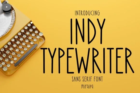
Tall condensed handwritten monoline sans serif (NOT a serif typewriter!)
Indy Typewriter is actually a tall, friendly monoline handwritten sans serif—zero serifs or mechanical slabs despite the 'Typewriter' name!
Ideas for this font
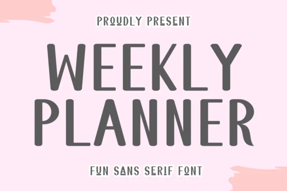
Tall quirky rounded sans
Weekly Planner is a tall rounded sans in grey on pink: narrow upright letters with rounded terminals, an open R leg, a bowed W and a curled L, presented in two stacked lines with a tracked caption beneath, so the pair reads as a planner cover rather than a neutral sans.
Ideas for this font
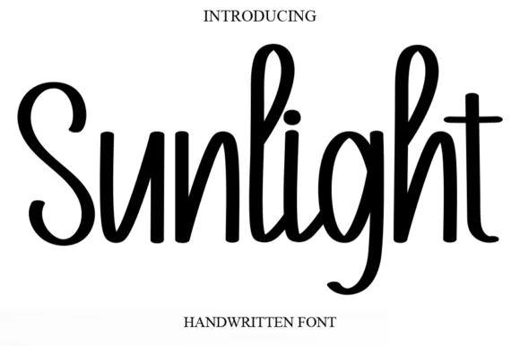
Tall condensed bouncy upright marker font
Sunlight is a tall, clean upright marker handwritten font with rounded loops and semi-connected farmhouse bounce.
Ideas for this font
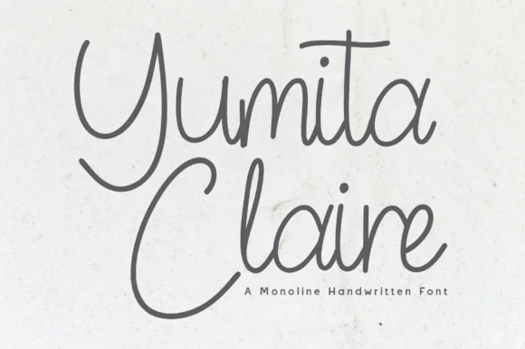
Monoline cursive handwriting
Yumita Claire is a monoline cursive in charcoal on speckled paper: tall looping capitals, low connected lowercase, even strokes and long entry and exit tails, so the two words read as a name written with a fine pen rather than a calligraphic display.
Ideas for this font
Same independent foundry
Allow optional Google Analytics to measure visits and catalogue actions. Your search words and notes are not included. Privacy & storage