Modern Grotesque Body

Jersey Sport + Saltriver Grotesk
Creates crisp high-hierarchy contrast beneath Jersey Sport headlines across menus, websites and labels.
Inspect Saltriver Grotesk specimenDisclosure: MakerFileHub may earn a commission from qualifying purchases via paid links on this page. How our links work.
Outlined collegiate sports slab with a flat fill and a thin keyline
Jersey Sport is a collegiate slab alphabet drawn as an outline with a flat fill inside it, so a word reads as a printed athletic front where the keyline does the work and the fill carries the colour.
Paid link
Get this fontProject & layout blueprintsAt-a-glance maker compatibility
Weld or Unite overlapping script joins into one continuous vector path before sending to the blade.
Visual anatomy & craft review
The J carries a full hook, the E holds three even arms, the R keeps a squared bowl and a straight leg and the Y forks high, all at a heavy weight with unbracketed slabs and a keyline that follows the contour at a even distance. That construction is the practical part: the keyline can be printed as one screen and the fill as another, which is how a two-colour athletic print is built at 60 mm. Because the letters are solid and equally weighted, two words stack with minimal leading. The white ground, the orange and navy inks, the rules and the star are presentation; the slab face is the two words.
Collegiate · Outlined · Stadium
Two-font hierarchy recipes
Tested contrast partners — pairing Jersey Sport with grounded secondary typography.
Jersey Sport + Saltriver Grotesk
Creates crisp high-hierarchy contrast beneath Jersey Sport headlines across menus, websites and labels.
Inspect Saltriver Grotesk specimen
Jersey Sport + Autography
Adds a warm human signature touch for 1-to-3-word callouts without competing against structured serif capitals.
Inspect Autography specimenPractical applications
Concrete hierarchy, scale and production guidance tailored to Jersey Sport’s stroke geometry.
The keyline and fill register as one two-colour print, and the heavy slabs read at 65 mm across a jersey chest from the stands.
Hierarchy & layout recipe
Screen a 300 mm front print: lay the keyline at 65 mm and the fill inside it, keep the keyline at 2 mm, and stay 45 mm below the collar so the print clears the shoulder seam allowance.
Pre-production check
Two screens registered by hand drift at jersey scale; check the imposed film at 100 percent and add 1 mm of trap to the keyline before burning.
The outlined blocks read at 20 cm on a panel, and the keyline gives a printed sign the look of a painted athletic board.
Hierarchy & layout recipe
Print a 2 by 0.6 m panel: set the stand name at 20 cm, set the gate numbers in a 6 cm caps slab below, and keep 12 cm of clear panel at each end so the fixings miss the letters.
Pre-production check
A keyline under 2 mm at 20 cm looks like a drawing error; check the panel at three metres and thicken the keyline rather than the letters.
The outlined construction stitches cleanly, and the keyline gives a small supporters patch a finished border at 70 mm wide.
Hierarchy & layout recipe
Embroider a 90 mm patch: set the club name at 60 mm, keep the keyline as a satin border at 2.5 mm, and stay 7 mm inside the patch edge so the merrow does not pull the outline.
Pre-production check
A merrow edge pulls the keyline inward; check a stitch-out and drop the keyline on patches below 70 mm.
Technical & licence verification
Confirm included OTF/TTF/WOFF formats, full glyph tables and licence coverage on the live store page before batch production.
Closest visual alternatives
Matched across letterform anatomy, stroke behaviour and craft applications.
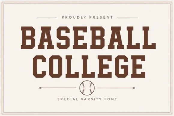
Clean solid collegiate & vintage baseball slab serif
Baseball College is a clean, solid-filled American varsity slab serif built with sturdy rectangular blocks and chamfered athletic corners.
Ideas for this font
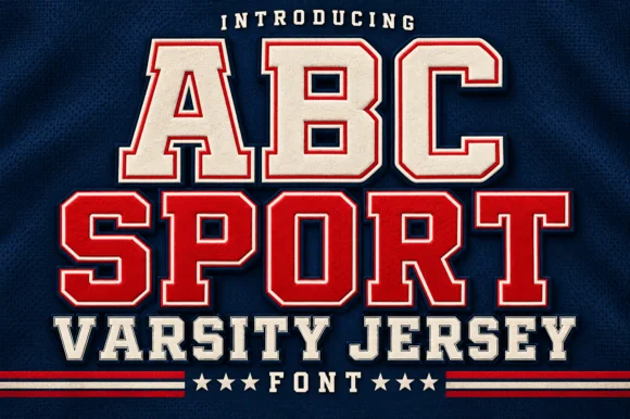
Layered varsity jersey capitals with fill, keyline and offset shadow
ABC Sport is a layered varsity capital alphabet in which each letter carries a fill, a narrow keyline and an offset shadow, so a name reads as the appliqué on a college jersey.
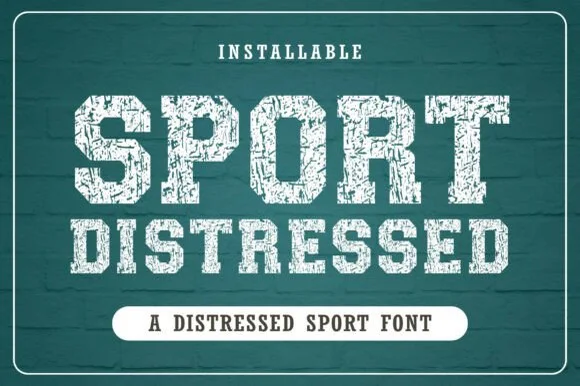
Chalk-weathered athletic slab with hatched wear and square feet
Distressed Sport is an athletic slab alphabet in which the stems are heavy and square, the wear runs as chalk hatching across the fill and the feet stay flat, so a word reads as a print pulled off a worn gym wall.
Ideas for this font
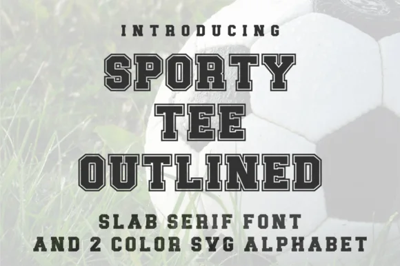
Varsity slab with outline and two-colour alphabet
Sporty Tee Outlined is a varsity slab in dark grey with a light outline: heavy square serifs, wide flat-topped caps, counters cut as rectangles, and an inline gap that separates the fill from the outline, sold with a two-colour SVG alphabet for the same job.
Ideas for this font
Same independent foundry
Allow optional Google Analytics to measure visits and catalogue actions. Your search words and notes are not included. Privacy & storage