 #1 · Best Overall
Disclosure: MakerFileHub may earn a commission from qualifying purchases via paid links on this page. How our links work.
Victorian serifs, Tuscan spurs & distillery frames
21 Best Whiskey, Craft Beer & Spirits Label Fonts
A spirits label has to look established and still survive a 3 inch bottle face. Blovanta and Kiron bring the weathered woodblock and Tuscan spur tradition, Rowancrest and Atomic Rust add Victorian ball terminals, and Aged Whiskey ships ornate label frames that solve the layout problem in one download. Timelapse and Baseball Western cover the storybook and rodeo ends.
Quick verdict
Blovanta is the strongest weathered saloon serif, Kiron is the pick for Tuscan spur detail, and Aged Whiskey is the fastest route to a complete label layout. Rowancrest suits a Victorian heritage brand.
Quick answer
Top 3 whiskey, craft beer & spirits labels picks right now.
Short on time? Start with our three highest-rated whiskey, craft beer & spirits labels standouts before scrolling the full breakdown.
#1 · Best Overall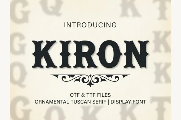 #2 · Runner-Up Pick
 #3 · Editor's Choice
How we tested & selected these 21 fonts
We kept 21 of 179 candidates after testing each on a simulated 3 inch bottle label at 300 dpi. Weighted whether the ornament survives at 6 pt, bracket and spur quality, and how the face looks alongside mandatory legal text.
Side-by-side summary
Top 5 whiskey, craft beer & spirits labels picks at a glance.
Compare specimens, OpenType/PUA traits and primary project roles side by side.
| Rank & Font | Style & File Specs | Best Project Fit | Store Listing |
|---|---|---|---|
| SerifFile formats | Smokehouse sign, rodeo tee & rustic cabin wood plaque | Get fontPaid link | |
| SerifSaloon | Smokehouse BBQ sign, hot-sauce bottle & Western hat patch | Get fontPaid link | |
| SerifRugged | Dry-rub spice tin, craft ale label & heritage denim tag | Get fontPaid link | |
| Slab SerifLanguage support · File formats | Small-batch hot sauce, BBQ rub & smokehouse label | Get fontPaid link | |
| SerifBiker-heritage | Custom motorcycle shop tee, whiskey flask & beard-balm tin | Get fontPaid link |
Serifs & Slab Serifs
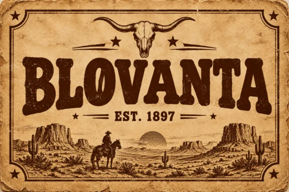
16 fonts#1 · Best OverallBlovanta
Blovanta is a heavy, weathered Western display serif featuring chunky flared stems, a notched 'O' crossbar accent, and vintage ranch grit.
Blovanta is a weathered woodblock Western saloon display serif: heavy unbracketed slabs with chipped edges, a slightly uneven baseline that mimics hand-set timber type and a surface where the ink coverage breaks into patches as if the block had worn. The chips are the design and they silt when the face is reversed or printed small. It needs roughly 30 mm for the chip and the slab to read, and it is best in one dense ink on uncoated stock, or a single ink with a slight deboss where the block edge catches light.
Recommended project & layout
Smokehouse sign, rodeo tee & rustic cabin wood plaque — Center an all-caps ranch or town name at 60 pt above flanked 'EST. 1897' horizontal rules on kraft or cedar backgrounds.
Before you cut or print
Interior woodblock speckles print and laser-engrave superbly; if cutting adhesive vinyl, weld/flatten tiny interior specks first.
Best paired with
Get fontPaid link
#2 · Runner-Up PickKiron
Kiron is a clean, heavy Western Tuscan display serif with crisp diamond median spurs, flared bracketed serifs, and solid single-layer geometry.
Kiron is a Tuscan slab serif with a median spur: heavy unbracketed slabs that split into a fork at the foot, a spur that rises from the middle of some stems and a decorative notch where the stem meets the slab. The forked slabs are the design and they close first when the face shrinks. It needs roughly 30 mm for the fork and the spur to read, and it is best in one dense ink on cream, or a single dark red on buff where the forks print as crisp cuts.
Recommended project & layout
Smokehouse BBQ sign, hot-sauce bottle & Western hat patch — Center all-caps brand names at 48–80 pt with +12 tracking above a symmetrical Victorian scroll divider.
Before you cut or print
Clean vector outlines with zero inline gaps make Kiron one of the easiest Western fonts to weed on HTV and sign vinyl down to 0.8 in.
Best paired with
Get fontPaid link
#3 · Editor's ChoiceVintage Strong
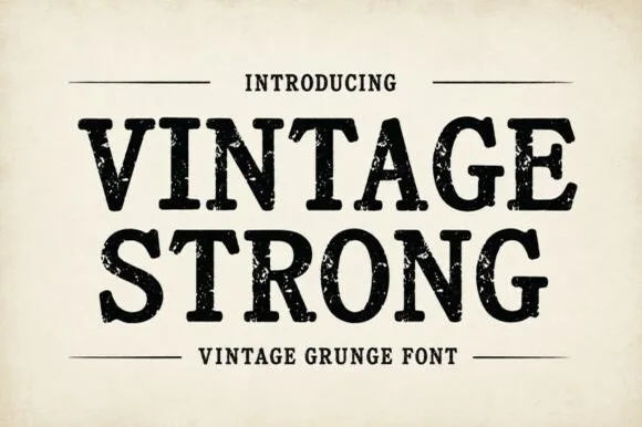
Vintage Strong is a bold, classic Western-style display serif textured with authentic iron-stamp speckles and worn press contours.
Vintage Strong is a weathered woodcut and iron-press Western serif: heavy bracketed slabs, a slightly irregular stem width and a surface of chipped edges, grain lines and small voids where the wood block wore. The wear is drawn, so a one-colour print keeps it, and the bracket is what closes first at small sizes. It needs roughly 32 mm for the bracket and the grain to read, and it is best in one dense ink on kraft and newsprint, or white on a dark board where the grain prints as light lines.
Recommended project & layout
Dry-rub spice tin, craft ale label & heritage denim tag — Stack 2 uppercase words centered between horizontal rule bars with a small tracked footer below.
Before you cut or print
Because internal grunge pits create tiny weeding specks, prefer label printing, DTF, screen print, or laser engraving over cut vinyl.
Best paired with
Get fontPaid link
 #4 · Top Maker Utility
Western Vintage
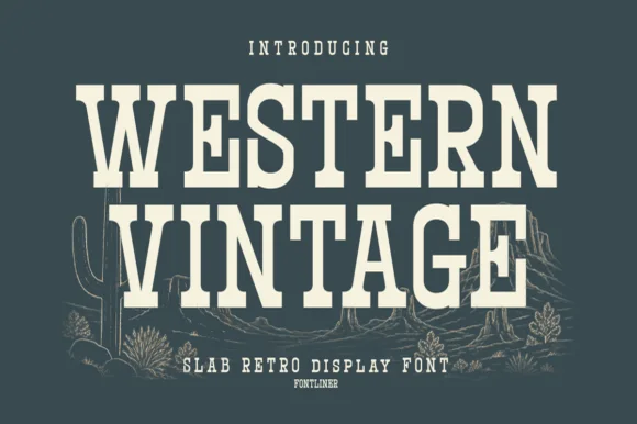
Western Vintage is a bold, condensed slab serif with crisp bracketed block feet and tall frontier poster proportions.
Western Vintage is a tall condensed Western saloon slab serif: heavy squared slabs on a narrow body, a very tall ascender, a spurred stem and a set of inline and shadow companions in the same proportions. It is the lettering of a saloon sign and a rodeo poster, so it wants height and one flat ink rather than a soft palette. The slab spurs are the finest element and they fill first at small sizes. It needs roughly 38 mm for the slab and the spur to read, and it is best on a painted board or a kraft ground.
Recommended project & layout
Small-batch hot sauce, BBQ rub & smokehouse label — Arch 'WESTERN' or the brand title slightly at +15 tracking above a horizontal divider rule and a bold heat-level badge.
Before you cut or print
Straight block slabs and open counters weed cleanly on adhesive vinyl, stencil film, and leather laser-engraving down to 0.6 in.
Best paired with
Get fontPaid link
 #5 · Standout Silhouette
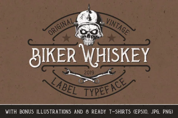
Biker Whiskey
Biker Whiskey is a clean, condensed Victorian label serif featuring hooked swash capitals, median thorns, and bonus skull/wrench shirt graphics.
Biker Whiskey is a spurred Victorian label serif with a bonus illustration set: heavy bracketed stems, a medial spur, split serifs and a small drawn ornament pack of wings and ribbons for the label corners. The spur breaks the silhouette, so a word widens at the ends, and the ornament set is drawn to the same line weight as the letters. It needs roughly 32 mm for the spur and the split serif to read, and it is best in one dark ink on cream and amber, or a single gold on a dark label where the spur holds.
Recommended project & layout
Custom motorcycle shop tee, whiskey flask & beard-balm tin — Drop the main brand name across the horizontal center bar of a shield crest, letting initial 'B' or 'W' drop slightly lower.
Before you cut or print
Clean solid font outlines cut reliably on HTV and outdoor decal vinyl at 1 inch+ letter height.
Best paired with
Get fontPaid link
 #6
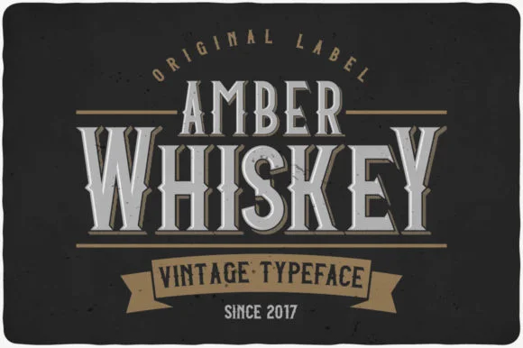
Amber Whiskey
Amber Whiskey is a tall, condensed Victorian display serif built for stacked spirits labels, apothecary crests, and heritage posters.
Amber Whiskey is a tall condensed Victorian bottle-label serif: very narrow bracketed stems, exaggerated thin strokes, split serifs with a small spur and a high cap height that fills a label's height. The condensation holds a long distillery name in a narrow panel, and the splits are the finest element. It needs roughly 28 mm for the split serif and the thin stroke to read, and it is best in one dense ink on cream and amber stock, or a fine gold on a dark ground where the splits print as cuts.
Recommended project & layout
Small-batch bourbon bottle, bitters label & cigar band — Stack a smaller 45% top word ('AMBER') directly over a full-width hero word ('WHISKEY') framed by thin rule lines.
Before you cut or print
Note that the silver inner bevel on the preview is poster styling; the font itself cuts and prints as clean solid serif shapes.
Best paired with
Get fontPaid link
 #7
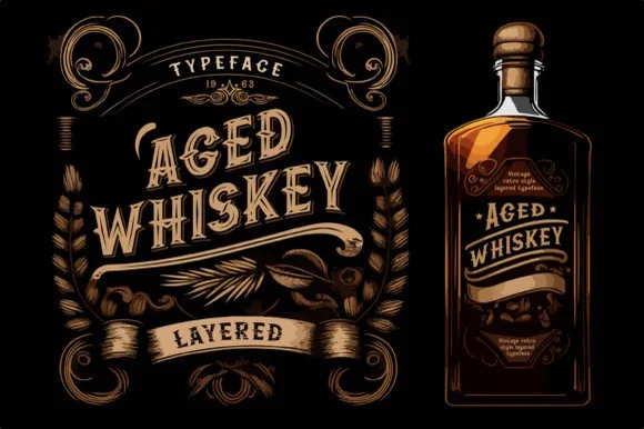
Aged Whiskey
Aged Whiskey is a classic layered vintage serif system with median-spurred capitals, swash hooks, and bonus ornamental bottle-frame graphics.
Aged Whiskey is a layered vintage distillery serif with ornate label frames and a two-colour build: a bracketed heavy serif with a printed keyline, a curled ampersand and a set of drawn frames and flourishes that lock around the word like a bottle label. The frame is drawn to scale with the word, so changing size reflows the whole ornament. The serifs are thick enough to hold on a curved bottle, and the keyline is the finest element. It needs roughly 30 mm for the keyline and the frame to read, and it is best in two inks, a dense black plus a warm tan on cream, or a single ink with a blind emboss for the second layer.
Recommended project & layout
Craft distillery bottle, barrel-aged coffee & maple syrup — Apply a gentle 12% upward arch or wave across two stacked uppercase words inside a botanical wheat border.
Before you cut or print
Use the solid base layer alone when cutting 1 in+ vinyl or laser-engraving oak barrel heads; stack layers for printed labels.
Best paired with
Get fontPaid link
 #8
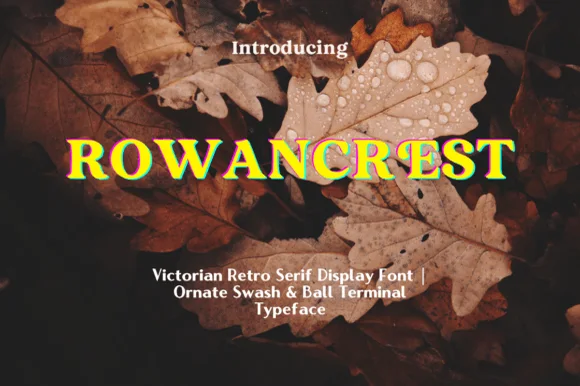
Rowancrest
Rowancrest is a sturdy Victorian retro display serif distinguished by plump ball terminals, bracketed slab-like serifs, and swash tails.
Rowancrest is a sturdy Victorian display serif with wide Roman proportions, bracketed slab-like serifs and plump ball terminals that curl the C and S into a small flourish. Swash tails extend past the word, so a layout needs space at the end of each line, and the weight is heavy enough that the face holds at 12 mm on a label while still reading as ornate at 90 mm. Because the ornament sits on the terminals, the counters stay open, which is why a Victorian revival of this weight remains legible in a short heading.
Recommended project & layout
Heritage cider bottle, autumn pub sign & wool-blanket tag — Set 1 uppercase title across 5–8 inches in antique gold, cream, or copper over dark forest brown or burgundy.
Before you cut or print
Solid, un-distressed strokes cut cleanly on 1 in+ wood-sign stencils, vinyl decals, and HTV.
Best paired with
Get fontPaid link
 #9
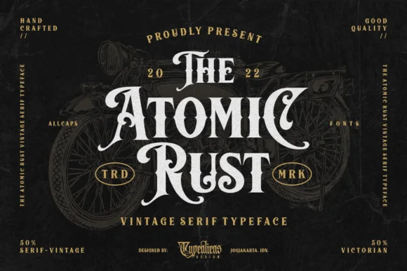
Atomic Rust
Atomic Rust is an all-caps Victorian heritage serif armed with median stem thorns, curled swash legs, and classic garage-emblem swagger.
Atomic Rust is a Victorian heritage display serif crossed with custom-motorcycle lettering: heavy stems with a thin inner line, exaggerated bracketed serifs that flare into small scrolls, and a small pinched waist on some strokes that reads as hand-painted enamel. The inner line and the scrolls are the finest elements and both close when the face is reduced. It needs roughly 32 mm for the inner line and the scroll to read, and it is best in one fine metallic on a dark ground, or a dense ink on cream with a spot varnish.
Recommended project & layout
Custom garage tee, coffee-roaster tin & whiskey label — Stack 3 centered words ('THE / ATOMIC / RUST') in descending/ascending widths with tucked swash capitals on outer edges.
Before you cut or print
Because strokes are solid (not speckled with grunge), Atomic Rust cuts cleanly on 1.25 in+ HTV and sign vinyl.
Best paired with
Get fontPaid link
 #10
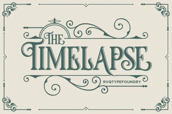
Timelapse
Timelapse is an ornate Victorian display serif crowned with spiraling vine swashes, teardrop terminals, and vintage apothecary charm.
Timelapse is a Victorian storybook and apothecary display serif with swashes: fine bracketed serifs against heavy stems, a small ball terminal on the diagonals, swash capitals that curl off the first letter and a slightly condensed width that keeps a long label on one line. The hairlines are the design and the swashes need side clearance. It needs roughly 30 mm for the swash and the hairline to read, and it is best in one fine ink on smooth or coated stock, or a foil impression above 40 pt where the curls still turn.
Recommended project & layout
Steampunk or historical novel cover, tea tin & poster — Center 1-to-2-word uppercase titles at 48–72 pt, activating upper flourishes on left initials and lower curls on middle/right stems.
Before you cut or print
Fine spiral tendrils and thin serif crossbars belong in print, foil, or laser wood engraving rather than small cut vinyl.
Best paired with
Get fontPaid link
 #11
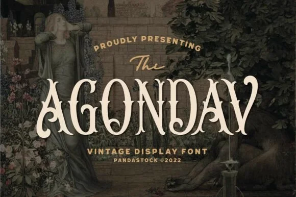
Agondav
Agondav is a romantic 19th-century Victorian display serif sculpting bifurcated Tuscan stems, waist notches, and curled 'A/V' terminals.
Agondav is a Victorian display serif in which the stems split into bifurcated Tuscan forms, with waist notches and curled terminals on the A and V, so a word reads as carved signage from a nineteenth-century shopfront. The construction is tall and narrow with a strong vertical axis, and the split stems mean the face needs size — roughly 25 mm — before the bifurcation reads as intentional rather than as a printing fault. It is a headline and label face, tight-spaced and all but unusable in long copy.
Recommended project & layout
Craft gin/absinthe bottle, apothecary candle & tarot deck — Center 1 uppercase brand word huge (72–145 pt) in parchment cream or antique gold beneath a small italic 'The'.
Before you cut or print
100% solid, crisp vector contours cut cleanly on 0.9 in+ Cricut vinyl/HTV, foil-stamp sharply, and laser-engrave deeply!
Best paired with
Get fontPaid link
 #12
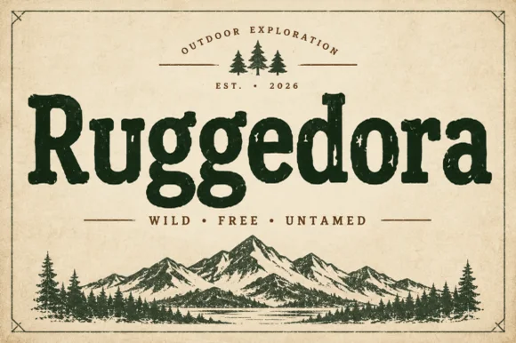
Ruggedora
Ruggedora is a heavy, softly distressed vintage slab serif with plump rounded bowls, bracketed feet, and weathered trail-sign warmth.
Ruggedora is a worn Cooper-style vintage slab serif: heavy bracketed slabs, a rounded stem, and a surface that is chipped along the contour with small voids inside the stroke so the letter reads as letterpress kept in a drawer. The wear is drawn, so a one-colour print keeps it, and the bracket is what closes first at small sizes. It needs roughly 30 mm for the bracket and the chips to read, and it is best in one dense ink on kraft and newsprint, or white on a dark board where the chips print as lights.
Recommended project & layout
Campfire enamel mug, national-park patch & overland decal — Center the main title in forest green, rust, or charcoal above wide-tracked sans mottoes ('WILD · FREE · UNTAMED') and pine icons.
Before you cut or print
Solid interior letter bodies allow clean HTV and outdoor car-decal weeding down to 0.85 inches.
Best paired with
Get fontPaid link
 #13
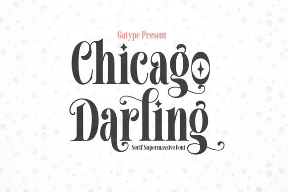
Chicago Darling
Chicago Darling is a bold, condensed modern-vintage serif distinguished by curled spiral terminals, sparkling counters, and deep descender loops.
Chicago Darling is a high-contrast vintage display serif with curled ball terminals: hairline thins against swollen stems, a small x-height, a high waist and terminals that roll into small balls on the a, c and r. It is the lettering of a nineteen-twenties poster and a department-store sign, so it wants size and air. The hairline thins are the finest element and they break first in print and in vinyl. It needs roughly 34 mm for the contrast and the ball terminal to read, and it is best one dark ink on a cream ground.
Recommended project & layout
Soy candle vessel label & apothecary box front — Stack a two-word scent or brand name tightly at 32–42 pt with tighter line-height, anchored by minimalist uppercase sans notes below.
Before you cut or print
Hairline crossbars and spiral tips shine in 300 DPI print and hot foil; avoid weeding small adhesive vinyl below 2 inches cap height.
Best paired with
Get fontPaid link
 #14
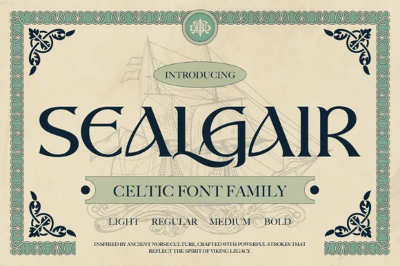
Sealgair
Sealgair is a four-weight Celtic display serif blending chiseled wedge terminals with sinuous interlocking crossbars and descender hooks.
Sealgair is an ornamental Celtic and Norse display serif family: sturdy stems with woven knotwork filling the counters, angular shoulder ornaments and a second cut whose interlacing runs thinner for a smaller line. The family is a carved-inscription look, so it belongs on a sign, a plaque and a cover rather than a paragraph. The knotwork is the finest element and it fills into a solid plate when the face is reduced. It needs roughly 44 mm for the weave to read, and it is best one dark ink on a stone-toned ground or carved in relief.
Recommended project & layout
Craft whiskey, meadery, or Highland pub bottle label — Set the spirit or pub name in Sealgair Bold all-caps across the label chest, using Regular or Light for batch numbers and tasting notes.
Before you cut or print
For laser-engraved oak barrels, leather coasters, or Slate plaques, choose Medium or Bold so fine wedge serifs engrave crisply.
Best paired with
Get fontPaid link
 #15
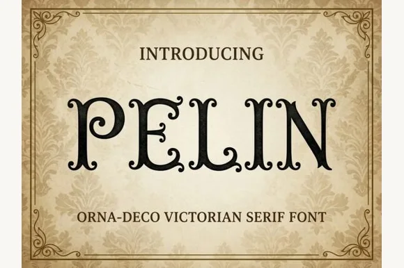
Pelin
Pelin is an Orna-Deco Victorian display serif blending classical Roman stems with inward-curled spiral hooks and diamond stem nodes.
Pelin is a Victorian Orna-Deco serif with curled inner terminals: high-contrast stems, thin slabbed serifs, a hairline inline and small curls that turn inward at the ends of some strokes instead of finishing flat. The curls are the design and they close first at small sizes, and the hairline inline silts on uncoated stock. It needs roughly 30 mm for the curl and the inline to read, and it is best in one fine ink on coated stock, or a foil impression above 40 pt where the curls still turn.
Recommended project & layout
Gothic mystery book cover, tarot deck & theater playbill — Center 1-to-3-word uppercase titles at 48–72 pt inside thin double-line ornamental frames on cream or charcoal backgrounds.
Before you cut or print
Delicate spiral curl tips reproduce crisply in print and laser engraving on wood boxes; keep vinyl cuts at 1.5 in+ cap height.
Best paired with
Get fontPaid link
 #16
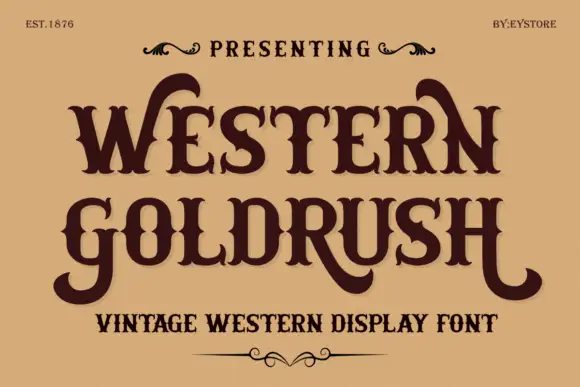
Western Goldrush
Western Goldrush is an ornamental western serif in which the capitals carry long curved spurs, the feet flare into heavy slabs and the middle letters stay narrow, so a word reads as a saloon sign.
The W opens with a wide curved spur and the letters after it keep a narrow body: the E holds three arms with spurred ends, the S swells through two heavy curves and the G closes with a straight bar and a curled ear. The H of the second word repeats the spur gesture on both stems, which is what gives the composition its symmetry. Weight is heavy in the verticals with a moderate contrast, and the spurs are thin enough to need a coated stock at small sizes. The fit is tight with deliberate overlaps where the spurs cross the next letter, which is how a painted sign reads. The sand ground, the dark brown ink, the small ornaments and the three caption lines are presentation; the typeface is the two words.
Recommended project & layout
A western story-night poster — Keep the story details clear of the lowest tails.
Before you cut or print
Confirm the required alternate forms.
Best paired with
Get fontPaid link
Display & Decorative Headlines
5 fonts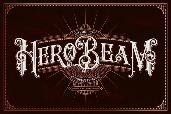 #17
Hero Beam
Hero Beam is an elaborate Victorian poster typeface dressed with interior inline filigree, curled spurs, and crisp drop-contour framing.
Hero Beam is a three-dimensional Victorian saloon and tattoo blackletter: a dense gothic body with a bevel that shades the left edge, a bright highlight ridge along the stem and a drop shadow that sits under the letter. The shading is the whole character, so it needs size to read as a solid beam rather than a smudge, and the highlight is the finest element. It needs roughly 36 mm for the bevel and the highlight to read, and it is best as a paper-colour build on dark stock, or one metallic ink with the highlight left as unprinted paper at 50 mm and above.
Recommended project & layout
Craft root-beer bottle, barber-parlor mirror & cigar box — Arc or center a single bold brand title at large scale (56–84 pt) over dark mahogany, navy, or black label panels.
Before you cut or print
Contains intricate interior filigree lines—produce via high-res label printing, DTF, or laser engraving rather than blade-cut vinyl.
Best paired with
Get fontPaid link
 #18
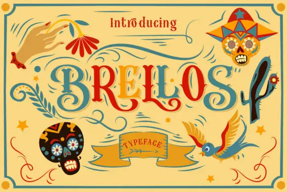
Brellos
Brellos is a hand-drawn folk display face with swash capitals in teal and red, a woven banner label and a set of sugar-skull and bird extras drawn in the style of Mexican paper craft.
BRELLOS fills the middle of the card in letters that mix a round bold skeleton with looping swashes: the B and the R carry curled tails that run under the word, the E is built from a slab with a swash on the bar, and the two Ls are drawn as tall strokes with a leaf. Around the letters the card is dressed in the vocabulary of papel picado: a sugar skull in a hat at the upper right, a second skull at the lower left, a bird with spread wings at the lower right, a leaf spray at the upper left, a hand on a ribbon. The palette is a flat teal, brick red and amber on a mustard ground, and a banner at the foot carries the word Typeface. It is a display face for festivals and packaging, and the extras are part of the purchase rather than decoration around the sample.
Recommended project & layout
An outdoor music social poster — Set the words on two teal and red lines on pale yellow, with one separate flower below and plain event details at the bottom.
Before you cut or print
Verify the new letters and create or license any illustration separately.
Best paired with
Get fontPaid link
 #19
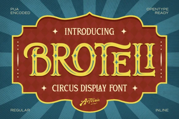
Broteli
Broteli is a theatrical vintage carnival display font featuring bifurcated Tuscan spurs, curled terminals, and both Regular and Inline cuts.
Broteli is a Tuscan-spurred circus and carnival poster display: heavy unbracketed slabs that split into a forked foot, a median spur rising from the middle of some stems, small ball terminals and a slight inward curve on the round letters that reads as a hand-painted carnival board. The forks are the design and they close first when the face shrinks. It needs roughly 32 mm for the fork and the spur to read, and it is best in two bright inks on cream, or one ink plus paper where the forks print as cuts.
Recommended project & layout
'Step Right Up' carnival birthday marquee & ticket invite — Set the child's name or 'CARNIVAL' in Broteli Inline at 56 pt inside a bordered plaque, flanked by four-point star dingbats.
Before you cut or print
Choose the solid Regular cut when cutting cardstock or vinyl banners; save the detailed Inline cut for printed invitations and posters.
Best paired with
Get fontPaid link
 #20
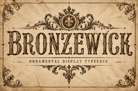
Bronzewick
Bronzewick pairs tall narrow Old West capitals with fine engraved linework inside every stem, so a single-colour print gains the depth of copperplate or woodblock engraving without a second ink.
The letters stay narrow and tall with heavy bracketed serifs, and the interior of each stem carries thin parallel hatch lines that read as shading. The internal hatching is the character: the depth lives inside the letter rather than in an outline, which is why the sample suits a whiskey label. Because the hatch lines are fine, keep 34 pt before they resolve, and check that the chosen surface does not fill them at press. The face suits short heritage headings and loses the engraving effect on longer lines.
Recommended project & layout
Craft whiskey label, beard-oil bottle or book cover — Use at 36pt+ on light kraft or cream stock so internal hatching lines stay crisp.
Before you cut or print
Fine internal engraving lines are made for print, laser engraving and sublimation — not blade vinyl cutting.
Best paired with
Get fontPaid link
 #21
Aristoreva
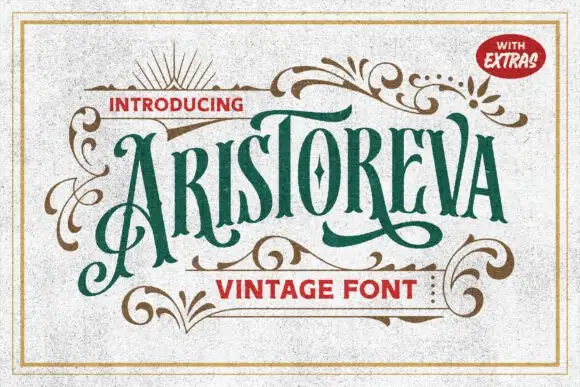
Aristoreva is a condensed vintage face in which the letters stay tall with high contrast, the terminals curl and a long A flourish descends below the baseline while several strokes sweep across or under neighbouring characters.
The letters compress tall, the terminals curl outward, one flourish leaves the A and drops well below the line and other strokes cross their neighbours by design. The long descending flourish is the character: it makes a short name read as an engraved label, which is why the sample sets the title inside gold ornamental curls. Because the sweeps travel, keep 22 mm beneath and 18 mm at each end from 28 pt, and treat the ornamental curls in the sample as surrounding artwork rather than part of the face.
Recommended project & layout
A decorative tea-label study — Use a generous title panel and keep ingredient information outside the swash area.
Before you cut or print
Test the exact capitals and verify any extras before using them.
Best paired with
Get fontPaid link
Practical buyer checklist
Frequently asked questions.
Key cutting, printing and pairing answers before choosing a whiskey, craft beer & spirits labels typeface.
What font size does legal text need on a spirits label?
Between 5 and 6 pt in most markets, and it must clear the jurisdiction's minimum. Use a plain sans with open counters at that size, and never set the warning text in the ornamental display face.
Can Victorian label fonts be foil stamped?
Yes, and foil suits the spurs and ball terminals. Reduce the foil temperature on textured stock, and increase the thinnest stroke slightly since foil spreads under pressure and can close a fine detail.
How much ornament is too much on a bottle?
One ornamented element: the brand name, or a frame. When the frame, the name and the flavour description are all decorated, the label reads as busy from a shelf distance of two metres.
Do these fonts include the numbers and symbols on a label?
Most include 0 to 9 and basic punctuation. Check for the percent sign and the small superscript used for ABV, since some display sets omit them and force a substitution mid-label.
Keep exploring
Related collections & guides.
Explore adjacent maker roundups or check our practical pre-production checklists.
01 / Type Styles
Western & vintage label
23 curated fonts · Previews & pairings
02 / Branding & Print
Soy candles, apothecary & skincare
29 curated fonts · Previews & pairings
03 / Branding & Print
Vintage logo badges & heritage emblems
20 curated fonts · Previews & pairings
04 / Branding & Print
Coffee shop, roastery & café branding
22 curated fonts · Previews & pairings
Guides: Invitation font checklist · Vinyl & cutting checklist · How to pair script & sans fonts