 #1 · Best Overall
Disclosure: MakerFileHub may earn a commission from qualifying purchases via paid links on this page. How our links work.
Stadium scripts, uniform slabs & seam details
17 Best Baseball, Dugout & Team Jersey Fonts
Baseball typography splits into two traditions: the arched uniform script that sits across a jersey chest, and the block slab used for numbers and scoreboards. Ballpark Beauty and Standley handle the script side with a layer and extrude, Baseball Custom and Baseball College cover the solid slab, and Baseball Stitch adds the seam detail that instantly reads as the sport.
Quick verdict
Baseball Custom is the most reliable uniform slab, Ballpark Beauty is the best script for a chest lockup, and Baseball Stitch is the pick when the seam detail has to be visible. Standley adds a layered vintage option.
Quick answer
Top 3 baseball, dugout & team jerseys picks right now.
Short on time? Start with our three highest-rated baseball, dugout & team jerseys standouts before scrolling the full breakdown.
#1 · Best Overall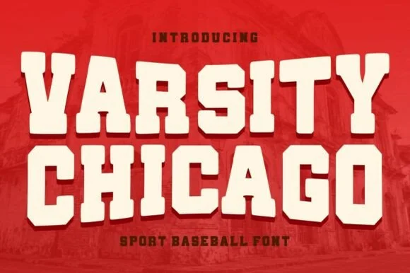 #2 · Runner-Up Pick
Varsity Chicago
Chunky baseball varsity capitals with stepped notched corners
Get fontPaid link
Read review ↓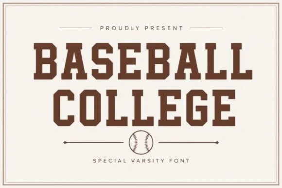 #3 · Editor's Choice
How we tested & selected these 17 fonts
We kept 17 of 477 candidates that reference the sport in construction rather than in the listing title. Judged on how the script arches across a chest, whether numerals read at 10 inches, and whether the seam or stitch detail survives single-colour cutting.
Side-by-side summary
Top 5 baseball, dugout & team jerseys picks at a glance.
Compare specimens, OpenType/PUA traits and primary project roles side by side.
| Rank & Font | Style & File Specs | Best Project Fit | Store Listing |
|---|---|---|---|
| DisplayHeavy | Little League uniform back, bat-bag tag or team tee | Get fontPaid link | |
| DisplayChunky | Vintage baseball tee, pennant or sports bar sign | Get fontPaid link | |
| Slab SerifVarsity-solid | Team jersey back name, senior sweatshirt & locker decal | Get fontPaid link | |
| DecorativeLaced-outline | Sublimation baseball tumbler, coach clipboard & team card | Get fontPaid link | |
| Slab SerifVintage-fleece | Vintage athletic-club crewneck, pickleball tote & cap | Get fontPaid link |
Serifs & Slab Serifs
11 fonts#1 · Best OverallBaseball Custom
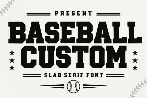
Baseball Custom is a heavy condensed slab alphabet in which the stems stay wide, the serifs turn square and the fit runs tight, so a two-word title reads as the lettering on a team jacket.
The B stacks two square bowls, the A carries a wide bar, the S steps a heavy spine, the E sets three thick arms and the M keeps four stout stems, all at a baseball weight with square serifs and almost no contrast. The condensation with full weight is the character: the face fills a narrow band without looking squeezed, which is why the sample sets two stacked words with stars either side. Because the counters stay open, the face reads from 26 pt and cuts cleanly in vinyl or felt. The cream ground, the stars, the ball and the ball-stitch corners are presentation; the black display words are the face.
Recommended project & layout
Little League uniform back, bat-bag tag or team tee — Arch slightly for chest logos or run straight across jersey shoulders.
Before you cut or print
Top pick for Cricut/Silhouette HTV and laser-cut hat patches.
Best paired with
Get fontPaid link
#2 · Runner-Up PickVarsity Chicago
Varsity Chicago is a chunky baseball capital alphabet in which the stems are wide, the corners step in and out, and the fit is tight, so a two-word title reads as a stitched team name on a jersey.
The V cuts two thick diagonals into a flat base, the A holds a low bar, the R turns a stepped leg, the S notches its spine, the I carries wide serifs and the T spreads a heavy arm, all at a single heavy weight with stepped corners and flat terminals. The stepped corner is the character: it looks like a cut felt letter rather than a drawn one, which is why the sample sets two stacked words edge to edge. Because the shapes are solid and open, the face holds from 30 pt upward and cuts well in vinyl or felt; it needs tracking rather than kerning. The red ground, the faded brick photograph and the small lines above and below are presentation; the cream varsity words are the face.
Recommended project & layout
Vintage baseball tee, pennant or sports bar sign — Set stacked all-caps in cream on crimson, navy or forest green shirts.
Before you cut or print
Smooth solid vector edges cut cleanly on HTV, vinyl and felt pennants.
Best paired with
Get fontPaid link
#3 · Editor's ChoiceBaseball College
Baseball College is a clean, solid-filled American varsity slab serif built with sturdy rectangular blocks and chamfered athletic corners.
Baseball College is a clean collegiate slab serif drawn from the two-colour varsity lettering of vintage baseball: thick unbracketed slabs, a heavy vertical weight, a flat top on the A and a slight upturn on the R leg. The solid construction holds one-colour printing without an outline, and the slabs give the face enough weight for embroidery. It needs roughly 26 mm for the slabs to read as separate, and it is best in navy on cream, or a single dark ink on white and heather grey.
Recommended project & layout
Team jersey back name, senior sweatshirt & locker decal — Arch or stack all-caps player/school names at 54–100 pt with +8 tracking above a baseball divider line.
Before you cut or print
Weeds in seconds on athletic HTV, flock vinyl, and tackle-twill stencils down to 0.6 inches!
Best paired with
Get fontPaid link
 #4 · Top Maker Utility
Baseball Stitch
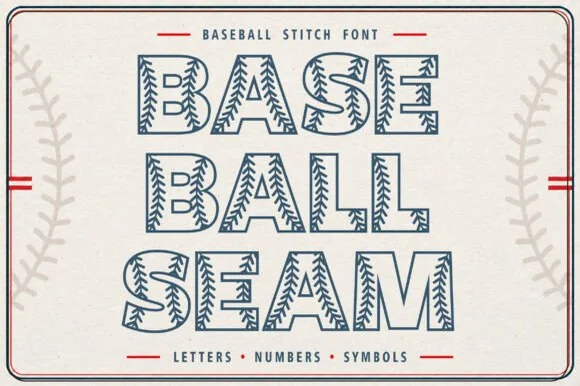
Baseball Stitch (Baseball Stitch Sans) is a hollow, single-outlined collegiate slab font detailed inside every stroke with curved V-chevron baseball stitches.
Baseball Stitch is a hollow-outlined varsity slab with curved seam laces: open letters where only the outline prints, with two curved stitch lines running through the counters and a small lace cross at the ends of each seam. The hollow face needs a light ground, and the stitched seams are the finest element and close first. It needs roughly 32 mm for the stitch and the outline to read, and it is best as a one-colour vinyl cut on a light ground, or two flat inks where the seams take the second colour.
Recommended project & layout
Sublimation baseball tumbler, coach clipboard & team card — Stack 2 or 3 short uppercase words or player numbers at 56–100 pt on white or light-gray blanks.
Before you cut or print
Fine hairline seam outlines + tiny V-stitches are built for sublimation, DTF, Print-Then-Cut stickers, and laser engraving—not vinyl weeding!
Best paired with
Get fontPaid link
 #5 · Standout Silhouette
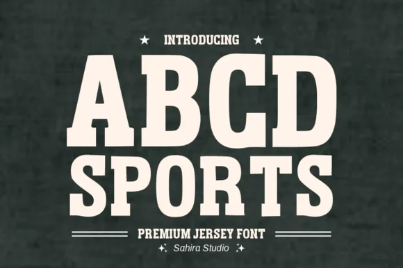
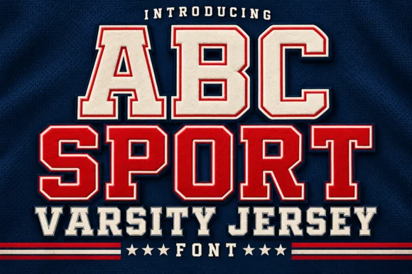
Abcd Sports
Abcd Sports is a clean, softly rounded athletic slab serif channeling 1980s Russell/Champion reverse-weave sweatshirt lettering.
Abcd Sports is a softly rounded athletic slab built on the 1980s reverse-weave sweatshirt lettering that university bookstores printed for decades, with heavy block capitals, blunt slabs and outer corners rounded so the letters read as felt rather than as a hard sports block. The weight is uniform and the counters are large, which lets the face hold at 12 mm on a cap and at 200 mm on a stadium banner. It is an all-caps face, pairs with a plain sans for names and numbers, and looks wrong in sentence case.
Recommended project & layout
Vintage athletic-club crewneck, pickleball tote & cap — Stack 2 centered uppercase lines at 64–120 pt (or arch +15% across a sweatshirt chest).
Before you cut or print
Rounded corners resist peeling in the wash—cuts and weeds fast on flock HTV, puff HTV, and twill down to 0.6 in!
Best paired with
Get fontPaid link
 #6
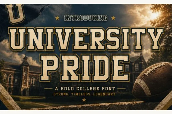
University Pride
University Pride is a commanding collegiate varsity slab serif featuring chamfered block stems framed by a crisp outer contour line.
University Pride is a double-outlined collegiate stadium varsity slab: extended block letters with a hard keyline inside a second keyline, thick unbracketed slabs and a small inward notch on the terminals that reads as a stadium banner. The double outline doubles the footprint and the inner line closes first. It needs roughly 32 mm for the second keyline and the notch to read, and it is best in two flat inks on jersey and banner mesh, or three inks where paper forms the second line.
Recommended project & layout
Alumni sweatshirt, homecoming banner & varsity jacket — Set school or department names across a 10-inch chest arch above flanked star dividers and graduation years.
Before you cut or print
Because every letter carries a thin outer border gap, cut HTV at 1.4 inches tall or larger, or use DTF/screen print for smaller crest text.
Best paired with
Get fontPaid link
 #7
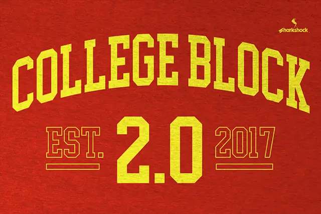
College Block 2.0
College Block 2.0 displays yellow block lettering on textured red, where the main title curves upward across a shallow arc and EST. and 2017 appear as thin hollow outlines beside a much larger solid 2.0 with clipped corners.
The blocks stay square and heavy, the counters narrow to rectangles, the secondary words thin into outlines and the main row follows an arc. That three-level treatment is the character: the sample builds a date lockup from one face by changing scale and outline, which is why the texture sits in the ground rather than the letters. The arch is a composition choice, not a font feature. Keep 44 pt, build the arc in your layout tool and check the thin outlines at the size you plan.
Recommended project & layout
An alumni programme cover — Arc COLLEGE gently over a straight REUNION line on a red programme cover; put the class year below with generous space.
Before you cut or print
Check the exact year and whether hollow styles are supplied or must be drawn separately.
Best paired with
Get fontPaid link
 #8
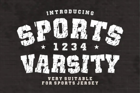
Sports Varsity
Sports Varsity is a bold, grunge-textured collegiate slab serif with matching athletic numerals ('1 2 3 4') built for vintage arched team shirts.
Sports Varsity is a bold collegiate slab with cracked ink texture and a matching set of athletic numerals, drawn for arched team layouts. The slabs are stout, the arch is achieved by the designer rather than the font, and the distress sits on the surface so the letters keep a solid silhouette at a distance. Numerals are cut to the same weight as the caps, which lets a jersey number sit next to a team name without a second face. It needs roughly 20 mm for the crack texture to read, and it is at its best in one light colour on a dark garment.
Recommended project & layout
Vintage arched tailgate sweatshirt, alumni mug & banner — Arch row one (+18%), center '★ YEAR ★' at 42 pt, and set row two straight underneath on charcoal or navy blanks.
Before you cut or print
Heavy grunge speckles and cracks are built for DTF transfers, sublimation, and screen print—never weed small HTV!
Best paired with
Get fontPaid link
 #9
Seniors First
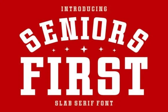
Seniors First is a solid, single-layer collegiate block slab serif with stout rectangular feet, chamfered bowls, and punchy athletic balance.
Seniors First is a chunky varsity block athletic slab serif: extended block letters with thick unbracketed slabs, a small notch cut into the terminals and an even weight that reads as a stadium jersey number. The wide blocks fill a banner and the notch closes when the face is reduced. It needs roughly 30 mm for the notch and the slab to read, and it is best in two flat inks on jersey and felt, or one ink on banner mesh at gate distance.
Recommended project & layout
Class-of-2027 hoodie, senior yard banner & car-window decal — Arch the top word at a 20% curve over small four-point stars and anchor the second word straight underneath.
Before you cut or print
Cuts cleanly at almost any craft scale from 0.5-inch cap badges up to 11-inch jersey backs.
Best paired with
Get fontPaid link
 #10
Varsity Spirit
Varsity Spirit is a layered varsity capital alphabet in which each letter carries an inline stroke, a keyline and a set of matching numerals, so a team name reads as the appliqué on a college jacket.
The V cuts two thick diagonals with an inline running between them, the S holds a stepped spine, the A pinches a flat apex, the R turns a notched leg and the numerals carry the same inline and keyline, all at a heavy slab weight with square serifs. The inline is the character: it divides each stroke into two bands, which is why the sample sets a stacked word above a full numeral line. Because the inline is narrow, the face needs 40 pt before it stays open, and each layer has to be a clean vector for a vinyl or embroidery cut. The white timber ground, the format strip and the small badge are presentation; the black and white layered words are the face.
Recommended project & layout
A school-spirit event poster — Put a broad title over a separate plain schedule and keep the inner lines away from background patterns.
Before you cut or print
Check every required numeral and letter rather than assuming the sample alphabet is complete.
Best paired with
Get fontPaid link
 #11
Vintage Varsity
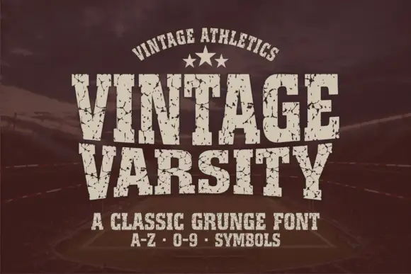
Vintage Varsity is a condensed athletic capital alphabet with heavy flat slabs and a cracked wear texture, so a short word reads as a printed team jersey from decades ago.
The letters are narrow and tall: the V closes to a sharp point, the A keeps a low bar, the R carries a straight leg and the S reverses through flat terminals, with slabs at every stem and no bracketing. The wear is drawn into the letterforms rather than applied as an effect: cracks run through the slabs and a few counters show chipped edges, which is what gives the face its printed-jersey look. Weight is heavy and uniform, the fit is tight enough that a long team name holds a single line, and because the texture is coarse the face needs a decent size to stay legible. The dark ground, the cream ink, the star rule and the two small caption lines are presentation; the typeface is the two words.
Recommended project & layout
A reunion match poster — Keep dates and scores in a clean companion face.
Before you cut or print
Inspect cracks in the narrowest strokes.
Best paired with
Get fontPaid link
Scripts & Calligraphy
6 fonts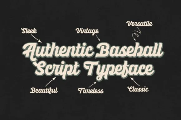 #12
Ballpark Beauty
Ballpark Beauty is an authentic, heavy-stroke vintage baseball script (NOT a block display!) built for arched jersey chests, brewery cans, and retro merch!
Ballpark Beauty is a heavy connected brush script in the vintage baseball idiom, with thick monoline-ish strokes, tall looped ascenders and a generous forward slant that lets a name arch across a jersey chest. The connections are wide and solid, so the face survives a screen print and a chain-stitch transfer, and the weight keeps it readable at a distance in stadium lighting. It needs roughly 30 mm before the arched rhythm reads as lettering rather than a wave, and it is at its best in one light colour on a dark ground with a solid drop shadow.
Recommended project & layout
Travel-baseball / softball team jersey, dugout banner & hat — Stack 2 title-case words at 68–140 pt in cream with a 0.08 in forest-green or navy 3D offset shadow.
Before you cut or print
Click Weld in Cricut Design Space—thick, hairlineless strokes cut and weed in seconds on stretch athletic HTV & tackle twill!
Best paired with
Get fontPaid link
 #13
Standley
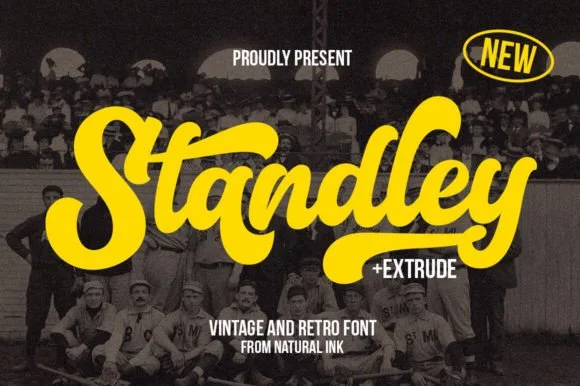
Standley is a chunky vintage ballpark script bundled with a matched Extrude shadow font and extra swash glyphs.
Standley is a layered vintage baseball and varsity brush script with an extrude layer: a loaded brush stroke with connected letters and a firm slant, delivered as a fill, a hard offset extrude and a keyline that can be printed in three passes. The extrude doubles the footprint and the brush edge is the finest element. It needs roughly 28 mm for the extrude and the brush edge to read, and it is best in three flat inks on jersey, or two inks where the extrude takes a darker tone of the fill.
Recommended project & layout
Little-League baseball shirt, dugout banner & team hoodie — Slant upward 5 degrees in athletic gold or crimson backed by the black Extrude layer across chest fronts.
Before you cut or print
Thick solid strokes on the base Standley font cut and weed fast and cleanly on jersey HTV and helmet decals (weld first!).
Best paired with
Get fontPaid link
 #14
William Jameson
William Jameson is a lively monoline signature script with broad looping capitals and a bold underline swash tail.
William Jameson is a slanted signature cursive with a sweeping underline swash: a fast forward-leaning stroke, letters joined at the baseline, and a long flat swash that draws under the whole name and lifts at the end. The swash is the design, so the face needs a wide measure rather than a square panel. The swash thins are the finest element and they break first in print and in foil. It needs roughly 30 mm for the swash and the slant to read, and it is best one dark ink on a smooth stock.
Recommended project & layout
Apparel neck label, hangtag & founder sign-off — Stack the first name slightly left of the surname so the descending 'J' or capital loop balances the underline swash across a 3-inch width.
Before you cut or print
For HTV hoodies or t-shirts, size the lockup at least 3.5 inches wide so compact 'e' and 's' loops weed without lifting.
Best paired with
Get fontPaid link
 #15
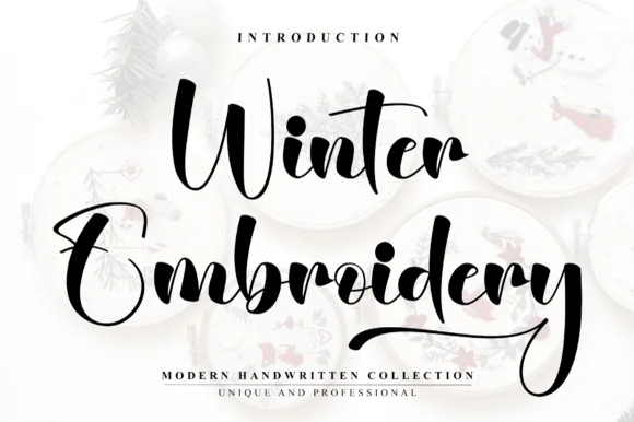
Winter Embroidery
Winter Embroidery is a bouncy modern calligraphy brush script—despite its name, it features smooth solid ink strokes rather than stitch textures.
Winter Embroidery is a thick-thin bouncy modern brush script: a high-contrast stroke with a swollen thick and a hairline-thin, letters that rise and fall along the baseline and joins that loop back into the word. It is the look of a machine-embroidered name, so it suits a patch or a knit more than a leaflet. The hairlines are the finest element and they break first, on thread and in print. It needs roughly 34 mm for the thick-thin contrast to read, and it is best one colour on a soft ground where the hairline holds.
Recommended project & layout
Holiday mug decal, gift sack & ornament lettering — Stack a two-word winter phrase with tight leading so the upper capital sits neatly above the wider lowercase second word.
Before you cut or print
Weld all cursive joins before vinyl cutting and keep x-height above 0.65 in so the thin upward connectors do not lift during weeding.
Best paired with
Get fontPaid link
 #16
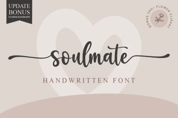
Soulmate
Soulmate sets a balanced modern cursive in a single dark weight on a warm neutral field, where moderate stroke contrast and tidy x-height proportions keep the word clear while horizontal s and e extensions run far out to both sides and frame the name symmetrically.
The strokes stay even and moderate, the letters stay upright and connected, the tails run horizontal and long, and the word stays centred inside them. Those side tails are the character, because they turn a single word into a rule that can hold a whole layout. A pale heart sits behind the word and a corner note advertises flower clipart, both as cover treatment. Keep 26 pt so the joins stay open, allow 25 mm at each side for the tails and check the middle letters against a long name before committing.
Recommended project & layout
Engraved keepsake box or vow book cover — Set in lowercase with side swashes on a single line above a small ceremony date.
Before you cut or print
PUA encoded; weld script joins and check thin outer tail tips before cutting small adhesive vinyl.
Best paired with
Get fontPaid link
 #17
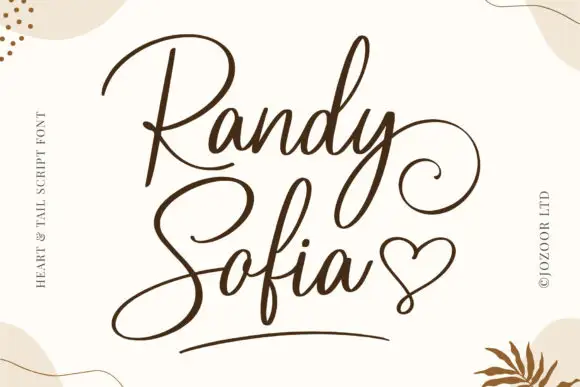
Randy Sofia
Randy and Sofia form a two-line composition with large opening capitals, where the upper R carries a broad open bowl, the lower S sweeps down and to the left, the y curls out to the right of the top line and a drawn heart plus a short underline occupy the bottom right of the pale field.
The strokes stay monoline and slim, the opening capitals stay large, the tails curl wide and the y drops into a long loop. Those tails are the character: the two words interlock through the descenders rather than sitting apart, which is why the composition needs a square area rather than a tight text box. The heart and the underline may be separate graphics, and the cover marks them as part of the drawn set. Keep 30 pt for the hairlines, plan 25 mm on all sides for the tails and check the heart in your file.
Recommended project & layout
An invitation with stacked names — Offset the lower name slightly left so the upper tail has room at the right. Start the ceremony text below the entire lower flourish.
Before you cut or print
Check the two real names together; a different descender may change the spacing and alignment.
Best paired with
Get fontPaid link
Practical buyer checklist
Frequently asked questions.
Key cutting, printing and pairing answers before choosing a baseball, dugout & team jerseys typeface.
What size should a baseball jersey script be?
Adult jerseys usually run 9 to 12 inches wide across the chest, with the lettering at 2 to 3 inches tall. Youth sizes drop to 7 to 9 inches wide so the arch does not wrap around the ribs.
Can I use a varsity slab for both letters and numbers?
Yes, that is what the style is drawn for. Check the 1, 4 and 7 first, since those digits are where a clipped slab shows its weakest shapes, and confirm that the digit widths match the letter widths.
Why does my arched script look crooked after pressing?
Heat and pressure stretch the film slightly, and a shallow arc exaggerates any misalignment. Align the centre letter to the shirt's placket, press from the centre outward, and use a cover sheet to spread the pressure evenly.
Do baseball fonts include lowercase letters?
The script faces do, since jerseys use mixed case. The block slabs usually ship capitals and numerals only. Check the glyph set before planning a name plate that integrates the two.
Keep exploring
Related collections & guides.
Explore adjacent maker roundups or check our practical pre-production checklists.
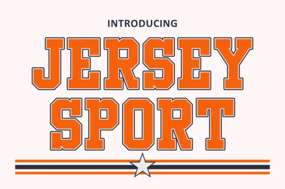
01 / Branding & Print
Varsity & athletic
25 curated fonts · Previews & pairings
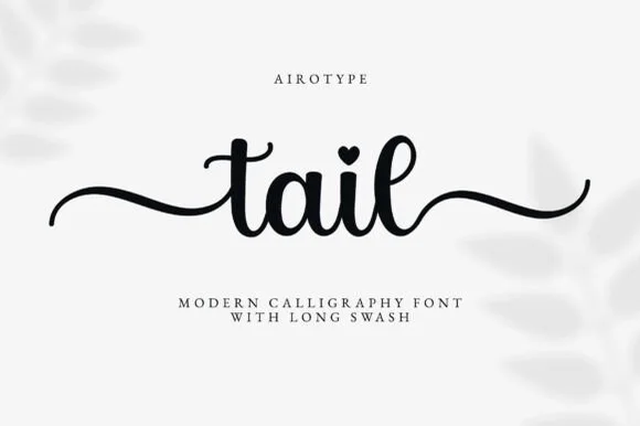


02 / Cricut & Craft
Cricut fonts with tails
21 curated fonts · Previews & pairings


03 / Cricut & Craft
T-shirts, hoodies & HTV apparel
33 curated fonts · Previews & pairings
04 / Occasions & Milestones
Graduation & senior class
18 curated fonts · Previews & pairings
Guides: Invitation font checklist · Vinyl & cutting checklist · How to pair script & sans fonts