Modern Grotesque Body

Sports Varsity + Montreal
Creates crisp high-hierarchy contrast beneath Sports Varsity headlines across menus, websites and labels.
Inspect Montreal specimenDisclosure: MakerFileHub may earn a commission from qualifying purchases via paid links on this page. How our links work.
Condensed varsity slab with heavy blocks
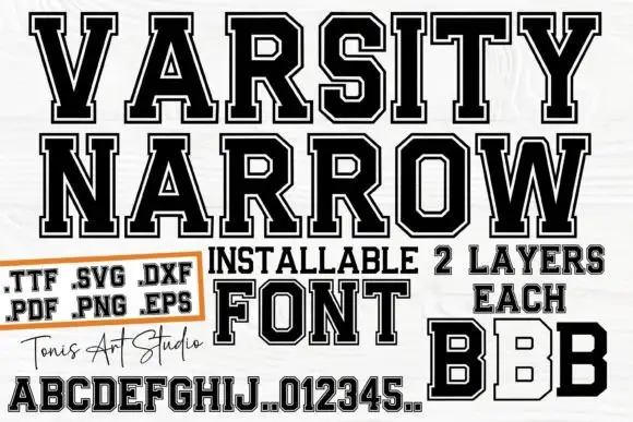
Sports Varsity is a varsity slab in black and red on white wood: heavy condensed capitals with flat serifs, shown as a headline, a red two-letter block, a full alphabet with digits, and a handwritten studio signature.
Paid link
Get this fontProject & layout blueprintsAt-a-glance maker compatibility
Sturdy stroke walls and open counters weed cleanly on adhesive vinyl, HTV apparel film, and cut cardstock.
Visual anatomy & craft review
The sheet is a product page rather than a single specimen, and the face is a varsity slab: the stems are heavy and the letters are condensed with thick flat serifs, flat apexes on the A and the V, squared shoulders on the S, a straight leg on the R and tight fitting so each word reads as a brick. The sample uses it three ways, as a two-line headline in black, as a two-letter block in red, and as a complete alphabet with digits along the bottom, which is the useful part: a buyer can see that the face works for a wordmark and for a number line on a jersey. The rest of the page carries a badge listing the file formats, a line of red capitals and a handwritten signature for the studio. The ground is a white wood surface. Sports Varsity is a display face for team wear, school signage, sports posters and merchandise, and it needs capitals at a large size with plenty of width.
Varsity, condensed, blocked
Two-font hierarchy recipes
Tested contrast partners — pairing Sports Varsity with grounded secondary typography.
Sports Varsity + Montreal
Creates crisp high-hierarchy contrast beneath Sports Varsity headlines across menus, websites and labels.
Inspect Montreal specimen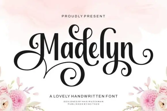
Sports Varsity + Madelyn
Adds a warm human signature touch for 1-to-3-word callouts without competing against structured serif capitals.
Inspect Madelyn specimenPractical applications
Concrete hierarchy, scale and production guidance tailored to Sports Varsity’s stroke geometry.
A condensed varsity slab keeps two digits readable from the far side of a gym, and the tight fitting makes the number read as one mass rather than two shapes.
Hierarchy & layout recipe
Print a 250 mm jersey back: set each digit at 200 mm cap height, keep 40 mm between the digits, and hold 60 mm clear of the shoulders and 45 mm clear of the hem.
Pre-production check
Curved numbers warp on a jersey; print one garment and check the digits at chest height before the squad order.
A varsity block reads at speed from a doorway, and the flat serifs stay sharp when the sign is cut from vinyl rather than printed on paper.
Hierarchy & layout recipe
Print a 1200 by 350 mm panel: set the name at 200 pt on one line, keep 45 mm of clear ground beneath before the hours at 30 pt, and hold 36 mm of margin on all four sides.
Pre-production check
A condensed face on a wide panel leaves space at the sides; add the school line at the same width and proof the layout.
A varsity slab names a fixture with the weight of a printed programme, and the condensed forms fit a long team name on one line.
Hierarchy & layout recipe
Print a 148 by 210 mm programme: set the fixture at 46 pt on one line, keep 16 mm of clear ground beneath before the teams at 13 pt, and hold 12 mm of margin on all four sides.
Pre-production check
A tight fit at forty-six points can merge the letters; print one cover at the final size and check the gaps.
Technical & licence verification
Confirm included OTF/TTF/WOFF formats, full glyph tables and licence coverage on the live store page before batch production.
Closest visual alternatives
Matched across letterform anatomy, stroke behaviour and craft applications.
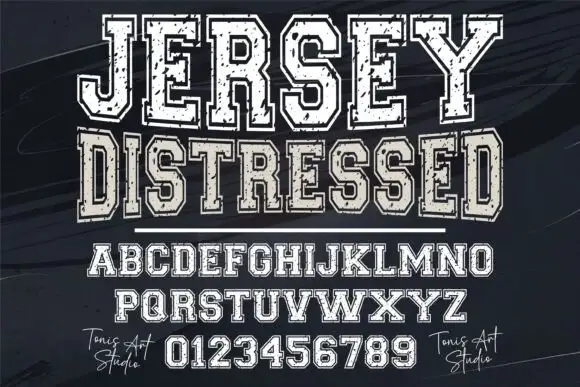
Distressed varsity slab capitals with an outline and a heavy fill
Jersey Distressed is a varsity slab capital alphabet with a heavy fill, a separate outline and a speckled wear texture, so one word reads as a shirt print that has been washed a hundred times.
Ideas for this font
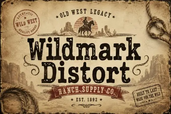
Distressed western display
Wildmark Distort is a distressed western display in black and cream on aged paper: a rounded slab with an uneven, worn outline, a swollen waist and a slight tilt, framed by a rope, a round seal, a ribbon and two small cards with period copy.
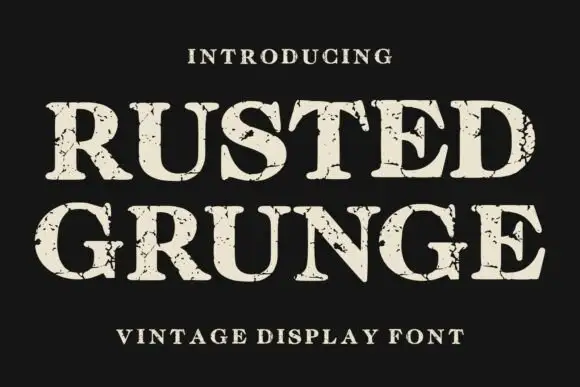
Distressed contrasting serif
Rusted Grunge is a broad contrasting serif in cream on a near-black ground: heavy stems with sharp serifs and irregular cracked gaps that run through the strokes and along the serifs, set on two lines with a tracked line above and a caption beneath.
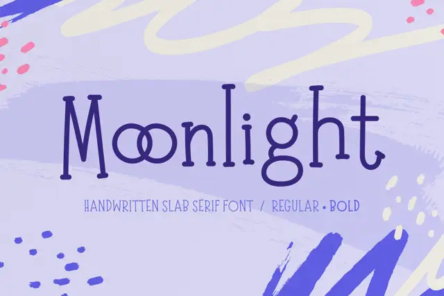
Tall irregular handwritten slab serif
Moonlight is a handwritten slab serif in deep purple on lavender: tall narrow letters with blunt serifs, an uneven baseline and a second bold cut, shown over soft painted shapes.
Ideas for this font
Same independent foundry
Allow optional Google Analytics to measure visits and catalogue actions. Your search words and notes are not included. Privacy & storage