Modern Grotesque Body

College Block + Prime Nordic
Creates crisp high-hierarchy contrast beneath College Block headlines across menus, websites and labels.
Inspect Prime Nordic specimenDisclosure: MakerFileHub may earn a commission from qualifying purchases via paid links on this page. How our links work.
Clean narrow collegiate slab capitals with angled cuts and no lowercase
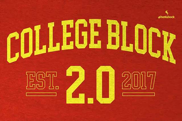
College Block is a condensed collegiate slab in capitals only, with heavy rectangular serifs, angled cuts and tight counters, built to be set on an arc across a garment.
Paid link
Get this fontProject & layout blueprintsAt-a-glance maker compatibility
Sturdy stroke walls and open counters weed cleanly on adhesive vinyl, HTV apparel film, and cut cardstock.
Visual anatomy & craft review
The C is cut square at both terminals rather than rounded, the O closes into a narrow ring with heavy slabs top and bottom, the L and the E repeat that slab as a foot, and the G carries a spur. Every letter keeps the same condensed width, so a word set on a curve holds an even rhythm instead of bunching at the ends. Serifs are unbracketed rectangles, and the cuts at the terminals are angled rather than perpendicular, which is the detail that reads as varsity lettering rather than a plain condensed slab. Counters are small and tight, weight is heavy and uniform, and there is no lowercase at all, so the face is designed for short all-caps words. The grey jersey, the red ink and the small crest above are presentation; the typeface is the two words.
Condensed · Collegiate · Blocky
Two-font hierarchy recipes
Tested contrast partners — pairing College Block with grounded secondary typography.
College Block + Prime Nordic
Creates crisp high-hierarchy contrast beneath College Block headlines across menus, websites and labels.
Inspect Prime Nordic specimen
College Block + Thick Black
Adds a warm human signature touch for 1-to-3-word callouts without competing against structured serif capitals.
Inspect Thick Black specimenPractical applications
Concrete hierarchy, scale and production guidance tailored to College Block’s stroke geometry.
The face was drawn for exactly this use: a condensed slab with angled cuts curves cleanly around a patch and holds its weight in embroidery, where a lighter face would lose its serifs.
Hierarchy & layout recipe
Set the name at 90 mm cap height on a 300 mm curved patch, keep the number in the same face at 120 mm inside the patch, and leave 15 mm of fabric between the lettering and the patch edge for the stitch.
Pre-production check
A 90 mm letter embroidered in satin stitch thickens by the thread width; ask the digitizer for a sample on the actual fabric before the run.
A collegiate slab signals competitive sport without a photograph, and the condensed width lets a long team name run across a single headline measure.
Hierarchy & layout recipe
Set the header at 54 pt on the opening spread, keep the standfirst in a 10 pt grotesque at 13 pt leading, and align the header's slab feet with the top rule of the text block.
Pre-production check
A tight counter in a heavy slab can fill in at 54 pt on newsprint; check one print of the page and open the tracking slightly rather than reducing the size.
All-caps collegiate lettering names the theme before anyone reads the details, and the heavy slabs stay readable across a room on a paper banner.
Hierarchy & layout recipe
Set the greeting at 70 mm tall on a 1 m banner, keep the name and age in the same face at 40 mm, and leave 30 mm on each side so the curved ends do not run into the hem.
Pre-production check
Cut-paper and printed banners both distort along a curve; check the artwork at the finished length and keep the outboard letters off the seam.
Technical & licence verification
Confirm included OTF/TTF/WOFF formats, full glyph tables and licence coverage on the live store page before batch production.
Closest visual alternatives
Matched across letterform anatomy, stroke behaviour and craft applications.
Narrow solid college capitals
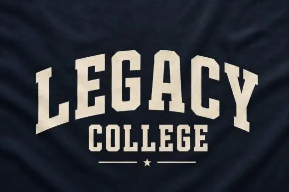
Legacy College is a narrow solid college block in cream on navy heather fabric: the word is arched over a straight second line, with a rule and a star closing the composition.
Ideas for this font
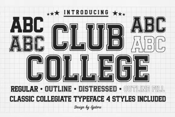
Tall collegiate blocks supplied in regular, outline, distressed and filled styles
Club College is a tall collegiate capital alphabet supplied in four treatments — regular, outline, distressed and outline fill — all built on the same squared skeleton with heavy slabs.
Ideas for this font

Outlined vintage varsity slab
School Mission is an outlined varsity slab in white on a photograph of a campus: heavy square serifs, notched corners and flat tops drawn as a thick contour with an inner line, with small tracked notes at the edges and a bottom caption in spaced caps, so the plate reads as a college print.
Ideas for this font

Wide geometric variable sans
Mechacore is a wide geometric sans in black on yellow: square extended letters, a flat-topped C, a stencil variant, five weights from light to bold, and an ultra-expanded width, laid out as a technical sheet with rules, labels and a barcode, so the plate reads as a system rather than a single font.
Ideas for this font
Same independent foundry
Allow optional Google Analytics to measure visits and catalogue actions. Your search words and notes are not included. Privacy & storage