Modern Grotesque Body

Vintage Varsity + Base Edge
Creates crisp high-hierarchy contrast beneath Vintage Varsity headlines across menus, websites and labels.
Inspect Base Edge specimenDisclosure: MakerFileHub may earn a commission from qualifying purchases via paid links on this page. How our links work.
Weathered outlined college capitals
Vintage Varsity is a weathered collegiate display in navy outline on aged tan paper: arched capitals, double-line letterforms and a printed wear that leaves speckles across the strokes.
Paid link
Get this fontProject & layout blueprintsAt-a-glance maker compatibility
Fine grain and micro-texture excel in 300 DPI print, sublimation, and screen print rather than small vinyl weeding.
Visual anatomy & craft review
VINTAGE is set on an arch and VARSITY beneath it on a straight line, and both are drawn as outline letters: each stroke carries two parallel lines so the letter reads as an edge rather than a solid, and the outline itself is broken by speckles and small chips that mimic a worn plate. The letters are wide slab-serifed blocks with squared counters, the arch is a layout decision rather than a glyph, and the spacing keeps the two rows locked. Around them a circular badge reads Legendary Champions, a row of numerals sits beneath, and a pennant, a football and a letterman patch fill the lower corners on the aged ground. The face is a varsity display for apparel, programmes and signs: the arch and the two-line construction are what make it read as collegiate.
An arched varsity word on aged paper
Two-font hierarchy recipes
Tested contrast partners — pairing Vintage Varsity with grounded secondary typography.
Vintage Varsity + Base Edge
Creates crisp high-hierarchy contrast beneath Vintage Varsity headlines across menus, websites and labels.
Inspect Base Edge specimen
Vintage Varsity + Hello Honey
Adds a warm human signature touch for 1-to-3-word callouts without competing against structured serif capitals.
Inspect Hello Honey specimenPractical applications
Concrete hierarchy, scale and production guidance tailored to Vintage Varsity’s stroke geometry.
An arched varsity word on aged paper is the standard cover of a college sports programme, and the outline holds at small print sizes.
Hierarchy & layout recipe
Print a 148 by 210 mm programme: set the institution at 46 pt on an arch, keep 18 mm of clear ground beneath before the fixture at 9 pt, and hold 14 mm of margin on all sides.
Pre-production check
Two-line outlines fill in at programme size on uncoated paper; print one cover on the actual stock and check a counter before the run.
A weathered varsity word suits an alumni garment, and the navy outline can be printed as one colour on a light shirt without losing the arch.
Hierarchy & layout recipe
Print a 260 by 120 mm chest print: set the institution at 80 pt on one row, keep 20 mm of clear ground beneath before the year at 30 pt, and hold 16 mm from the widest letter to the seam.
Pre-production check
Weathered edges are lost in a single-colour screen print; print one pull on the actual shirt and check the wear before the run.
A printed-wear varsity word signals an institution with history, and the arch gives a cover movement without a photograph.
Hierarchy & layout recipe
Print a 210 by 297 mm cover: set the institution at 54 pt on an arch, keep 20 mm of clear ground beneath before the issue line at 18 pt, and hold 16 mm of margin on all sides.
Pre-production check
Speckles on a large cover can read as poor print quality; print one cover and judge the wear at arm's length before the run.
Technical & licence verification
Confirm included OTF/TTF/WOFF formats, full glyph tables and licence coverage on the live store page before batch production.
Closest visual alternatives
Matched across letterform anatomy, stroke behaviour and craft applications.
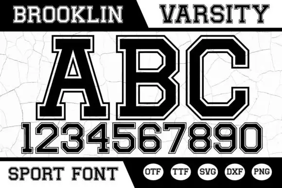
Angular bordered athletic capitals with matched numerals
Brooklin Varsity is an athletic display face: heavy capitals with sharp inner corners, a white inline border running inside each stroke, and a full numeral set drawn to the same construction.
Ideas for this font
Distressed varsity college slab
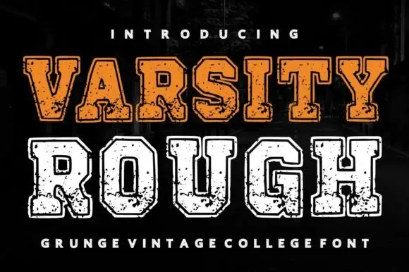
Varsity Rough is a distressed varsity slab in orange and white on a dark street: heavy square serifs, wide flat-topped caps, chipped edges and a speckled fill, presented in two inks on two lines with a tracked credit beneath, so the pair reads as a worn college jersey print.
Ideas for this font
Outlined varsity capitals with a distressed twin and a squared skeleton
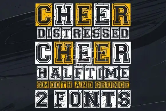
Cheer is a varsity capital alphabet shown as a clean outline and a distressed twin, built on a squared skeleton with an inner border and heavy slabs.
Ideas for this font
Heavy upright slab
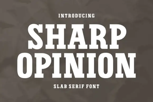
Sharp Opinion is a heavy upright slab in white on a mottled olive ground: wide capitals with tall rounded bowls, blunt slab feet and a firm even stroke, set in two lines with a small tracked line above and a plain line beneath.
Ideas for this font
Same independent foundry
Allow optional Google Analytics to measure visits and catalogue actions. Your search words and notes are not included. Privacy & storage