Modern Grotesque Body

Baseball Athlete Jersey + Clyne Sans
Creates crisp high-hierarchy contrast beneath Baseball Athlete Jersey headlines across menus, websites and labels.
Inspect Clyne Sans specimenDisclosure: MakerFileHub may earn a commission from qualifying purchases via paid links on this page. How our links work.
Broad angular baseball slabs with wedge serifs and a tight fit
Baseball Athlete Jersey is a broad slab capital alphabet with wedge serifs, angular bowls and a tight fit, drawn so a word reads as a sewn athletic letter rather than as a sports headline.
Paid link
Get this fontProject & layout blueprintsAt-a-glance maker compatibility
Sturdy stroke walls and open counters weed cleanly on adhesive vinyl, HTV apparel film, and cut cardstock.
Visual anatomy & craft review
The B closes two squared lobes with wedge feet, the A carries a low crossbar and splayed stems, the S reverses through flat curves and the Y forks with an angular junction, all at a heavy weight with unbracketed serifs that widen at the base. The angularity is the character: corners are cut rather than rounded, which is what lets the face read as a stitched applique at 60 mm and as a headline at 20 pt. The fit is tight, so a nine-letter word holds one line across a jersey front, and the counters stay open enough for a screen print. The dim stadium photograph, the cream and red inks, the ball and the small type blocks are presentation; the display face is the three words.
Baseball · Angular · Broad
Two-font hierarchy recipes
Tested contrast partners — pairing Baseball Athlete Jersey with grounded secondary typography.
Baseball Athlete Jersey + Clyne Sans
Creates crisp high-hierarchy contrast beneath Baseball Athlete Jersey headlines across menus, websites and labels.
Inspect Clyne Sans specimen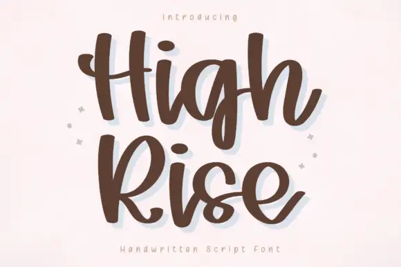
Baseball Athlete Jersey + High Rise
Adds a warm human signature touch for 1-to-3-word callouts without competing against structured serif capitals.
Inspect High Rise specimenPractical applications
Concrete hierarchy, scale and production guidance tailored to Baseball Athlete Jersey’s stroke geometry.
The wedge slabs reproduce an athletic applique, and the tight fit holds a long club name on one line across a jersey chest at 60 mm.
Hierarchy & layout recipe
Screen a 300 mm front print: set the club name at 60 mm on one line, keep the wedge feet at 3 mm minimum, and stay 45 mm below the collar so the print clears the shoulder seam allowance.
Pre-production check
A wedge foot under 2 mm closes on a fleece mesh; check a pull on the actual garment and widen the foot rather than the stems.
The broad angular blocks read at 15 cm from a queue, and the wedge serifs make a plain panel look like a painted sports board.
Hierarchy & layout recipe
Print an 800 by 400 mm panel: set the field name at 15 cm across the upper half, set the gate numbers in a 5 cm caps slab below, and leave 9 cm of border so the feet sit clear of the frame and the fixings.
Pre-production check
A tight fit printed large can look cramped between letters; check the panel at three metres and open the tracking slightly rather than reducing the weight.
The slabs read at 10 pt on a hang tag, and the angular construction keeps a small tag from looking like a soft rounded logo.
Hierarchy & layout recipe
Print a 45 by 65 mm hang tag: set the brand at 10 pt, set the size in a 5 pt caps sans beneath, and keep 5 mm of margin so the wedge feet are not cut by the die and the punched hole stays clear.
Pre-production check
A tight slab fit at 10 pt closes on card; check the printed tag and open the tracking by 2 percent rather than dropping a letter.
Technical & licence verification
Confirm included OTF/TTF/WOFF formats, full glyph tables and licence coverage on the live store page before batch production.
Closest visual alternatives
Matched across letterform anatomy, stroke behaviour and craft applications.
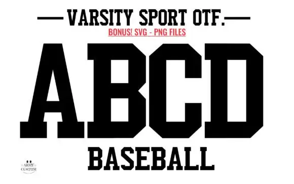
Solid athletic blocks with clipped bowls
Varsity Sport Army is a solid athletic block in black on white: wide slab-serifed capitals with clipped corners, a flat top and foot, and squared counters, shown as an alphabet specimen above the word Baseball.
Ideas for this font
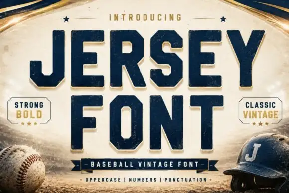
Square athletic capitals with chamfered bowls, hooked J and small slab feet
Jersey is a square athletic slab in which the capitals clip their corners, the O chamfers into an octagon, the J hooks under its stem and small slab feet sit flat, so a team name reads as a stadium board.
Ideas for this font

Layered varsity slab with depth
Vintage Glory is a layered varsity slab in red and navy on cream: heavy square serifs, notched corners, a solid extrusion behind every letter that steps down and right, and a round badge with a ball seam, so the two words read as a printed sports pennant rather than a flat headline.
Ideas for this font
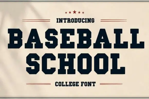
Heavy wide collegiate slabs with hard clipped bowls
Baseball School shows solid dark capitals on cream, where broad slab feet and sharply chamfered B, S and O curves create an athletic silhouette and small counters keep the heavy title dense rather than airy.
Ideas for this font
Same independent foundry
Allow optional Google Analytics to measure visits and catalogue actions. Your search words and notes are not included. Privacy & storage