Modern Grotesque Body

Rustic Cowboy + Lemon Milk Pro FTR
Creates crisp high-hierarchy contrast beneath Rustic Cowboy headlines across menus, websites and labels.
Inspect Lemon Milk Pro FTR specimenDisclosure: MakerFileHub may earn a commission from qualifying purchases via paid links on this page. How our links work.
Condensed western display with a rope frame
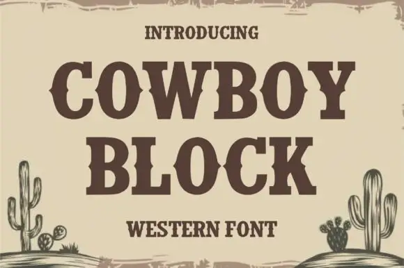
Rustic Cowboy is a condensed western display in brown on tan: spurred slab letters with small wedge serifs inside a drawn rope border, with a galloping horse on either side.
Paid link
Get this fontProject & layout blueprintsAt-a-glance maker compatibility
Sturdy stroke walls and open counters weed cleanly on adhesive vinyl, HTV apparel film, and cut cardstock.
Visual anatomy & craft review
Rustic sits above Cowboy in a tall condensed slab, and the letters carry the small spurs and wedges of a western poster: the stems are narrow, the serifs flare out at the foot, the R has a curled leg and the C closes almost to a square. The two rows are tightly spaced and centred, a galloping horse is drawn at each side of the first row, and the frame is a rope with a knot at each corner and a second rope running along the top and bottom. Three captions sit above and below in a small typewriter-style serif. The face is a western display for signage, packaging and event material: the condensed width fits long names, the single colour keeps a sign affordable, and the fine serifs on the spurs need a size where they do not close up.
A western display in a rope frame
Two-font hierarchy recipes
Tested contrast partners — pairing Rustic Cowboy with grounded secondary typography.
Rustic Cowboy + Lemon Milk Pro FTR
Creates crisp high-hierarchy contrast beneath Rustic Cowboy headlines across menus, websites and labels.
Inspect Lemon Milk Pro FTR specimen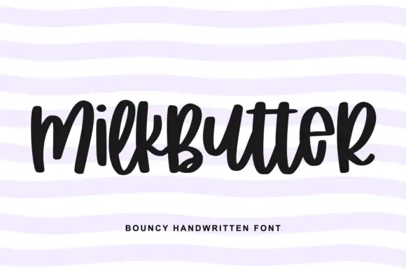
Rustic Cowboy + Milkbutter
Adds a warm human signature touch for 1-to-3-word callouts without competing against structured serif capitals.
Inspect Milkbutter specimenPractical applications
Concrete hierarchy, scale and production guidance tailored to Rustic Cowboy’s stroke geometry.
A western display sets a barn wedding without a cliché script, and a single brown on a board matches the timber it hangs on.
Hierarchy & layout recipe
Print a 500 by 350 mm board: set the greeting at 100 pt across two rows, keep 24 mm of clear ground beneath before the names at 24 pt, and hold 22 mm of border on all sides.
Pre-production check
Finely spurred serifs blur on a painted board; print one at the final size and check the R before the set.
A western block on a bottle reads as a small producer, and the condensed letters fit a long product name on a narrow label.
Hierarchy & layout recipe
Print a 45 by 80 mm bottle label: set the product at 15 pt on one row, keep 6 mm of clear ground beneath before the heat level at 4.5 pt, and hold 4 mm from the widest spur to the die line.
Pre-production check
The wedge serifs fill in at bottle-label size; print one on the real stock and check the C E before the order.
A western display signals the subject of a feature on ranching or barbecue before a word is read, and it holds at heading size on uncoated paper.
Hierarchy & layout recipe
Print a 230 by 300 mm opener: set the heading at 60 pt on one row, keep 18 mm of clear ground beneath before the standfirst at 10.5 pt, and hold 18 mm of margin on both sides.
Pre-production check
Condensed serifs on newsprint can look sooty; print one opener on the actual stock and check the spurs before the issue.
Technical & licence verification
Confirm included OTF/TTF/WOFF formats, full glyph tables and licence coverage on the live store page before batch production.
Closest visual alternatives
Matched across letterform anatomy, stroke behaviour and craft applications.
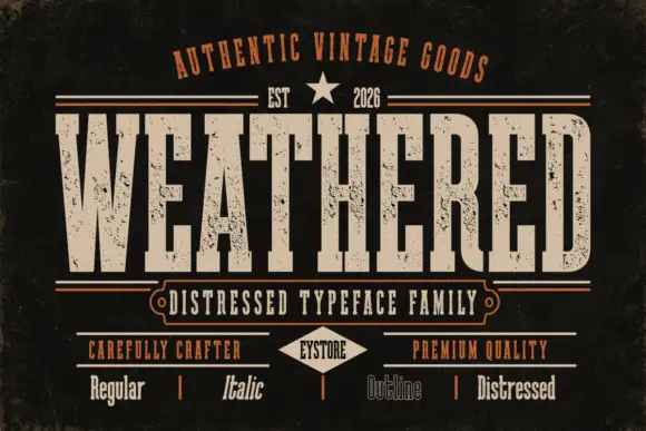
Condensed distressed varsity slab
Weathered is a condensed distressed slab in cream on black: heavy square serifs, tight inner counters, chipped edges and speckled interiors, presented as a family of four cuts with a small badge and a row of tracked labels beneath, so the sheet reads as a vintage sign kit.
Ideas for this font

Condensed western capitals with stem ornaments
Saddlewick is a condensed western slab in dark brown on leather: very tall capitals, squared serifs and small nicked ornaments cut into the stems, with a spur and a star in the counters.
Ideas for this font
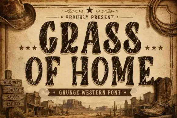
Condensed rounded Western capitals crossed by long diagonal scratches
Grass of Home is a condensed rounded slab in which tall oval bowls and soft curved ends give a Western tone, while long pale diagonal scratches and smaller chips cut through the thick strokes of a two-row title.
Ideas for this font
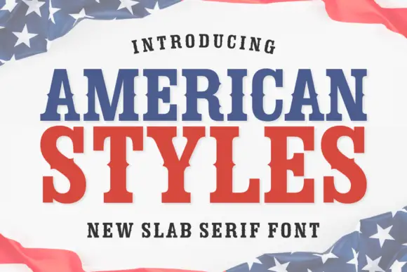
Bold slab serif with bracketed slabs and a wide even colour
American Styles is a bold slab serif in which the slabs bracket into the stems, the weight stays even and the fit runs wide, so a two-word title reads as a printed pennant rather than as a headline.
Ideas for this font
Same independent foundry
Allow optional Google Analytics to measure visits and catalogue actions. Your search words and notes are not included. Privacy & storage