Modern Grotesque Body

Baseball Varsity + Cultivo
Creates crisp high-hierarchy contrast beneath Baseball Varsity headlines across menus, websites and labels.
Inspect Cultivo specimenDisclosure: MakerFileHub may earn a commission from qualifying purchases via paid links on this page. How our links work.
Layered varsity slab capitals with an arc
Baseball Varsity builds its two words out of heavy slab capitals with a dark offset shadow and a white inline, stacking them on a shallow arc above a ruled band and a round badge.
Paid link
Get this fontProject & layout blueprintsAt-a-glance maker compatibility
Cut solid base, outline, and shadow layers in separate vinyl colors and align on registration marks.
Visual anatomy & craft review
BASEBALL sits on the upper arc in white slab capitals, each letter carrying an outline and a hard shadow offset down and right, and VARSITY follows in gold on the lower line at a larger size, so the two words step up rather than repeat. The serifs are square and untapered, which is what makes the shapes read as stitched felt rather than as a sign-painter's sans, and the counters are cut narrow to keep the letters dense. Below the pair sits a rule band with COLLEGE FONT inside it, then three separate badges in the corners: a round athletic seal on the left, a ball with wings in the centre and a pennant marked EST. 2024 on the right. The faint repeated watermark across the background is the listing's own texture, not part of the alphabet.
Athletic · Layered · Slab
Two-font hierarchy recipes
Tested contrast partners — pairing Baseball Varsity with grounded secondary typography.
Baseball Varsity + Cultivo
Creates crisp high-hierarchy contrast beneath Baseball Varsity headlines across menus, websites and labels.
Inspect Cultivo specimen
Baseball Varsity + Black Ink Brush
Adds a warm human signature touch for 1-to-3-word callouts without competing against structured serif capitals.
Inspect Black Ink Brush specimenPractical applications
Concrete hierarchy, scale and production guidance tailored to Baseball Varsity’s stroke geometry.
Layered slab capitals are the standard for team apparel because each layer can be a separate screen or thread colour, and the square serifs hold their shape on a soft fabric that distorts curves.
Hierarchy & layout recipe
Size the two words to 240 mm wide on the chest, keep 70 mm below the collar seam, and reduce the pairing to two layers so the print does not build up into a heavy patch that cracks.
Pre-production check
On a fleece surface the inline fills in first; either drop it for the garment version or widen it by a millimetre before the screens are made.
An arched varsity lockup gives a sports opener the look of a stadium banner and carries a two-word headline at a size that a normal headline face could not reach without dominating the page.
Hierarchy & layout recipe
Run the lockup at 150 mm wide across the top of the spread, set the headline in a condensed serif at 36 pt below the rule band, and start the standfirst 10 mm under the lowest badge.
Pre-production check
The arc makes the two words sit at different heights; align the body copy to the rule band rather than to either word or the page will look tilted.
A league needs a mark that works on a shirt, a banner and a scoreboard and this layered slab supplies all three at once, since the same shapes hold at 20 mm and at two metres.
Hierarchy & layout recipe
Build the crest at 60 mm for apparel, 200 mm for the field banner and 20 mm for the patch, and drop the badges below 30 mm where they dissolve into dots.
Pre-production check
At patch size the small round seal and pennant lose their inner detail; replace them with a plain circle and a single letter rather than shrinking the full crest.
Technical & licence verification
Confirm included OTF/TTF/WOFF formats, full glyph tables and licence coverage on the live store page before batch production.
Closest visual alternatives
Matched across letterform anatomy, stroke behaviour and craft applications.
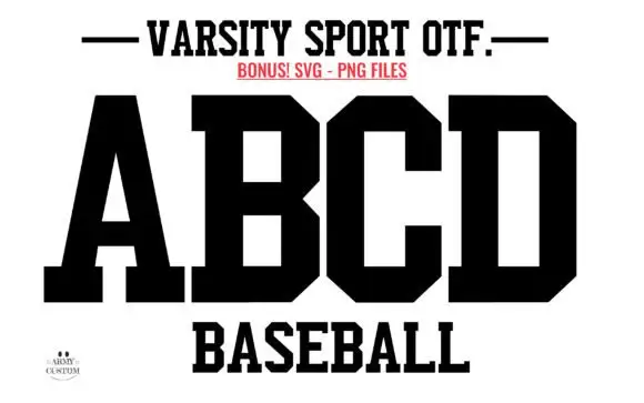
Solid athletic blocks with clipped bowls
Varsity Sport Army is a solid athletic block in black on white: wide slab-serifed capitals with clipped corners, a flat top and foot, and squared counters, shown as an alphabet specimen above the word Baseball.
Ideas for this font
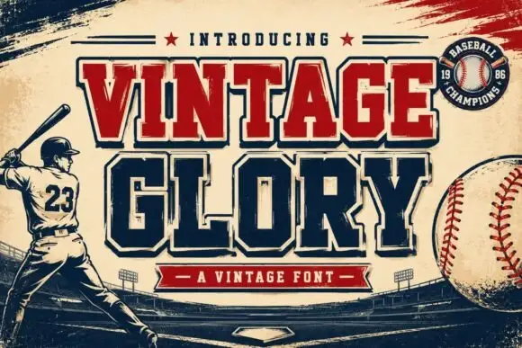
Layered varsity slab with depth
Vintage Glory is a layered varsity slab in red and navy on cream: heavy square serifs, notched corners, a solid extrusion behind every letter that steps down and right, and a round badge with a ball seam, so the two words read as a printed sports pennant rather than a flat headline.
Ideas for this font
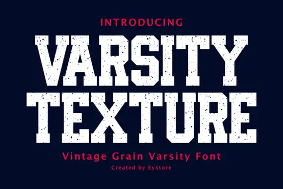
Display
Varsity Texture is a collegiate block face: heavy slab-serifed capitals with a flat top and foot, tight spacing and a grain texture that leaves the letters looking stamped on fabric.
Ideas for this font
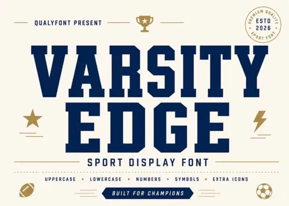
Solid angular varsity blocks
Varsity Edge is a heavyweight collegiate display: wide slab-serifed capitals with flat tops and feet, tight spacing and squared counters, set navy on cream with a set of sport icons around it.
Same independent foundry
Allow optional Google Analytics to measure visits and catalogue actions. Your search words and notes are not included. Privacy & storage