Modern Grotesque Body

Football Jersey + Swaraga
Creates crisp high-hierarchy contrast beneath Football Jersey headlines across menus, websites and labels.
Inspect Swaraga specimenDisclosure: MakerFileHub may earn a commission from qualifying purchases via paid links on this page. How our links work.
Solid athletic capitals with clipped corners and square slab ends
Football Jersey presents solid white athletic capitals on charcoal inside a double frame, where the O bowls have cut-off corners, the T and J carry broad rectangular terminals and the two rows keep an even dense rhythm with almost no space between the letters.
Paid link
Get this fontProject & layout blueprintsAt-a-glance maker compatibility
Fine grain and micro-texture excel in 300 DPI print, sublimation, and screen print rather than small vinyl weeding.
Visual anatomy & craft review
The strokes stay heavy and even, the corners clip, the terminals square off and the tracking stays tight so the row reads as a block. That density is the character: the sample looks like a jersey print rather than a display setting, which is why the two rows nearly touch. The double frame, the star marks and the credit line are cover graphics, and no numerals are shown. Keep 46 pt so the clipped corners stay readable and check that your file carries digits before planning a number.
Solid athletic capitals with clipped corners and square slab ends
Two-font hierarchy recipes
Tested contrast partners — pairing Football Jersey with grounded secondary typography.
Football Jersey + Swaraga
Creates crisp high-hierarchy contrast beneath Football Jersey headlines across menus, websites and labels.
Inspect Swaraga specimen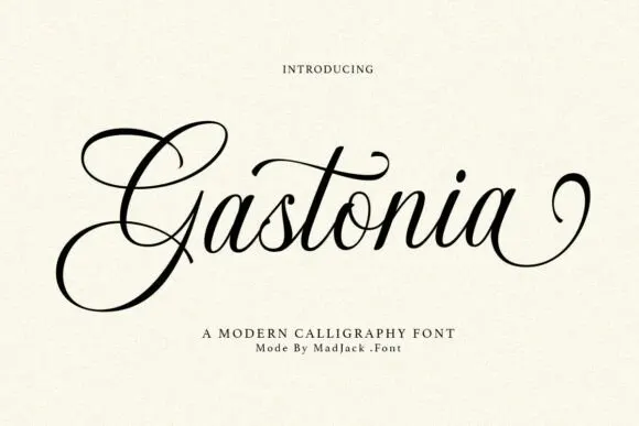
Football Jersey + Gastonia Script
Adds a warm human signature touch for 1-to-3-word callouts without competing against structured serif capitals.
Inspect Gastonia Script specimenPractical applications
Concrete hierarchy, scale and production guidance tailored to Football Jersey’s stroke geometry.
The dense athletic blocks give a football team name its printed weight on a shirt, and the clipped corners hold up under a transfer press.
Hierarchy & layout recipe
Print a 300 mm back panel: set the team name at 72 mm on one row, keep 10 mm between letters so the corners stay separate, and keep 22 mm of margin from each side seam.
Pre-production check
Digits are not demonstrated in the preview; check your file before planning a squad number.
The jersey blocks give a small sportswear tag a garment-industry register, and the tight rhythm suits a very narrow label.
Hierarchy & layout recipe
Print a 45 by 70 mm tag: set the brand name at 18 pt on one row, keep 8 mm of clear ground beneath before the size at 6 pt, and keep 5 mm to the woven edge.
Pre-production check
Clipped corners round off in weaving; check the mill proof before the woven label run starts.
The heavy blocks read across a sports field, and the even density keeps a two-word camp name legible from the touchline.
Hierarchy & layout recipe
Print a 700 by 300 mm panel: set the camp name at 60 mm across two rows with 18 mm between baselines, keep 24 mm of clear ground beneath before the dates at 15 pt, and keep 26 mm of border.
Pre-production check
The double frame is cover art; check the artwork files before planning a frame around the letters.
Technical & licence verification
Confirm included OTF/TTF/WOFF formats, full glyph tables and licence coverage on the live store page before batch production.
Closest visual alternatives
Matched across letterform anatomy, stroke behaviour and craft applications.

Collegiate slab with inline border
Varsity Legacy is a collegiate slab in black with a thin light inline border on a pale wood ground: wide caps with heavy slab serifs, a low waist and closed counters, edged by a light contour that follows every stroke, with tracked lines above and below.
Double-outlined varsity jersey display
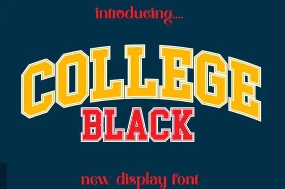
College Black pairs heavy collegiate slab capitals with a built-in athletic border framing, where wide stable letterforms and generous counter openings keep arched headlines crisp on jerseys, pennants and party backdrops.
Ideas for this font
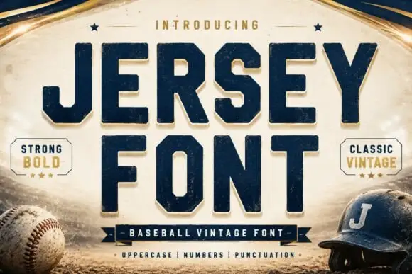
Square athletic capitals with chamfered bowls, hooked J and small slab feet
Jersey is a square athletic slab in which the capitals clip their corners, the O chamfers into an octagon, the J hooks under its stem and small slab feet sit flat, so a team name reads as a stadium board.
Ideas for this font
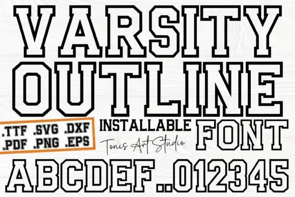
Outlined athletic capitals with clipped corners and broad squared feet
Ab Varsity Outline is an athletic slab in which the capitals keep a white interior inside a heavy dark outline, the outer corners clip away, the feet square off broad and the O and R turn polygonal, so a team name reads as a stitched patch letter without the fill.
Same independent foundry
Allow optional Google Analytics to measure visits and catalogue actions. Your search words and notes are not included. Privacy & storage