Modern Grotesque Body

The Western + Corven
Creates crisp high-hierarchy contrast beneath The Western headlines across menus, websites and labels.
Inspect Corven specimenDisclosure: MakerFileHub may earn a commission from qualifying purchases via paid links on this page. How our links work.
Heavy western capitals with pinched sides
The Western is a heavy western display in cream on dark brown: tall capitals with pinched waists, wedge serifs and a rough printed edge, laid out with a ribbon banner and two round badges.
Paid link
Get this fontProject & layout blueprintsAt-a-glance maker compatibility
Sturdy stroke walls and open counters weed cleanly on adhesive vinyl, HTV apparel film, and cut cardstock.
Visual anatomy & craft review
THE sits at the upper left and WESTERN FONT fills the card in two rows, and each letter is a tall slab with a pinched middle: the stems narrow at the waist, the serifs flare into small wedges and the E and the F carry short even arms. The edges are slightly rough, as if printed on a worn plate, and the two rows are spaced tight enough to read as a single block. Around the word a ribbon banner carries Cowboy Western Font, two round badges state Bold and Strong and Classic and Timeless, and a row of small icons at the foot lists the characters and the intended uses. The face is a western display for signing, packaging and event material: it wants size, one ink, and the pinched stems mean it should not be set small or printed at low resolution.
A western display with a banner
Two-font hierarchy recipes
Tested contrast partners — pairing The Western with grounded secondary typography.
The Western + Corven
Creates crisp high-hierarchy contrast beneath The Western headlines across menus, websites and labels.
Inspect Corven specimen
The Western + Rebel Marks
Adds a warm human signature touch for 1-to-3-word callouts without competing against structured serif capitals.
Inspect Rebel Marks specimenPractical applications
Concrete hierarchy, scale and production guidance tailored to The Western’s stroke geometry.
A western display sets a rustic venue without a script, and a single cream on brown matches the timber it will hang against.
Hierarchy & layout recipe
Print a 600 by 400 mm board: set the greeting at 120 pt across two rows, keep 26 mm of clear ground beneath before the names at 26 pt, and hold 24 mm of border on all sides.
Pre-production check
Pinched stems can look like a printing fault on a painted board; print one at the final size and check a letter before the set.
A western block on a bottle reads as a small producer, and the condensed width fits a long product name on a narrow label.
Hierarchy & layout recipe
Print a 45 by 80 mm bottle label: set the product at 16 pt on one row, keep 6 mm of clear ground beneath before the heat level at 4.5 pt, and hold 4 mm from the widest serif to the die line.
Pre-production check
The pinched waist fills in at label size; print one on the real stock and check the B and the R before the order.
A western display is the conventional language of a country storefront, and the badges can be dropped to leave a plain readable word.
Hierarchy & layout recipe
Print a 900 by 500 mm fascia: set the store name at 150 pt on one row, keep 30 mm of clear ground beneath before the opening hours at 22 pt, and hold 28 mm of border on all sides.
Pre-production check
Thin arms on a large cut sign warp; print one at the final size on the intended material and check the F before the order.
Technical & licence verification
Confirm included OTF/TTF/WOFF formats, full glyph tables and licence coverage on the live store page before batch production.
Closest visual alternatives
Matched across letterform anatomy, stroke behaviour and craft applications.
Weathered western slab display
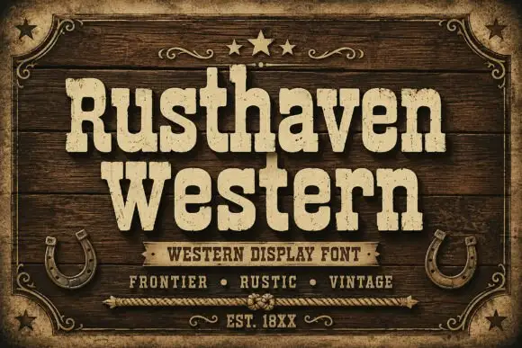
Rusthaven Western is a weathered western slab in cream on dark timber: heavy slabs with softened corners, a chipped edge and a speckled fill, set in two lines with a ribbon banner, stars and horseshoes, so the pair reads as a brand burned into a barn door.
Ideas for this font
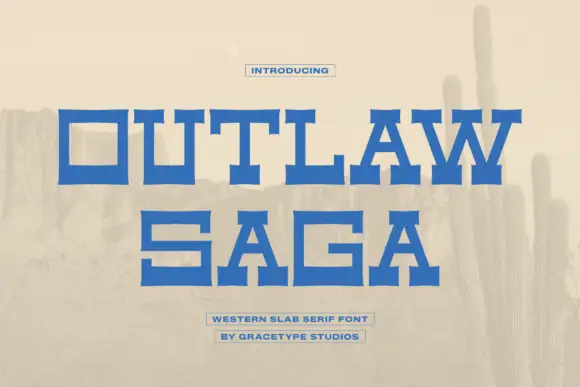
Wide geometric western slab
Outlaw Saga is a wide geometric western slab in blue on a pale desert scene: square letters with heavy horizontal arms, deep rectangular counters and stepped serifs that flare at the ends, set on two lines with two small boxed lines beneath.
Ideas for this font
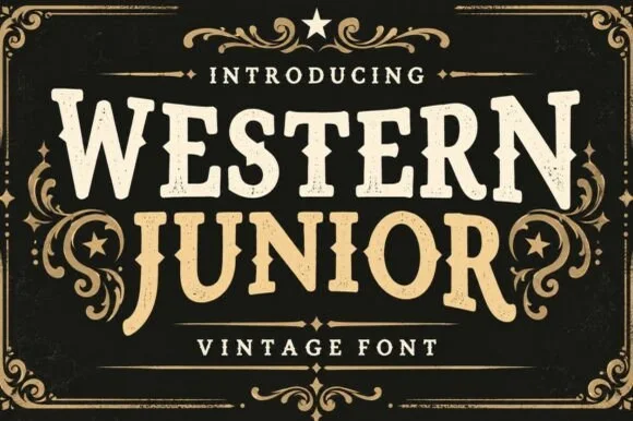
Vintage western slab with scrollwork frame
Western Junior is a vintage western display face in cream and gold on black: rounded slab capitals with small spurs and a dusty surface, set inside an elaborate scrollwork frame with stars, a rule and a banner.
Ideas for this font
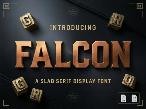
Slab serif display with bevelled cuts and sharp square serifs
Falcon is a slab serif display in which the stems stay broad, the serifs turn square and the corners carry a bevel, so a single word reads as a cast metal plaque rather than as a headline.
Ideas for this font
Same independent foundry
Allow optional Google Analytics to measure visits and catalogue actions. Your search words and notes are not included. Privacy & storage