Neutral Sans Workhorse

Megasour + Memoir Slang
Lets Megasour own the focal silhouette while handling secondary copy, sizing and subheads cleanly.
Inspect Memoir Slang specimenDisclosure: MakerFileHub may earn a commission from qualifying purchases via paid links on this page. How our links work.
Swirling organic funk & liquid-groove display
Megasour is an exuberant organic funk display typeface with swirling teardrop terminals, liquid S-curves, and energetic 70s album-cover rhythm.
Paid link
Get this fontProject & layout blueprintsAt-a-glance maker compatibility
Sturdy stroke walls and open counters weed cleanly on adhesive vinyl, HTV apparel film, and cut cardstock.
Visual anatomy & craft review
Megasour is a swirling organic display built from liquid-groove shapes: the stems curve into soft loops, the bowls melt into one another and the counters open as long liquid slits rather than closed holes. The swirl grows the word vertically and horizontally, so a tight box clips it, and the slits close first when the face is small. It needs roughly 34 mm for the swirl and the slit to read, and it is best in one saturated ink on cream, or a two-colour build where a lighter tone runs inside the grooves.
Funky · Swirling · Expressive
Two-font hierarchy recipes
Tested contrast partners — pairing Megasour with grounded secondary typography.
Megasour + Memoir Slang
Lets Megasour own the focal silhouette while handling secondary copy, sizing and subheads cleanly.
Inspect Memoir Slang specimen
Megasour + Askinо
Grounds bold display lettering with classic typographic authority on posters, badges and apparel.
Inspect Askinо specimenPractical applications
Concrete hierarchy, scale and production guidance tailored to Megasour’s stroke geometry.
A liquid-groove display reads as poured rather than drawn, which is what a juice bar wants above its counter. The swirl gives the name motion at 50 mm, and one saturated ink prints the cup, the board and the card from a single separation.
Hierarchy & layout recipe
Menu board 600 x 900 mm, word 100 mm with 12 mm swirl clearance, items 26 mm, 30 mm margins. Cup print 70 x 50 mm, word 16 mm, 5 mm margins. Card 85 x 55 mm, word 16 mm, 5 mm margins.
Pre-production check
A 70 x 50 mm cup panel at 16 mm closes the liquid slits and the name prints as a solid blob. Raise cup type to 22 mm or use the simplified cut, and check one printed cup before the order.
A swirling display reads as a record sleeve rather than a magazine headline, which is what a feature about groove and rhythm wants at the opener. The liquid slits hold at 72 pt against a dark page, and one ink keeps the swirl legible without shading.
Hierarchy & layout recipe
Opener 210 x 297 mm, title 72 pt with 14 mm swirl clearance, standfirst 11/15 pt, body 9/13 pt, 18 mm margins. Pull quote 40 pt. Cover flash 90 x 60 mm, word 34 pt, 6 mm margins.
Pre-production check
At 34 pt on the cover flash the slits fill and the word reads as an ink puddle. Keep the face at 48 pt and above, and proof one cover at 1:1 before the run.
A liquid display suits a summer festival because the grooves read as heat shimmer at distance. The swirl holds at 140 mm on a poster, and one bright ink prints the poster and the tote from the same artwork.
Hierarchy & layout recipe
Poster A2, word 140 mm with 18 mm swirl clearance, details 40 mm, 20 mm margins. Drink card 105 x 148 mm, header 30 mm, items 10 mm. Tote print 300 x 300 mm, word 70 mm, 25 mm margins.
Pre-production check
Screen printed on a tote at 70 mm the liquid slits bridge and the word fills into a stain after one wash. Use the solid cut on fabric, and wash one sample before the order.
Technical & licence verification
Confirm included OTF/TTF/WOFF formats, full glyph tables and licence coverage on the live store page before batch production.
Closest visual alternatives
Matched across letterform anatomy, stroke behaviour and craft applications.
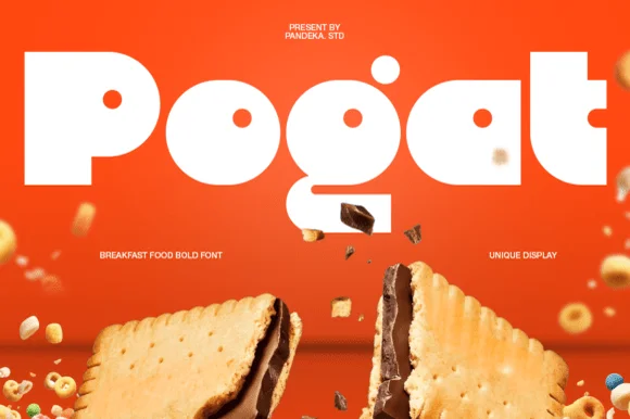
Ultra-fat heavy-packaging & cereal-box geometric display
Pogat is an ultra-heavy, slab-thick retro packaging font with massive ink mass and tiny circular pinhole counters built for snack and food branding!
Ideas for this font
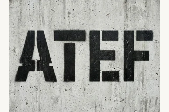
Heavy industrial concrete & military spray-stencil sans
Atef is a heavy, weathered industrial stencil sans featuring bold military bridge cuts and raw concrete spray-paint texture.
Ideas for this font
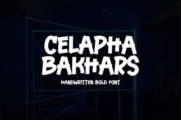
Energetic flat-chisel street-marker all-caps display
Celapha Bakhars is a punchy street-marker display font slashing thick, slightly overlapping chisel-tip capitals with urban poster energy.
Ideas for this font
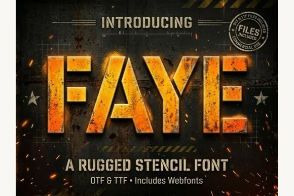
Heavy tactical steel-plate stencil sans (OTF, TTF & Webfonts)
Faye is a wide, ultra-heavy industrial stencil sans featuring diagonal tactical bridge cuts across massive block capitals (OTF, TTF & Webfonts).
Ideas for this font
Same independent foundry
Allow optional Google Analytics to measure visits and catalogue actions. Your search words and notes are not included. Privacy & storage
