High-Contrast Display Serif

Nyxar + The Simple Editorial
Pairs sculptural editorial warmth with Nyxar's clean modern geometry.
Inspect The Simple Editorial specimenDisclosure: MakerFileHub may earn a commission from qualifying purchases via paid links on this page. How our links work.
Double-stroke geometric caps
Nyxar is a double-stroke geometric sans in gold on green marble: wide uppercase letters drawn with two parallel strokes, sharp mitred junctions and a flat, high waist, with oversized ghost letters floating behind and a specification strip at the foot.
Paid link
Get this fontProject & layout blueprintsAt-a-glance maker compatibility
Weld or Unite overlapping script joins into one continuous vector path before sending to the blade.
Visual anatomy & craft review
The word is set once, wide, and the drawing is a geometric caps alphabet: every stem is doubled, the horizontals are hairlines, and the junctions meet at sharp mitres, which gives the letters their art deco architecture. Because the double stroke creates a gap inside each letter, the face needs a large size and a smooth ground, and the specimen supplies both with a polished marble surface and a metallic finish. The ghost letters behind are the same alphabet at a huge size and low contrast, which is an honest way to show the range without a second face, and the strip at the foot states the format and the file types in a light serif. The palette is gold on green throughout, which keeps a detailed face from becoming noisy.
Geometric, deco, metallic, luxury
Two-font hierarchy recipes
Tested contrast partners — pairing Nyxar with grounded secondary typography.
Nyxar + The Simple Editorial
Pairs sculptural editorial warmth with Nyxar's clean modern geometry.
Inspect The Simple Editorial specimen
Nyxar + Lovely
Introduces organic movement on pull-quotes, signatures and gift tags.
Inspect Lovely specimenPractical applications
Concrete hierarchy, scale and production guidance tailored to Nyxar’s stroke geometry.
A double-stroke geometric mark reads as architecture rather than fashion, and the uppercase collection keeps a monogram, a door plate and a key card consistent.
Hierarchy & layout recipe
Set the mark at 60 mm on a door plate, 14 pt on a card and 25 mm on a key fob, in one colour. Keep clear space equal to the double stroke and never reduce the stroke below 1 mm at print size.
Pre-production check
Check the 14 pt card mark, where the inner gap can close; keep the printed gap above 0.3 mm. Confirm the door plate reads at four metres and that the mark still works reversed out of a dark ground.
A deco geometric title gives a monograph an architectural tone, and the uppercase construction lets a short name hold a large area without a second graphic.
Hierarchy & layout recipe
Set the title at 100 mm cap height across 220 mm, the subtitle in a 12 pt serif, and the publisher at 8 pt caps. Print gold on a dark ground and keep the ghost letters at 8 percent opacity behind.
Pre-production check
Check the title at thumbnail size, where the hairlines can vanish; keep the contrast high. Confirm the 8 pt publisher survives lamination and that the ghost letters do not interfere with the small type.
A geometric deco face gives a formal invitation a period structure, and the uppercase-only construction keeps the names symmetrical on a centred card.
Hierarchy & layout recipe
A5 invitation: the names at 26 pt, the request in a 10 pt serif, and the date at 9 pt caps. Keep 22 mm margins and foil one colour on a deep-toned card so the double stroke stays crisp.
Pre-production check
Check the 26 pt names in foil, where the inner gap can fill; specify a fine foil die. Confirm the 10 pt request reads at arm's length and that the names stay centred across the card.
Technical & licence verification
Confirm included OTF/TTF/WOFF formats, full glyph tables and licence coverage on the live store page before batch production.
Closest visual alternatives
Matched across letterform anatomy, stroke behaviour and craft applications.
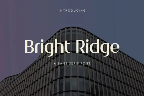
Narrow contrasting mixed case with tall ascenders and a low double-storey g
Bright Ridge sets a cream mixed-case line over a dusk photo of a curved tower, its letterforms wide with small wedge serifs, a high x-height and strokes that stay almost even from stem to join.
Ideas for this font
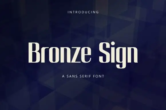
Narrow upright sans letters with softened rectangular bowls
Bronze Sign is a condensed sans display face: tall narrow caps and lowercase with a closed aperture, tight spacing and a flat, even stroke that reads like a sign painter's block letter.
Ideas for this font

Open rounded mixed case with a tall t and broad circular bowls
Cultivo shows a large black title-case name across the lower part of a pale beige cover, where light to moderate nearly even strokes form an open C, a broad u and near-circular bowls, the t finishes with a rounded lower turn and the v opens a clean diagonal.
Ideas for this font
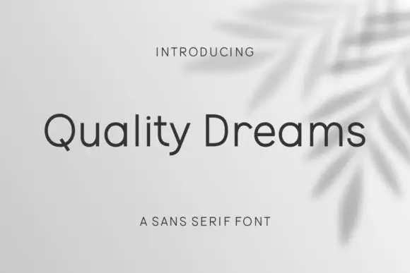
Plain rounded neutral sans
Quality Dreams is a plain rounded sans in charcoal on a pale ground with a soft leaf shadow: mixed case with a short diagonal Q tail, an open e, even strokes and rounded terminals, set as one line with a small tracked line above and a plain line beneath.
Ideas for this font
Same independent foundry
Allow optional Google Analytics to measure visits and catalogue actions. Your search words and notes are not included. Privacy & storage