High-Contrast Display Serif

Retro Groovy Bundle + Grandeur – Elegant Classic Serif
Pairs sculptural editorial warmth with Retro Groovy Bundle's clean modern geometry.
Inspect Grandeur – Elegant Classic Serif specimenDisclosure: MakerFileHub may earn a commission from qualifying purchases via paid links on this page. How our links work.
A collection of curled retro serif previews
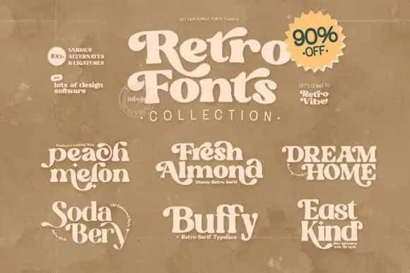
Retro Groovy Bundle presents several named retro samples around a large curved serif title, with heavy green lettering on a warm cream cover, small name plates reading Fresh Almond, Buffy, Peach Melon, East Kind, Dream Home and Soda Berry, and a corner badge that advertises SVG, PDF and EPS files.
Paid link
Get this fontProject & layout blueprintsAt-a-glance maker compatibility
Sturdy stroke walls and open counters weed cleanly on adhesive vinyl, HTV apparel film, and cut cardstock.
Visual anatomy & craft review
The main title stays heavy with rounded serifs and a deep curve on its first letter, while the six smaller names share the same seventies weight but differ in width and swash. That range is the character: the bundle is sold on variety, so a buyer picks family members rather than one face. The badge and the format marks are cover information, not proof of what installs on your machine. Check the actual file list before planning a mixed headline, keep 34 pt for the narrow members and test two members side by side before pairing them.
A collection of curled retro serif previews
Two-font hierarchy recipes
Tested contrast partners — pairing Retro Groovy Bundle with grounded secondary typography.
Retro Groovy Bundle + Grandeur – Elegant Classic Serif
Pairs sculptural editorial warmth with Retro Groovy Bundle's clean modern geometry.
Inspect Grandeur – Elegant Classic Serif specimen
Retro Groovy Bundle + Gita Lian
Introduces organic movement on pull-quotes, signatures and gift tags.
Inspect Gita Lian specimenPractical applications
Concrete hierarchy, scale and production guidance tailored to Retro Groovy Bundle’s stroke geometry.
The bundle gives a menu a heavy title and a lighter member for the course names, so one cover carries the whole seventies register without a second purchase.
Hierarchy & layout recipe
Print a 210 by 297 mm menu: set the diner name in the heavy member at 44 pt, set the course headings in a narrower member at 16 pt, keep 14 mm of clear ground between them, and keep 18 mm of margin.
Pre-production check
Members can be too close in width to read as a pair; check two printed samples side by side first.
The curved title sets a market poster and the smaller members handle the date block, which is the usual split for a busy listing.
Hierarchy & layout recipe
Print an A2 poster: set the market name in the curved member at 80 pt, set the dates in a plain member at 20 pt, keep 28 mm of clear ground between the two blocks, and keep 24 mm of border.
Pre-production check
The advertised formats do not confirm installed styles; check the download list before promising a member.
The period weight sets a themed card and the lighter member keeps the details readable, which is the point of buying a family rather than one font.
Hierarchy & layout recipe
Print a 148 by 210 mm card: set the greeting in the heavy member at 40 pt, set the address in a narrow member at 12 pt, keep 18 mm of clear ground between them, and keep 16 mm of margin all round.
Pre-production check
Mixing three members on one card looks like a sample sheet; check the layout, stop at two and keep the body text in a plain serif.
Technical & licence verification
Confirm included OTF/TTF/WOFF formats, full glyph tables and licence coverage on the live store page before batch production.
Closest visual alternatives
Matched across letterform anatomy, stroke behaviour and craft applications.
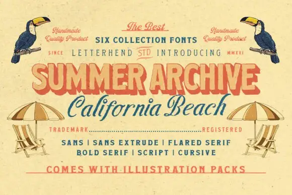
Retro mixed-style beach collection
Summer Archive is a collection of six retro styles in a warm coral and teal palette: a fat display, a flared serif, a bold serif, a script, a cursive and a sans with an extruded companion, plus illustration packs.
Ideas for this font
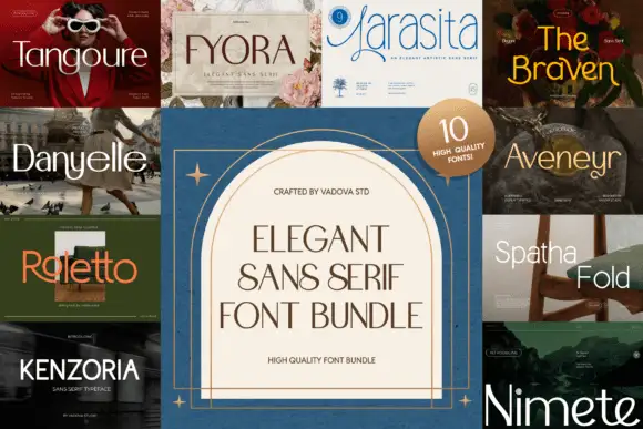
A multi-panel comparison of light, narrow and curving sans display directions
Elegant Sans Serif Font Bundle gathers ten separate sans covers around a central panel, each in a different register from a wide light luxury face to a bold condensed grotesque, and sells them together.
Ideas for this font

Collage of contrasted serif names with curled and thin-line options
Exclusive Serif Retro Bundle puts a dark serif title on a cream panel over a mosaic of nine covers, from Lemino and Vorina through Silver Chair, Maver Royal, Nasta Creme, Pongór, Moon Creme and Rod Brown, where the surrounding names range from substantial mixed-case forms with curled entries to very thin capitals and overlapping round shapes.
Ideas for this font
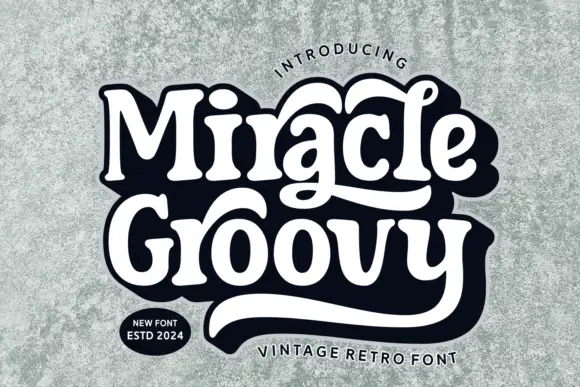
Retro mixed-case letters with long integrated swashes
Miracle Groovy shows weighty rounded forms with small sharp serif tips, where the a and the lower y extend into long sweeping tails that visually bind two rows together, and a heavy dark offset surrounds the white title on a textured pale field.
Ideas for this font
Same independent foundry
Allow optional Google Analytics to measure visits and catalogue actions. Your search words and notes are not included. Privacy & storage