Modern Grotesque Body

Funky Pickle + Corven
Creates crisp high-hierarchy contrast beneath Funky Pickle headlines across menus, websites and labels.
Inspect Corven specimenDisclosure: MakerFileHub may earn a commission from qualifying purchases via paid links on this page. How our links work.
Retro display serif with bulbous terminals and rounded flair
Funky Pickle is a retro display serif in which the stems swell, the terminals turn into bulbs and the arms curl, so a two-word title reads as a 1970s record sleeve rather than as a modern serif.
Paid link
Get this fontProject & layout blueprintsAt-a-glance maker compatibility
Sturdy stroke walls and open counters weed cleanly on adhesive vinyl, HTV apparel film, and cut cardstock.
Visual anatomy & craft review
The F curls its arm into a bulb, the u drops a round tail, the n keeps a soft shoulder, the k turns two fat diagonals, the y swells into a hooked descender and the e closes a heavy eye, all at a moderate weight with bulbous serifs and a warm, irregular rhythm. The bulb terminals are the character: they carry the period feel without any gradient or shadow, which is why the sample sets two words in one flat colour on a pale ground. Because the strokes are round, the face holds at 26 pt and cuts cleanly, and it prints happily on a screen. The pale ground, the small arc of caps above, the tiny hearts and the caption below are presentation; the dark display words are the face.
Retro · Bulbous · 70s
Two-font hierarchy recipes
Tested contrast partners — pairing Funky Pickle with grounded secondary typography.
Funky Pickle + Corven
Creates crisp high-hierarchy contrast beneath Funky Pickle headlines across menus, websites and labels.
Inspect Corven specimen
Funky Pickle + Simple Alphabet
Adds a warm human signature touch for 1-to-3-word callouts without competing against structured serif capitals.
Inspect Simple Alphabet specimenPractical applications
Concrete hierarchy, scale and production guidance tailored to Funky Pickle’s stroke geometry.
The bulb serifs carry the period in one colour, and the warm rhythm keeps a short invitation readable at 30 pt on matte card.
Hierarchy & layout recipe
Print an A6 card: set the party title at 30 pt on two lines, set the date in a 10 pt rounded sans beneath, and keep 12 mm of margin so the swollen descenders are inside the trim.
Pre-production check
Bulb terminals at the trim look trimmed off; check the card and keep every terminal 8 mm inside the edge.
The retro serif suits a small pickle and preserve producer, and the bulb terminals stay solid on a printed jar label at 22 pt.
Hierarchy & layout recipe
Print a 60 by 45 mm jar label: set the product word at 22 pt, set the weight in a 7 pt sans beneath, and keep 5 mm from the die so the round terminals are not clipped.
Pre-production check
A bulb terminal near a die edge reads as a misprint; check the label and centre the word rather than tracking it wide.
The period serif gives a music feature a warm section head, and the bulbous weight keeps its edge against a photograph at 64 pt.
Hierarchy & layout recipe
Print an A4 spread: set the section head at 64 pt over the quieter part of the image, set the standfirst in a 10 pt sans beneath, and keep 18 mm of clearance around the word.
Pre-production check
Bulb serifs over a busy photograph disappear at the edges; check the proof and move the head onto the flat area of the image.
Technical & licence verification
Confirm included OTF/TTF/WOFF formats, full glyph tables and licence coverage on the live store page before batch production.
Closest visual alternatives
Matched across letterform anatomy, stroke behaviour and craft applications.
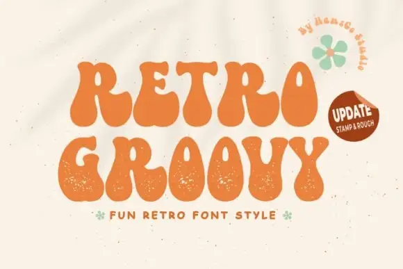
Groovy fat display with grainy edges
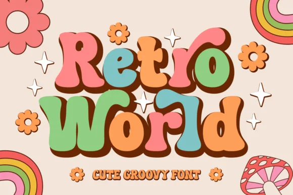
Retro Groovy is a groovy display face in orange on cream: fat blobby letters with wavy contours and a grainy surface, set as two stacked lines with a small tracked line beneath and a green flower beside them.
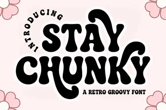
Retro groovy chunky display
Stay Chunky is a retro groovy display in black on pale pink: very heavy rounded caps with curled tails that drop below the baseline, an R with a swash leg, a Y and an A with hooked stems, and a curved note above, with flowers at the corners.
Ideas for this font
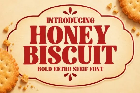
Bold retro serif with heavy bracketed slabs and narrow counters
Honey Biscuit is a bold retro serif in which the bracketed slabs are heavy, the stems are fat and the counters pinch narrow, so a word reads like a printed biscuit tin rather than a book title.
Ideas for this font
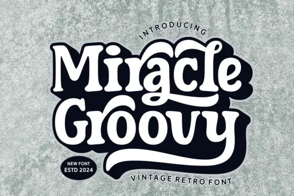
Retro mixed-case letters with long integrated swashes
Miracle Groovy shows weighty rounded forms with small sharp serif tips, where the a and the lower y extend into long sweeping tails that visually bind two rows together, and a heavy dark offset surrounds the white title on a textured pale field.
Ideas for this font
Same independent foundry
Allow optional Google Analytics to measure visits and catalogue actions. Your search words and notes are not included. Privacy & storage