Modern Grotesque Body

Miracle Groovy + Clyne Sans
Creates crisp high-hierarchy contrast beneath Miracle Groovy headlines across menus, websites and labels.
Inspect Clyne Sans specimenDisclosure: MakerFileHub may earn a commission from qualifying purchases via paid links on this page. How our links work.
Retro mixed-case letters with long integrated swashes
Miracle Groovy shows weighty rounded forms with small sharp serif tips, where the a and the lower y extend into long sweeping tails that visually bind two rows together, and a heavy dark offset surrounds the white title on a textured pale field.
Paid link
Get this fontProject & layout blueprintsAt-a-glance maker compatibility
Sturdy stroke walls and open counters weed cleanly on adhesive vinyl, HTV apparel film, and cut cardstock.
Visual anatomy & craft review
The bodies stay weighty and round, the serif tips stay small, two letters grow tails and the offset repeats the silhouette behind. That binding tail is the character: the second row hangs off the first rather than sitting beneath it, which is why the sample shows one dense lockup. Only one phrase is shown, so test your own wording for joins, keep 36 pt and allow 26 mm beneath the sweeps for whatever comes next. The binding tail is drawn for one phrase only: a different word loses the join, so test your wording first and allow 26 mm beneath the sweeps for whatever sits under them.
Retro mixed-case letters with long integrated swashes
Two-font hierarchy recipes
Tested contrast partners — pairing Miracle Groovy with grounded secondary typography.
Miracle Groovy + Clyne Sans
Creates crisp high-hierarchy contrast beneath Miracle Groovy headlines across menus, websites and labels.
Inspect Clyne Sans specimen
Miracle Groovy + Farmhouse
Adds a warm human signature touch for 1-to-3-word callouts without competing against structured serif capitals.
Inspect Farmhouse specimenPractical applications
Concrete hierarchy, scale and production guidance tailored to Miracle Groovy’s stroke geometry.
The groovy forms give a diner a period label, and the sweeping tails hold a two-word name at 24 pt on a 60 by 45 mm panel, where the round bodies stay legible at arm's length.
Hierarchy & layout recipe
Print a 60 by 45 mm label: set the name at 24 pt over two short rows, keep 18 mm of clear ground beneath for the y tail, and draw any offset in layout so the file stays one flat colour.
Pre-production check
Offset shadows drawn under 1 mm read as a misregistration; check the plate proof and keep the shadow at 1.5 mm.
The retro lettering sets a period heading, and the weighty forms hold a two-word title at 52 pt on a page, where the sharp serif tips keep the row crisp.
Hierarchy & layout recipe
Print a 210 mm page: set the title at 52 pt on one row, keep 24 mm of clear ground beneath for the descender, and keep the body in a plain serif so the retro heading stays the only period note.
Pre-production check
Two retro rows on one spread compete for the same attention; check the page and keep the deck in roman type, with one period voice per spread.
The rounded tails suit a themed card, and the heavy strokes hold a short greeting at 30 pt on an A6 sheet, where the binding swash gives the row its movement.
Hierarchy & layout recipe
Print an A6 card: set the greeting at 30 pt on one row, keep 20 mm of clear ground beneath for the tail, and keep the details at 11 pt in a plain sans so the display face leads.
Pre-production check
The tail may need a specific alternate; check the character map before the layout is fixed.
Technical & licence verification
Confirm included OTF/TTF/WOFF formats, full glyph tables and licence coverage on the live store page before batch production.
Closest visual alternatives
Matched across letterform anatomy, stroke behaviour and craft applications.
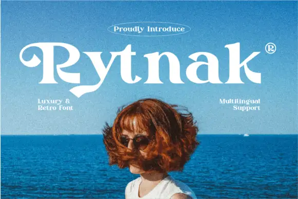
Heavy retro serif
Rytnak is a heavy retro serif in white over a photograph of a figure against a blue sea: fat stems, a hooked R, a pointed y tail and wide bowls, set as one word with a tracked line above in an oval rule and two small notes at the sides.
Ideas for this font
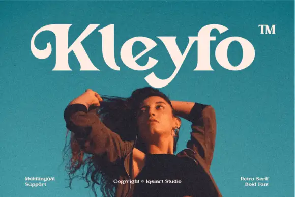
Heavy retro serif with a curled K entry and sweeping terminal swashes
Kleyfo is a heavy retro serif in which the stems carry groovy weight, the K opens a long curled entry, the diagonals stay thick and the terminals sweep into small pointed joins, so a short name reads as a seventies boutique label.
Ideas for this font
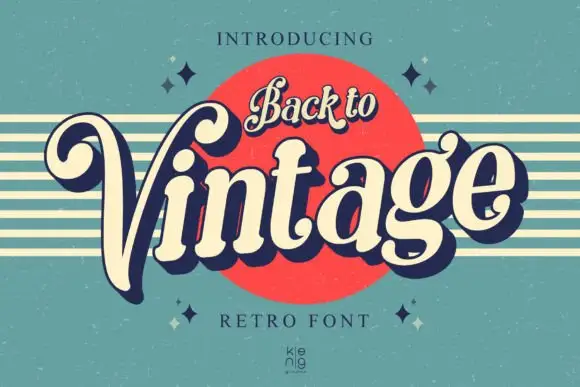
Slanted retro serif with curled V
Back to Vintage shows bold slanted high-contrast letters in cream with a deep navy shadow, where the large V curls inward at its upper left, the g carries a deep rounded lower loop and a small top hook, and a script badge reading Back to sits above on a red disc.
Ideas for this font
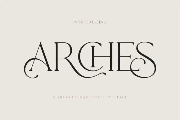
Decorative ligature serif
Arches sets one word in dark ink on a warm neutral field, where wide flat serifs sit on hairline cross strokes, the A climbs to a sharp apex, the R leg sweeps into a long horizontal tail that runs beneath the following letters and the S closes with an extended curl.
Ideas for this font
Same independent foundry
Allow optional Google Analytics to measure visits and catalogue actions. Your search words and notes are not included. Privacy & storage