High-Contrast Display Serif

Sailors + The Bilstein Editorial
Pairs sculptural editorial warmth with Sailors's clean modern geometry.
Inspect The Bilstein Editorial specimenDisclosure: MakerFileHub may earn a commission from qualifying purchases via paid links on this page. How our links work.
5-style vintage nautical & heritage grotesk family (Regular, Rough, Condensed & Slants!)
Sailors is a proven 5-style vintage sans family ('Regular, Rough, Condensed, Slant & Condensed Slant') built for maritime badges, breweries, and rugged merch!
Paid link
Get this fontProject & layout blueprintsAt-a-glance maker compatibility
Fine grain and micro-texture excel in 300 DPI print, sublimation, and screen print rather than small vinyl weeding.
Visual anatomy & craft review
Sailors is a five-style heritage grotesk family drawn from nautical signage: a regular with flat terminals and a tall x-height, a rough version with a chipped contour, a condensed cut, and two slanted styles. The rough and condensed cuts share the skeleton, so a word can combine a rough headline with a clean condensed caption on the same sign. It needs roughly 20 mm for the flat terminal and the chip to read, and it is best in one dense navy on white and cream, or white on a dark hull colour.
5-style-nautical · Round-and-Rough · Maritime-heritage
Two-font hierarchy recipes
Tested contrast partners — pairing Sailors with grounded secondary typography.
Sailors + The Bilstein Editorial
Pairs sculptural editorial warmth with Sailors's clean modern geometry.
Inspect The Bilstein Editorial specimen
Sailors + Welcome
Introduces organic movement on pull-quotes, signatures and gift tags.
Inspect Welcome specimenPractical applications
Concrete hierarchy, scale and production guidance tailored to Sailors’s stroke geometry.
A heritage grotesk with a rough cut reads as signage painted on a harbour wall rather than a modern café logo. The rough headline sits at 60 mm with the clean condensed caption beneath at 20 mm, so one sign uses two styles of the same family without a second typeface.
Hierarchy & layout recipe
Menu board 600 x 900 mm, rough header 80 mm, condensed items 24 mm, 30 mm margins. Cup print 70 x 50 mm, clean word 14 mm, 5 mm margins. Card 85 x 55 mm, rough word 14 mm, condensed details 7 pt.
Pre-production check
On a 70 x 50 mm cup panel the rough cut at 14 mm prints as dirt and the name looks damaged. Use the clean cut on cups and keep the rough for boards, and check one printed cup before the order.
A nautical grotesk gives a dockside business a thank-you that reads as stencilled on a crate rather than printed by a marketing team. The clean condensed cut sets the details at 8 pt on a small tag, and one ink prints the card, the tag and the crate label in a single order.
Hierarchy & layout recipe
Card A6, rough word 18 mm, condensed note 8/11 pt, 12 mm margins. Rope tag 40 x 80 mm, word 10 mm with a 4 mm hole and 8 mm clear. Crate label 120 x 80 mm, word 20 mm, 6 mm margins.
Pre-production check
A 40 x 80 mm rope tag at 10 mm puts the chipped edge against the punched hole and the card tears when the line pulls. Keep the word 10 mm clear of the hole or use the clean cut, and test one tag on a line.
A five-style nautical family suits a summer harbour festival because the rough cut looks painted and the condensed cut fits a long programme of events. The rough headline holds at 140 mm across a poster, and the slanted cut marks the volunteer shirts without a second typeface.
Hierarchy & layout recipe
Poster A2, rough word 140 mm, condensed details 36 mm, 20 mm margins. Programme A5, header 30 mm, listings 8/11 pt. Shirt back 300 x 400 mm, slanted word 90 mm, 20 mm margins.
Pre-production check
On a 300 x 400 mm shirt the slanted cut at 90 mm bridges the 1.2 mm notch in the rough contour and the word fills into a slab. Print shirts from the clean cut and keep the rough for paper, then wash one sample before the order.
Technical & licence verification
Confirm included OTF/TTF/WOFF formats, full glyph tables and licence coverage on the live store page before batch production.
Closest visual alternatives
Matched across letterform anatomy, stroke behaviour and craft applications.
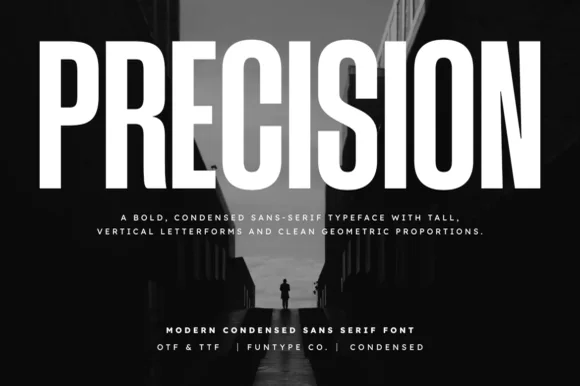
Tall ultra-condensed geometric headline grotesk
Precision is a bold, ultra-condensed sans serif typeface with tall vertical pillars, tight flat-sided counters, and clean modernist snap.
Ideas for this font
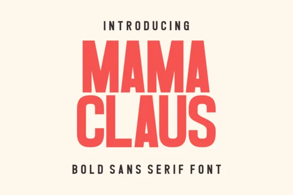
Heavy condensed bold sans
Mama Claus is a heavy condensed sans in red on cream: very thick stems, narrow counters, flat terminals and a tall x-height, with two stacked lines filling the plate and a tracked caption beneath, so the pair reads as a modern poster headline rather than a period display.

Tall condensed rounded retro sans-serif with 110+ PUA extras
Whiskey Tango is a lively, tall-and-narrow rounded sans-serif packed with Latin, Cyrillic, and Greek support plus over 110 PUA alternates.
Ideas for this font
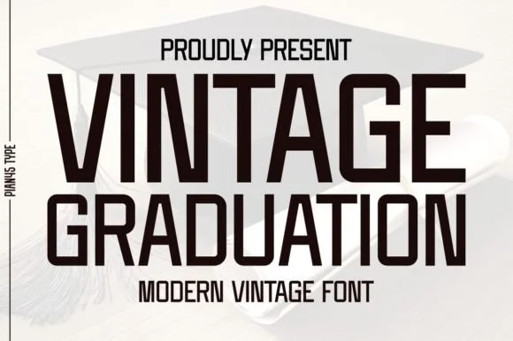
Condensed modern vintage sans
Vintage Graduation is a condensed sans in near-black on a pale ground, set over a graduation cap: tall narrow caps with flat terminals, a high waist, closed counters and tight spacing, arranged on two lines with a tracked label above and beneath in the same face.
Ideas for this font
Same independent foundry
Allow optional Google Analytics to measure visits and catalogue actions. Your search words and notes are not included. Privacy & storage