Neutral Sans Workhorse

Momo + Taught
Lets Momo own the focal silhouette while handling secondary copy, sizing and subheads cleanly.
Inspect Taught specimenDisclosure: MakerFileHub may earn a commission from qualifying purchases via paid links on this page. How our links work.
Groovy 60s/70s rainbow-flower-power plump bubble font
Momo is a plush, groovy retro bubble display font built for multi-ringed 1970s rainbow outlines, daisy illustrations, and puff-print apparel.
Paid link
Get this fontProject & layout blueprintsAt-a-glance maker compatibility
Sturdy stroke walls and open counters weed cleanly on adhesive vinyl, HTV apparel film, and cut cardstock.
Visual anatomy & craft review
Momo is a plump retro bubble display with inflated round bowls, near-circular counters and a heavy, even weight that was drawn to carry concentric rainbow contours. The letters sit wide and low, so a word becomes a stack of soft pebbles rather than a linear string, and the tight default spacing lets a designer nest outlines without gaps collapsing. Because the shapes are so simple, the face tolerates multi-colour puff printing and thick keylines that would destroy a more detailed alphabet.
Flower-power · Cushiony · 70s-joy
Two-font hierarchy recipes
Tested contrast partners — pairing Momo with grounded secondary typography.
Momo + Taught
Lets Momo own the focal silhouette while handling secondary copy, sizing and subheads cleanly.
Inspect Taught specimen
Momo + The Simple Editorial
Grounds bold display lettering with classic typographic authority on posters, badges and apparel.
Inspect The Simple Editorial specimenPractical applications
Concrete hierarchy, scale and production guidance tailored to Momo’s stroke geometry.
Inflated bubble bowls are the same volume as the balloon letters children already recognise from party décor, so the banner reads as part of the decorations. The wide, low proportions stack into a bunting triangle without re-drawing, and each letter survives being cut from card and hung against a window.
Hierarchy & layout recipe
Bunting: twelve triangles 180 mm wide, 210 mm drop, one word per pennant at 45 mm cap-height, 25 mm margins. Shirt print 240 x 180 mm on a 6-9 month bodice, name 30 mm. Bottle label 90 x 45 mm wrap, name 10 mm with a 3 mm keyline offset.
Pre-production check
The centre counter of 'o', 'b' and 'a' drops out if the pink layer is printed before the white base on a coloured garment. Print the keyline as a separate white screen underneath, and check one washed sample for cracking at the counter edge.
Soft, heavy bubbles signal play without the aggressive bounce of a cartoon face, which is the balance a childrenswear boutique has to hit for parents. The regular geometry reproduces in small sizes on a freshener card where a textured or flourished face turns to noise.
Hierarchy & layout recipe
Logo lockup: name 18 mm cap-height, descriptor 4 mm letterspaced 120 units. Freshener card 90 x 65 mm, name 20 mm, 5 mm trim margin, 4 mm hang slot. Cup wrap 200 x 60 mm, name 16 mm repeated twice round the circumference with an 8 mm fog gap at the seam.
Pre-production check
On a 60 mm wrap the seam overlap eats 8 to 10 mm, so a word crossing the seam arrives with a doubled letter. Lay the wrap flat, check where the seam falls, and pad the copy so no counter sits inside that band.
Round bubble shapes rhyme with pool rings and sunglasses, so an invitation reads as festive before a single illustration is added. Wide letters fill a square card edge to edge with one short line, which is the fastest way to make a summer invite look intentional at arm's length.
Hierarchy & layout recipe
Invite A6 landscape, 105 x 148 mm, 3 mm bleed. Headline 24 pt across two lines, leading 1.05, 12 mm margins; details 9/12 pt in a neutral sans below a 1 mm rule. Toppers: 75 mm circles on 2 mm card, word 12 mm cap-height, 8 mm stick slot.
Pre-production check
Bubble faces pool ink at the widest point of each bowl on uncoated stock. If the invite is printed on 300 gsm textured card, drop the headline to 20 pt or add 3 percent ink reduction, then rub-test a dry proof for offsetting in a warm car.
Technical & licence verification
Confirm included OTF/TTF/WOFF formats, full glyph tables and licence coverage on the live store page before batch production.
Closest visual alternatives
Matched across letterform anatomy, stroke behaviour and craft applications.
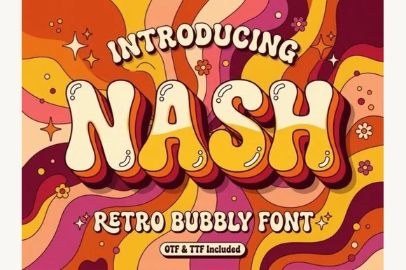
Groovy 1970s psychedelic lava-lamp bubble display (OTF & TTF)
Nash is a cheerful 1970s psychedelic bubble display font swelling bottom-heavy groovy curves for retro shirts, posters, and mugs (OTF & TTF).
Ideas for this font
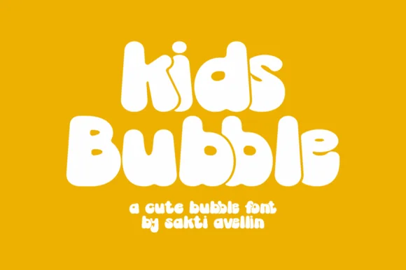
Groovy 70s marshmallow lowercase & mixed-case bubble font
Kids Bubble is a buoyant, ultra-heavy mixed-case bubble font packing 1970s marshmallow warmth into chubby lowercase letters.
Ideas for this font
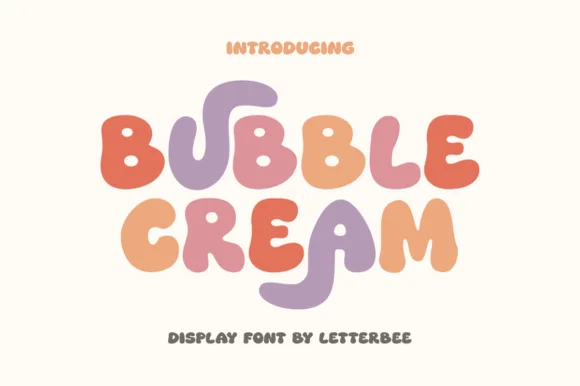
Soft groovy ice-cream-scoop & pastel bubble display
Bubble Cream is a sweet, organic rounded display font featuring playful stretched U/R tails and pillowy ice-cream-scoop curves.
Ideas for this font
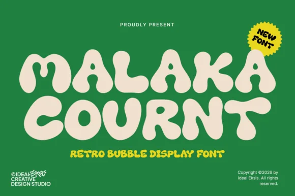
Ultra-heavy groovy pillow-bubble retro display
Malaka Cournt is an ultra-bold retro bubble display font sculpting wide, squishy 1970s letterforms with compressed teardrop counters.
Ideas for this font
Same independent foundry
Allow optional Google Analytics to measure visits and catalogue actions. Your search words and notes are not included. Privacy & storage