Modern Grotesque Body

Retro Kids + Cultivo
Creates crisp high-hierarchy contrast beneath Retro Kids headlines across menus, websites and labels.
Inspect Cultivo specimenDisclosure: MakerFileHub may earn a commission from qualifying purchases via paid links on this page. How our links work.
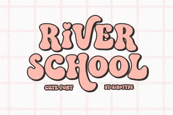
Soft retro letters with heart and long curved leg
Retro Kids uses rounded heavy serif-like forms with uneven widths, where the i takes a heart for its dot, the k drops a long curved leg under the row, the two words sit in pink and yellow with a thick outline and the cover fills the field with outlined daisies.
Paid link
Get this fontProject & layout blueprintsAt-a-glance maker compatibility
Sturdy stroke walls and open counters weed cleanly on adhesive vinyl, HTV apparel film, and cut cardstock.
Visual anatomy & craft review
The strokes stay heavy and soft, the feet round, the widths shift and one letter borrows a heart for a dot while another leg curves far below. That heart dot is the character, because it turns a plain vintage face into a children's mark with a single gesture. The daisies and stars are cover artwork. The source notes PUA-encoded extras and stylistic alternates, so check how the heart is reached and test the long k leg against your bottom margin before setting a two-row block.
Soft retro letters with heart and long curved leg
Two-font hierarchy recipes
Tested contrast partners — pairing Retro Kids with grounded secondary typography.
Retro Kids + Cultivo
Creates crisp high-hierarchy contrast beneath Retro Kids headlines across menus, websites and labels.
Inspect Cultivo specimen
Retro Kids + Hailey
Adds a warm human signature touch for 1-to-3-word callouts without competing against structured serif capitals.
Inspect Hailey specimenPractical applications
Concrete hierarchy, scale and production guidance tailored to Retro Kids’s stroke geometry.
The heavy rounded forms and the heart dot suit a young child's card, where the lettering carries the whole design on its own.
Hierarchy & layout recipe
Print a 105 by 148 mm card: set the greeting at 34 pt across two rows with 14 mm between baselines, keep 20 mm of clear ground beneath for the k leg, and keep 15 mm of margin at each side.
Pre-production check
The heart dot may be an alternate glyph; check the file and your app before promising it to the buyer.
The soft heavy letters read at a child's height and the warm forms keep a room label from looking like an institutional sign.
Hierarchy & layout recipe
Print a 300 by 150 mm plate: set the room name at 46 pt on one row, keep 18 mm of clear ground beneath before the group name at 12 pt, and keep 20 mm of margin for the fixings.
Pre-production check
The thick outline needs a light ground; check the plate and avoid tinted stock directly behind the letters.
The vintage weight with a heart detail gives a small shop a friendly mark that still reads at shelf distance in a store.
Hierarchy & layout recipe
Print a 70 by 50 mm label: set the shop name at 20 pt on one row, keep 10 mm of clear ground beneath before the town at 6 pt, and keep 6 mm to the die edge for the outline.
Pre-production check
The outline closes the counters under 16 pt; check the proof and keep the name at 18 pt or above.
Technical & licence verification
Confirm included OTF/TTF/WOFF formats, full glyph tables and licence coverage on the live store page before batch production.
Closest visual alternatives
Matched across letterform anatomy, stroke behaviour and craft applications.
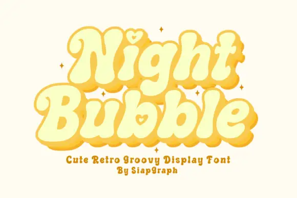
Soft retro bubble letters with hearts
Night Bubble is a soft retro display face in butter yellow: fat rounded letterforms, an offset pink shadow, and a small heart tucked into the counters of the N and the b.
Ideas for this font
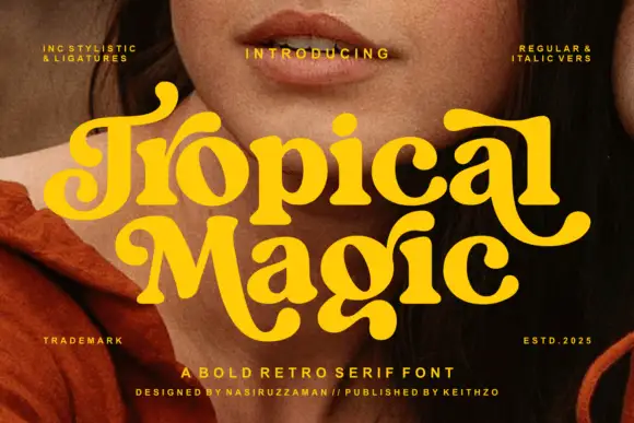
Heavy rounded retro serif
Tropical Magic is a heavy rounded retro serif in yellow over a portrait: fat stems with ball terminals, curled entries on the capitals, round bowls and a swollen waist, set on two lines with tracked notes in the corners naming the italics and the alternates, and a credit along the foot.
Ideas for this font
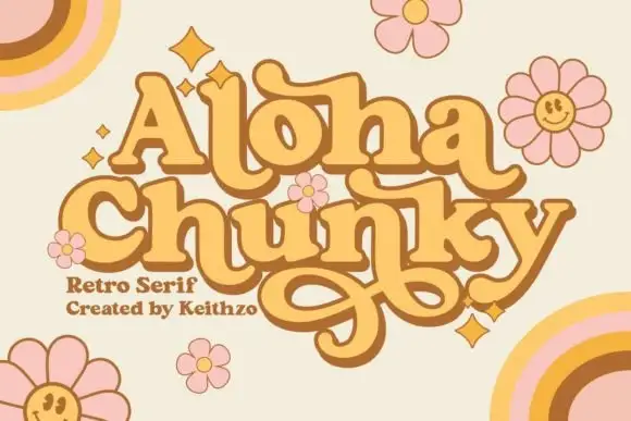
Chunky rounded retro letters with intertwined low swashes
Aloha Chunky shows yellow-orange stacked lettering with brown outlines and offset dark edges, where broad rounded bodies, bulbous terminals and rolled entries make the words feel dense, the upper A keeps a triangular counter and the h and a finish in wide curls that collect beneath the lower line.
Ideas for this font
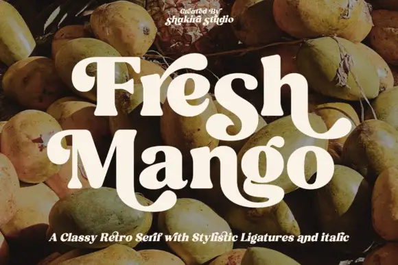
Heavy rounded retro serif with broad curling descenders
Fresh Mango shows cream mixed-case letters with thick soft strokes and narrow internal counters over a fruit photograph, where the initial F curls at its upper left, the h ends in an outward hook and the M sweeps into a large low curve that runs under the following letters.
Ideas for this font
Same independent foundry
Allow optional Google Analytics to measure visits and catalogue actions. Your search words and notes are not included. Privacy & storage